
How to Choose the Right Stock Photo for Your Next Project


Former VP of Marketing @ Buffer
You’ve likely got a great way to search the web for the best free stock photos.
And once you know where to look, how do you decide which photos to choose?
Should you go with abstract or specific?
What is the best color profile?
What is the best orientation?
There are so many great sources for free photos. I find myself asking these questions most every time I pick a photo—how to identify the right stock photo for a project. There’s a good bit of research and advice out there on how to make the best choice when it comes to stock photos. Take a look at what I’ve found here.
1. Know where your image is going
How will you use the photo? Where will the photo appear?
There’re a million different places an image could appear, based on the million or more types of projects that involve stock photography.
Let’s consider online content for a moment.
When we look at the different places that a stock photo may appear, there’s often a handful that come to mind most often:
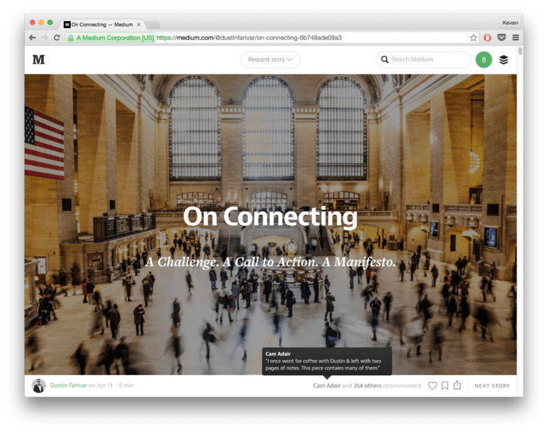
A full-width image in the header
Examples of this include stories on Medium and popular blogs like Crew or Zapier.
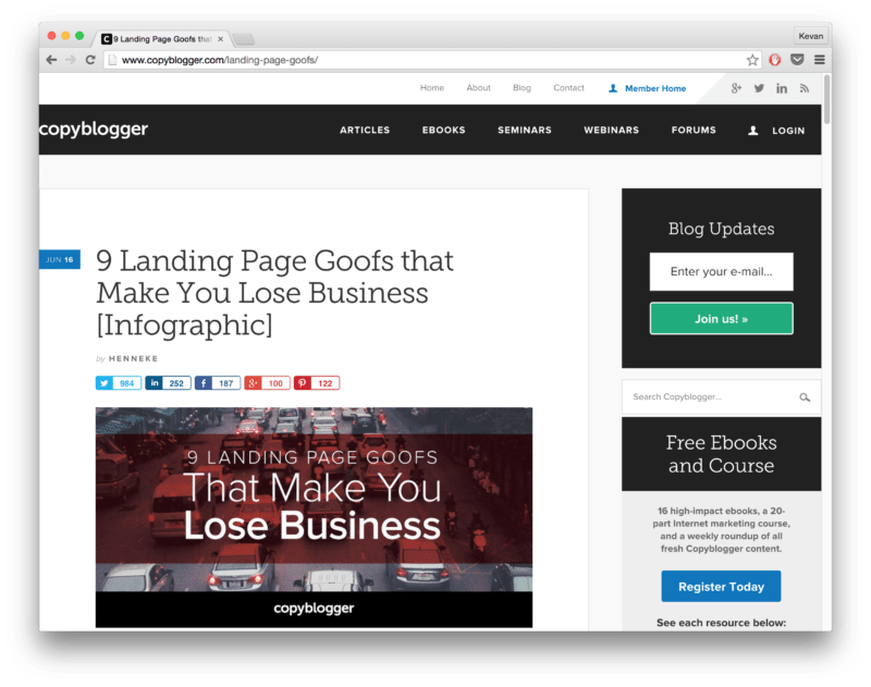
A background image as part of a graphic, behind text or icons
Examples of this include the images we create for Buffer blog posts and some great designs on blogs like Copyblogger and Agora Pulse.
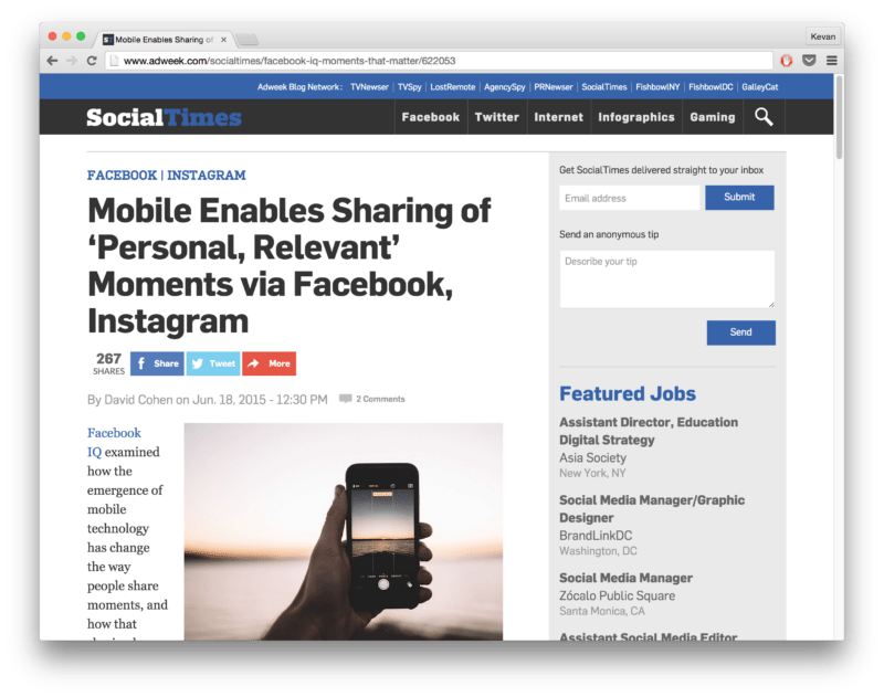
Right-aligned images inside blog posts
Examples include The Social Times blog. (The image could also be left-aligned, too, though the far more common usage is right-aligned.)
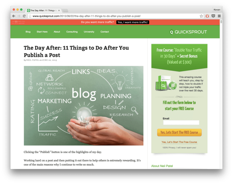
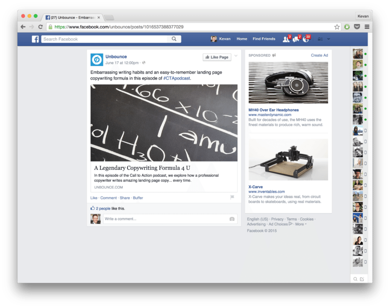
Full-width images inside blog posts
Examples include the Unbounce blog and the Quick Sprout blog.
Social media featured images
Examples include Facebook and Google+ when you share a link and Twitter when you’ve enabled Twitter cards.
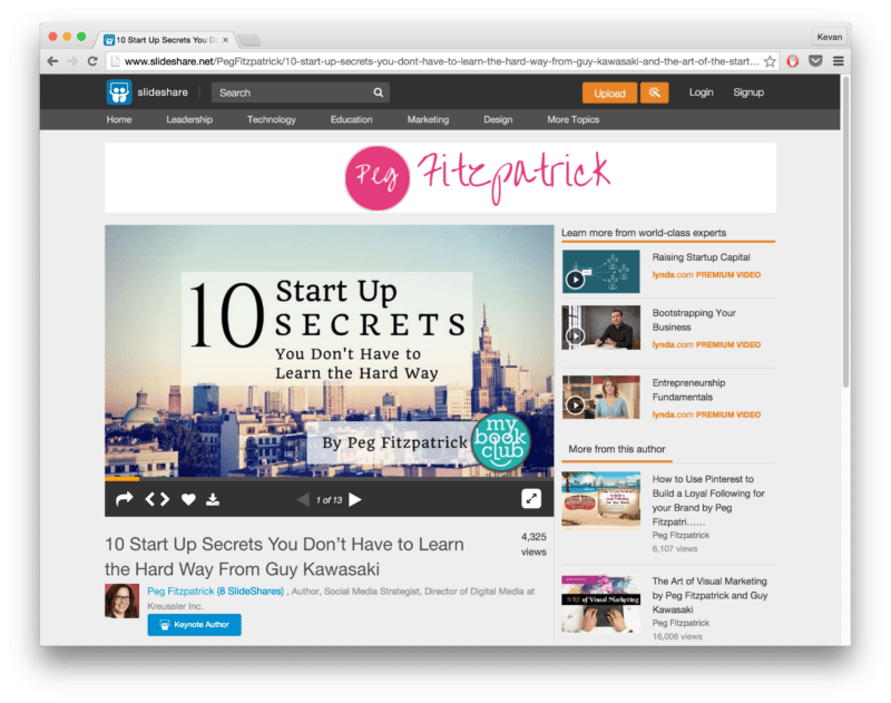
Slidedeck backgrounds
Lots of great examples on SlideShare.
In each of the examples above, it’s possible that a different stock photo would be considered an ideal fit, based on what looks good with text on top of it, what looks good splashed on Facebook, or what looks good at the start of a blog post.
In my experience, I’ve seen stock photos commonly used in one of two ways. Either
- On their own as standalone images
- With text or graphics placed on top, as designed images
Both are great routes forward, especially considering the unique places these images are used online. Once you figure out where your image is going and how it will be used, you’re certain to have a greater sense of what’s right stock photo for your project.
2. Understand the contrast of your image
Identify areas of low contrast if you plan on adding text or graphics to the image
Let’s say you want to add an overlay onto your image—a catchy quote with Pablo or an announcement blurb and graphic over a cool background.
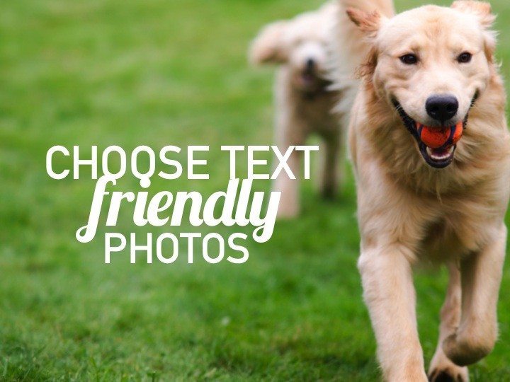
The ideal stock photo for these projects would be one with areas of low contrast so that your text and graphics have an even, consistent backdrop.
The SlideShare blog has a good example of how contrast affects the design of image. SlideShare refers to those images with areas of low contrast as text-friendly images.
Good example:
Bad example:

Put another way, these ideal stock photos with areas of low contrast make it possible that your text and graphics will have high contrast with the photo.
For instance, an image with many shades of blue could be said to have low contrast. If you were to add white text on top, the white text would have high contrast with the blue image.
If you always add white text to your images, look for images with darker colors.
If you’ve grabbed a black icon from a site like The Noun Project, you’ll want to place it on an image with lighter tones.
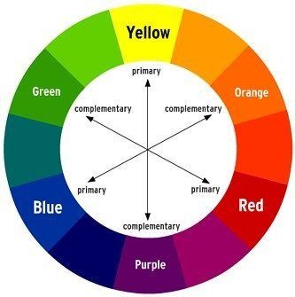
One way to look at contrast in this sense is to picture the color wheel. Selecting colors that are opposite one another on the wheel creates a contrasting effect. You can choose an ideal stock image that focuses on one color and text and graphics that focus on an opposite one.
Legibility and clarity are key here. Typically when you create an image with text, graphics, or other elements overlaid onto a photo, the most important visual aspect of your image will be your enhancements, not the stock photo itself.
You don’t need to think much about the content of the picture—especially if you’ll be adding strong effects like blur or darken/lighten.
You’ll just want something that has the right contrast to make your added elements pop.
Another trick I like to try, when possible, is to add an image to my photo editor (Canva, typically) and change the image to black-and-white. Usually quite quickly I can tell if the image has high or low contrast within its colors.
(You’ll also grow to notice the right contrast rather intuitively over time.)
Where this becomes important is when you begin to place elements on top of the image. Text, for instance, has the chance to be difficult to read if you’re placing it over contrasting colors—white text could disappear over the white parts of the image yet still look just fine over the darker colors, for instance.
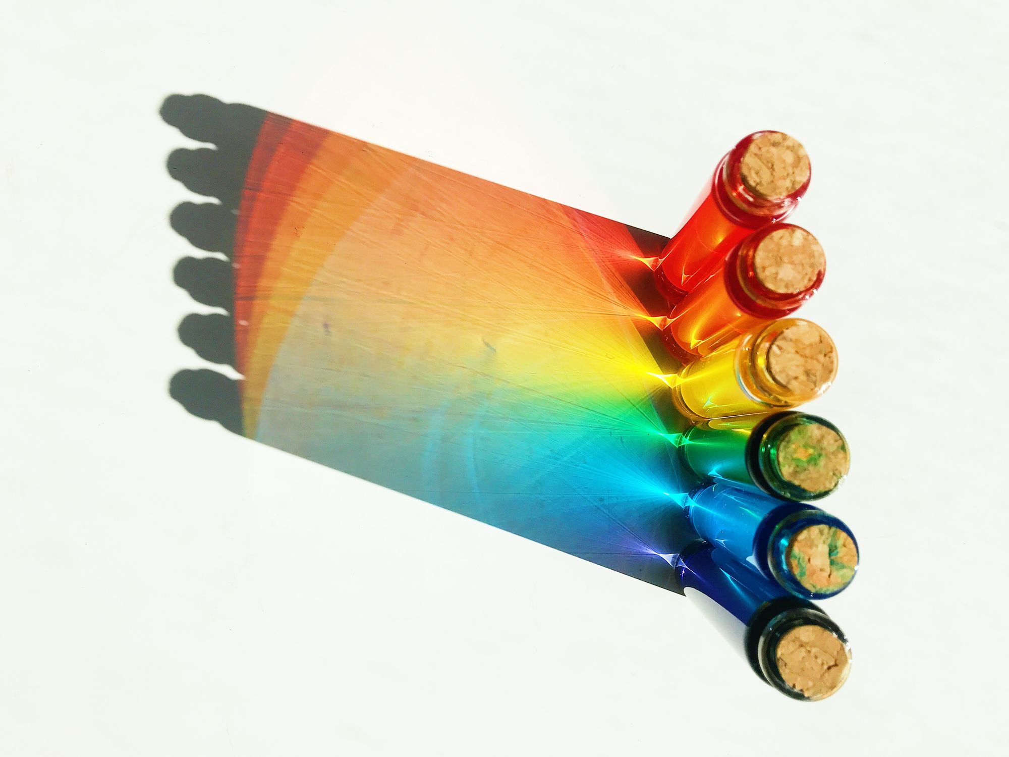
3. Choose colors that elicit a visceral response
Attention-grabbing colors & images will stand out on social
Visceral reactions are some of the strongest connections we can make to visual content.
Biologically, when we feel a visceral reaction, we tap into the part of the brain responsible for survival instincts and fight-or-flight responses. The response is subconscious. It originates from the central nervous system whenever we’re stimulated by vital factors like food, shelter, danger, or reproduction. We might not be able to explain why we love a beautiful design because our conscious thought hasn’t yet caught up with our subconscious.
And one of the ways to drive these visceral reactions is with color choice.
A study from Georgia Tech looked at 1 million Pinterest images for the color trends between the highest and lowest shared images. They found:
- Red, Purple and Pink promote sharing
- Green, Black, Blue and Yellow all stop people from sharing
The thinking was that the three highly-shared colors—red, purple and pink—are tied to visceral emotions. And the overall takeaway is that color makes for a huge portion of an image’s success.
To find an ideal stock photo that’s rich with attention-grabbing color, you can again turn to contrast—in particular, the seven color contrasts identified by Johannes Itten.
- Pure (hue) contrast
- Light-dark contrast
- Cold-warm contrast
- Complementary contrast
- Simultaneous contrast
- Contrast of quality (color saturation)
- Contrast of quantity
(For more detail on each of these seven, I’d highly recommend this blog post from Love of Graphics.)
Two of Itten’s seven color contrasts that stand out to me when choosing stock photos are contrast of saturation and contrast of hue. The Color at Play blog created some great examples of these contrasts in action.
Contrast in saturation
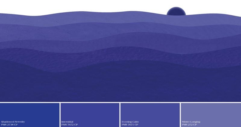
Example:

Contrast in hue
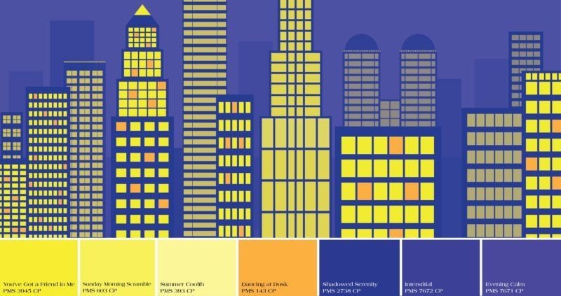
Example:

4. Find an image that supports your message
Attention-grabbing images are great, so long as they don’t distract
In most cases, stock photos are generic and abstract enough that they can grab attention without diverting too much focus.
There are, however, exceptions.
Simply, when choosing a stock photo, find one that does not distract from the main message of your article, update, or headline.
Typically, distracting images would be those that have one or more of these qualities:
- Controversial
- Loud, garish
- Too specific
- Recognizable
- Meme
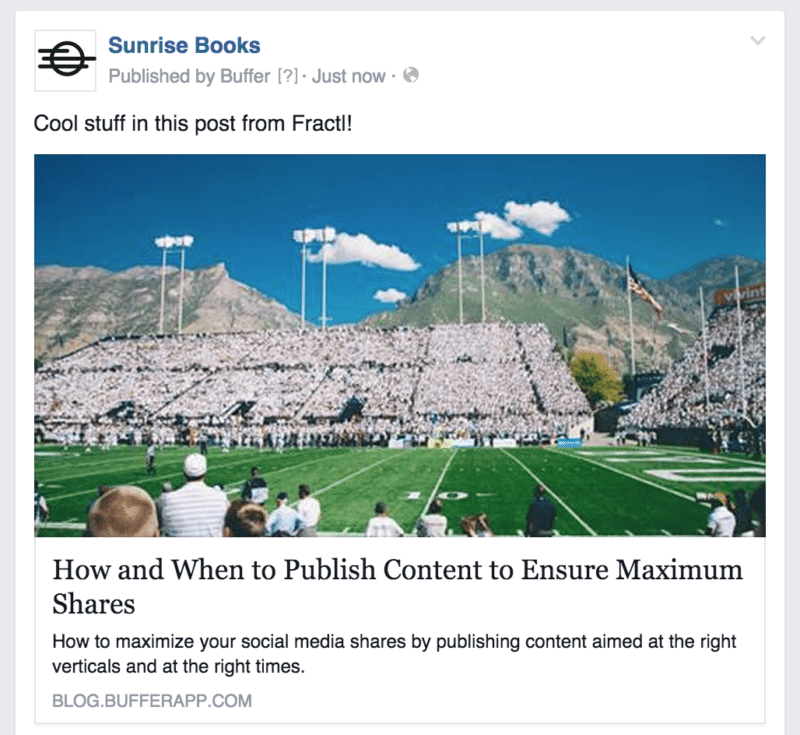
Here’s an example of one that I used in a story. The image was probably a bit too specific—a football game, fans dressed in white, lettering in the end zone—and on looking back at it now, my mind immediately begins trying to figure out just who those teams are (instead of focusing on the cool article).
5. Take care to pick a person
What to consider when picking a photo with a person
There’s been some neat research about this question. What effect is there, if any, should you choose a photo with a person?
Turns out, there are a lot of different ways to include a person in your picture.
- Looking away from camera vs. looking at camera
- Back of head vs. face
- Shadow/silhouette
- Pics of arms, legs, or bodies
A brief overview of some case studies on the topic reveals these findings:
- Human photos have a positive impact on trustworthiness of a website.
- A smiling face can help increase conversions.
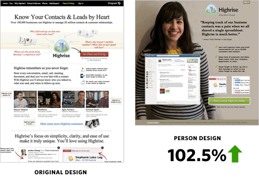
- In general, though, if you are to use a person in your photos, it’s best to use an actual person (an employee or customer) rather than a generic person from a stock photo
- Psychologically, we tend to follow the eyes of people in stock photos. This can create a directional cue toward buttons, CTAs, or text.
- The effect of using photos with real people is minimized with the focus of other elements on the picture or page.
6. Be mindful of the size and shape
Which orientation do you want? Tall vs. wide vs. square
One factor that might sway your decision one way or another is the size and shape of an image. In general, these are the ideal image sizes for each social network:
- Facebook – 1,200 x 628
- Twitter – 16:9 (for example: 1024×576, 1152×648, 1280×720, 1366×768, 1600×900, 1920×1080)
- LinkedIn – 700 x 400
- Google+ – 800 x 1,200
- Pinterest – 735 x 1,102
- Instagram – 1,080 x 1,080
The commonly-held best practice is to aim for something like this:
- Facebook & Instagram — square images
- Pinterest & Google+ — tall images
- Twitter — wide images
What happens if you fall in love with an image that isn’t the right size?
There’s a fun tip we use here at Buffer for how to crop easily.
When you double-click to open an image on your Mac computer, you enter Preview, which contains several useful tools.
To crop, place your mouse over the picture and click and drag to select the area you want to keep. Then go to Tools > Crop (or press Command+K).
You can also resize large images from Preview by going to Tools > Adjust Size.
In this way, you can fall in love with just about any image and crop down to the size and shape you need.
7. How to perform a search
The best way to search for abstract photos
Many of our favorite free image sources have robust search features to help you dig through the photo archives.
Sometimes there can be a bit of an art to finding what you’re after.
If you’re writing an article about brand management, for example, it could be difficult to know which terms to use in your search; if you were to search for “brand” or “management,” the image results might be a bit lean and off-topic.
What we like to do in searches for the Buffer blog is to enter terms that have to do with the image we have in mind, rather than the title of the page itself.
- For social media posts, we often look to find pictures of computers, laptops, mobile devices, or keyboards.
- For analytics posts, we look for transportation, things with forward motion.
- For research posts, we might search for books or pen and paper.
We also find that crowd shots or interactive photos with two or more people together make for good social media images.
What this might look like in practice:
- Search according to the verbs in your headlines or page titles, rather than the nouns
- Go to the thesaurus to find variations of your search terms (a simple thesaurus: Google search for “[keyword] synonym”)
- Search for nouns related to your verbs, e.g. “launch” could mean rockets or race cars
Over to you
What are your favorite tips for finding a great stock photo?
I’d love the chance to learn from you! Leave any thoughts here in the comments, and I’ll respond right away.
Image sources: Pablo, IconFinder, SlideShare, John Barsby Photography, Color at Play, UnSplash, 37 Signals, Eyequant
Try Buffer for free
140,000+ small businesses like yours use Buffer to build their brand on social media every month
Get started nowRelated Articles

I spoke to leading B2B content marketers (an in-house content director, agency owners, top freelancers, and thought leaders) to find out what they think B2B brands can do to create good content in 2024.

Black Friday and Cyber Monday marketing guidance to help you stand out from the crowd — complete with tried-and-tested examples.
Over the past two years, Buffer’s Senior Growth Marketing Manager, Sophie, has run 25 A/B tests in Google Adwords. In this article, she shares her strategic approach to conducting successful marketing experiments, how to come up with new experiment ideas, and the lessons she’s learned along the way.