Ultimate Guide to Mobile Social Media: Phone and Tablet Strategies for Twitter, Facebook, LinkedIn, and Google+


Former VP of Marketing @ Buffer
I spend my days writing content from my desktop computer for people who will read the content on their smartphones and tablets.
Go figure.
Mobile devices are fast becoming the preferred method of reading, sharing, and engaging with online content. It’s strange to think that the content we create on desktops and laptops will end up on dozens of different screen sizes before all is said and done. It’s a good lesson to keep in mind.
When I share to social media, what will my sharing look like to the people who see it? Increasingly, they’ll be seeing my tweets and updates on a screen in the palm of their hand and not on a monitor.
Digital consumption is going mobile. Digital marketing should head there, too.
Download the free Buffer app for iPad and iPhone!
I’m really interested to learn what this means for those of us who share on social. What are the implications of a growing mobile audience? Where can we improve our social media profiles and social media updates? Here’s some insight into what I found.
Let’s start with an experiment …
I like to think I know the Buffer blog inside and out, backwards and forward. I imagine you know your website just as well.
Do you know how it looks on a mobile device?
Here’s the Buffer blog on an iPhone:
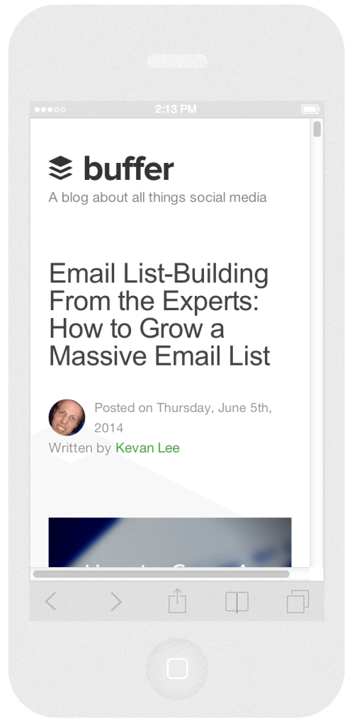
It’s a fascinating shift in paradigm for how to picture your website. When I think about how a blog post will look after I hit publish, my go-to view is the desktop view. Maybe it’s time to think outside the 15-inch widescreen box.
Ninety percent of Americans have a cell phone. Sixty-three percent use their cell phone to surf the Internet, and 34 percent claim that their phone is the predominant way they go online. Clearly, the way I think about the blog should include mobile.
(If you’re interested in seeing your own website on a dozen different mobile devices, I’d recommend Responsinator.com.)
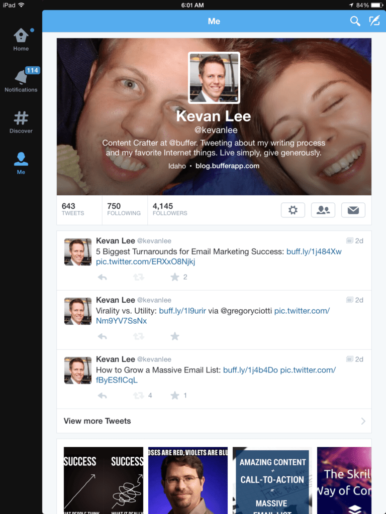
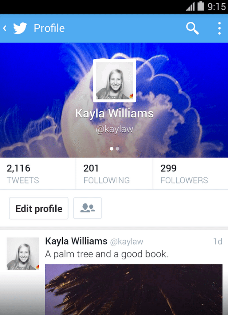
OK, next experiment. I have a pretty good grasp on the look of my Twitter profile. It’s got a profile image atop the left sidebar. It’s got a main header image across the top. I’ve spent lots of time customizing it to look just the way I want it.
And wouldn’t you know, it looks quite different on a mobile device.
The same goes for Facebook and Google+ and LinkedIn (see below for the specifics). Desktop and mobile deliver the same content, but they do so in vastly different ways. It’s like eating a hamburger or eating four hamburger sliders; the food’s the same, but the experience is quite different.
Now that you see how different the views are on a mobile device compared to desktop, let’s see exactly why mobile is such an important area to focus on.
4 stunning social media stats for mobile
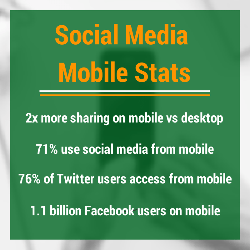
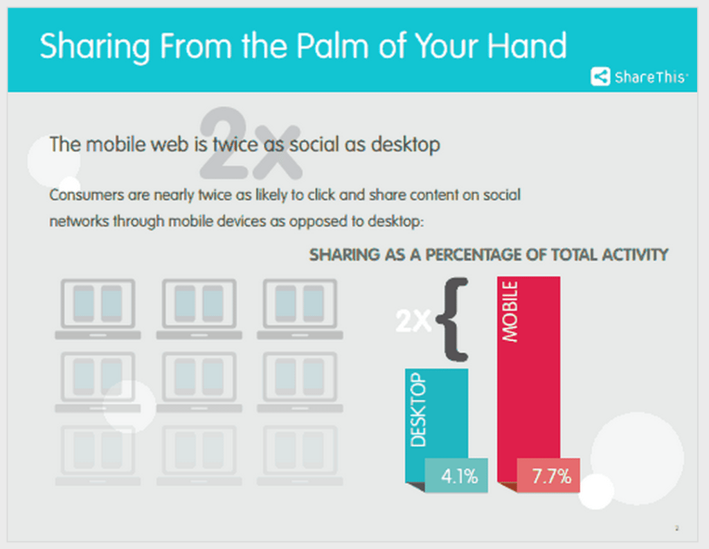
Sharing from mobile happens twice as often as sharing from desktop
ShareThis performed a study of the 2.4 million websites in its network, examining more than 6 billion social signals to come to this conclusion:
The mobile web is twice as social as desktop
A mobile users spends nearly 8 percent of their total activity sharing content, whereas desktop users spend only 4 percent. The numbers are even greater for iPhone users who share at a three-times greater rate than desktop (12 percent to 4 percent).
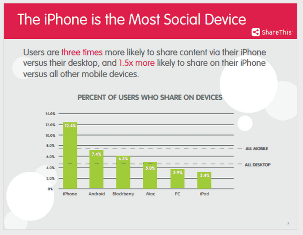
Among ShareThis’s other interesting findings:
- Facebook, Twitter, and Pinterest dominate the sharing numbers, accounting for nearly 75 percent of mobile shares
- iPhone users share more on Facebook. iPad users share more on Pinterest.
- Email sharing accounts for nearly 10 percent of sharing on desktop and less than 1 percent on mobile.
71 percent of social media users access social networks from a mobile device
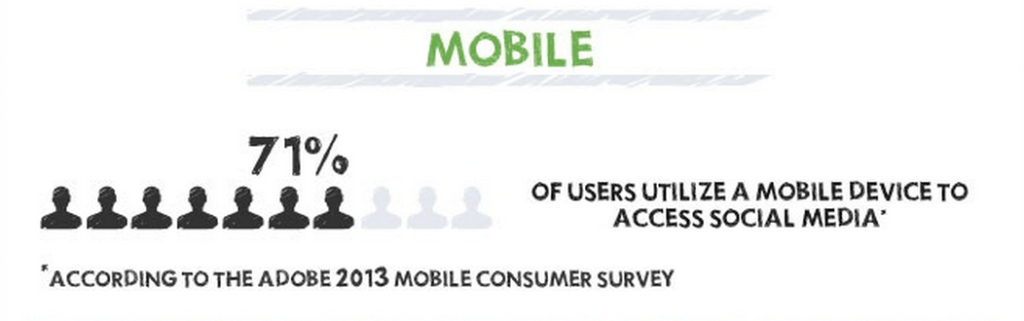
That’s nearly three out of every four people, according to a consumer survey from Adobe. Facebook’s and Twitter’s numbers make this survey result seem pretty accurate, if not a bit conservative.
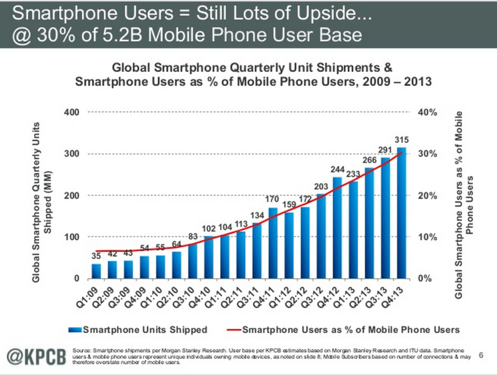
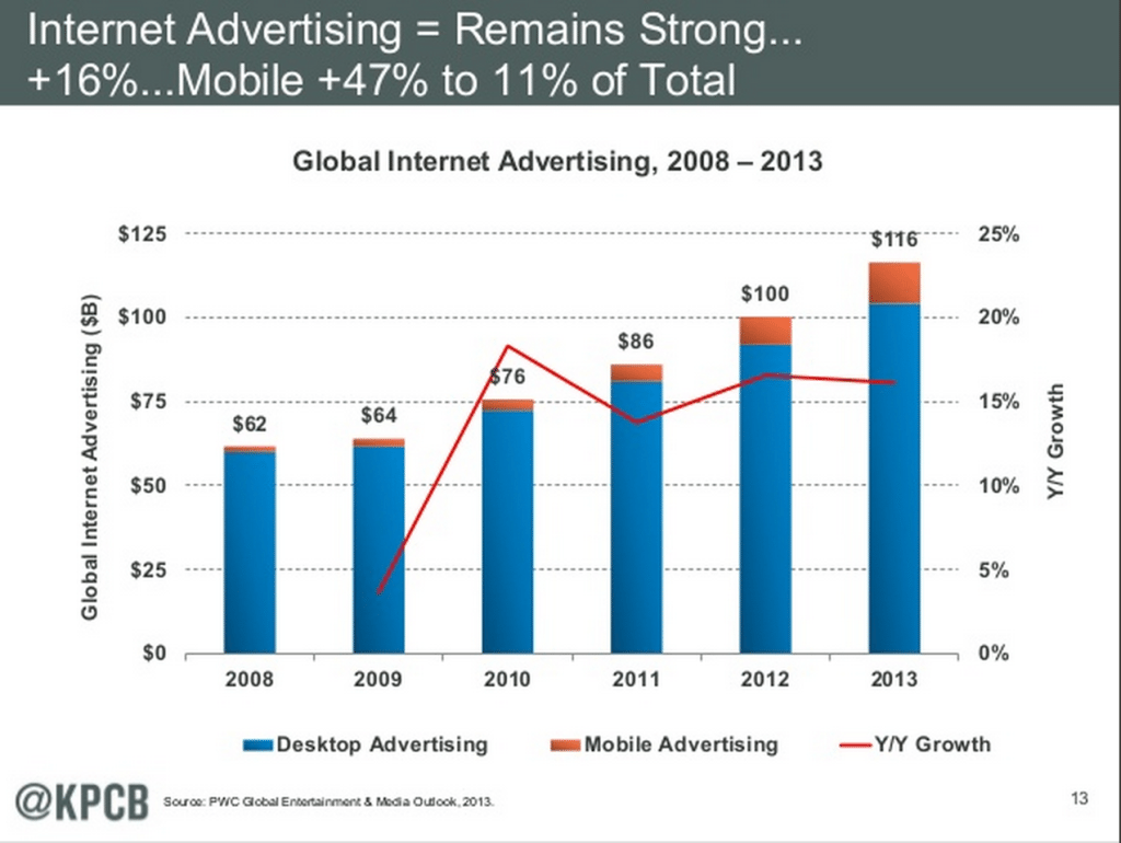
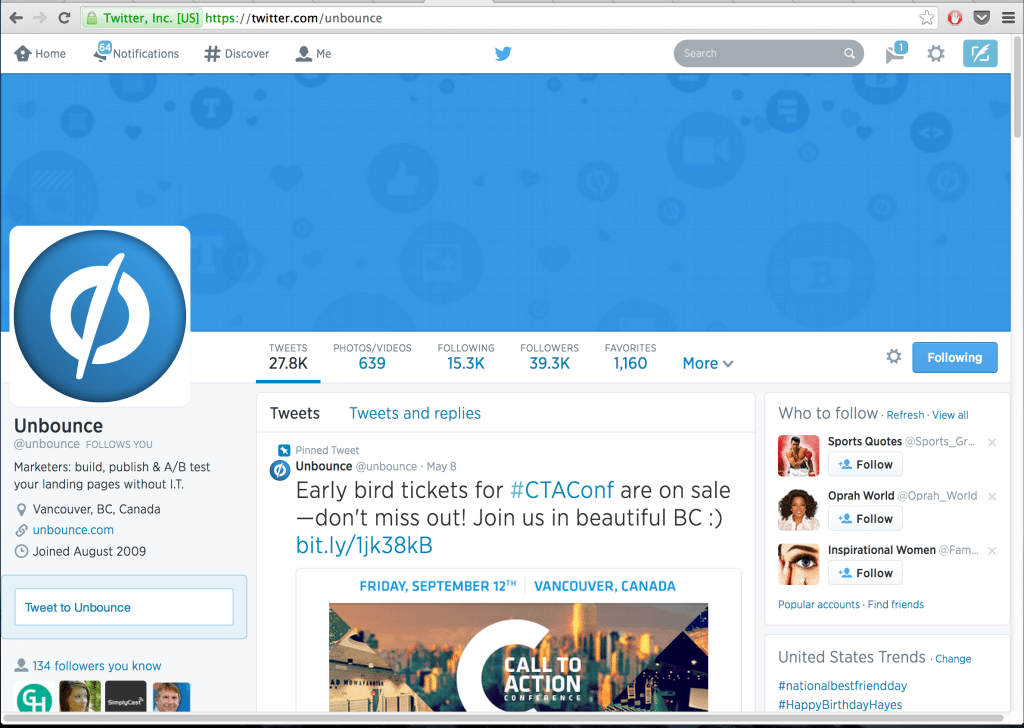
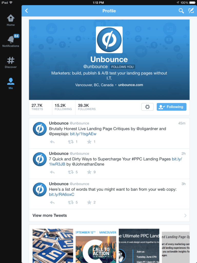
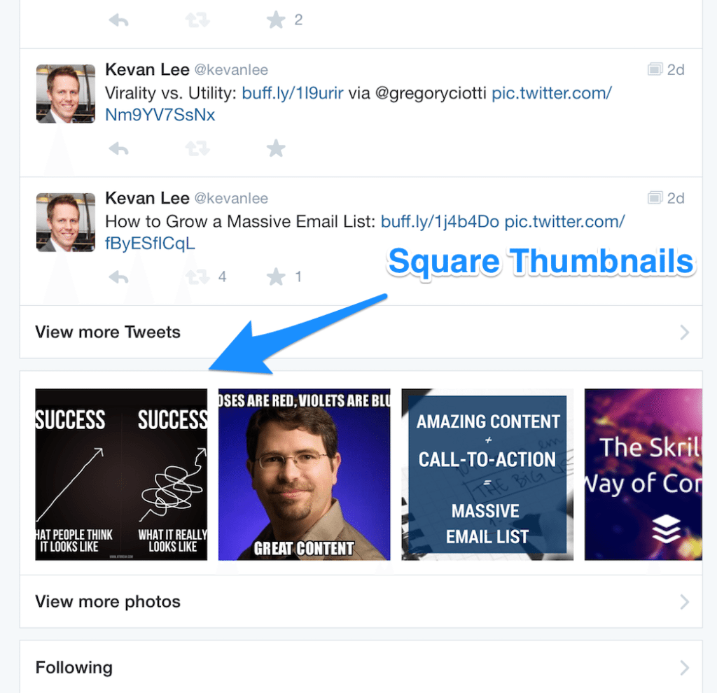
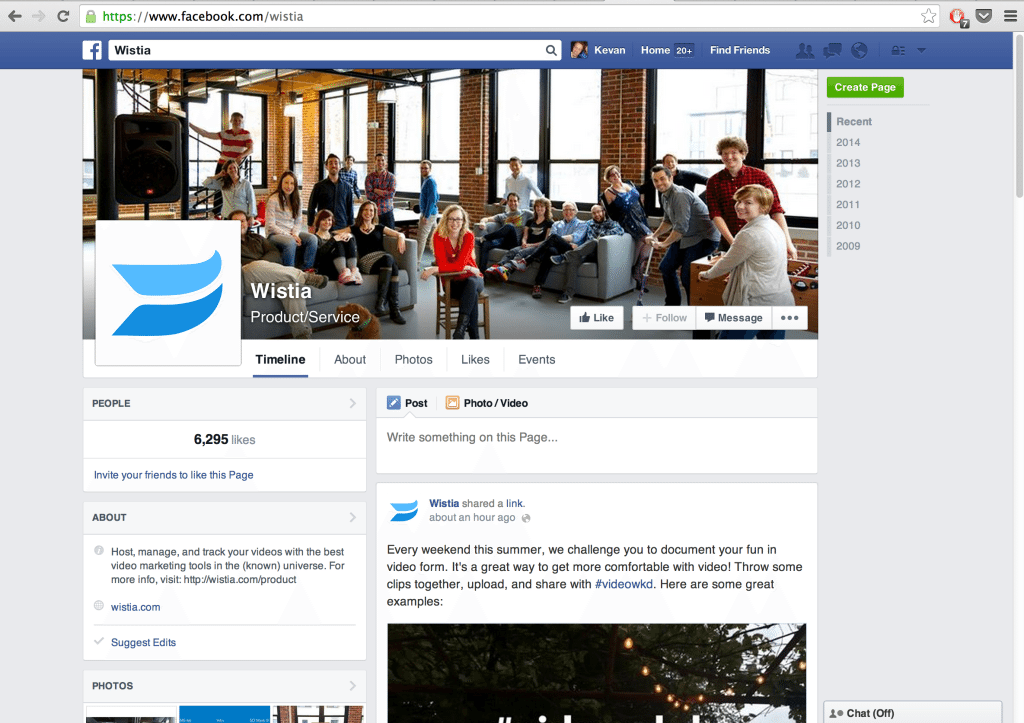
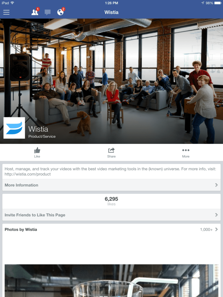
76 percent of active Twitter users access via a mobile device (phone, tablet, etc.) ( Of its 1.28 billion monthly active users, Facebook reports that 1.1 billion access the site on a phone or tablet (source) Litmus keeps a monthly accounting of the devices used to open emails, and the numbers are striking: In May, the iPhone was No. 1, accounting for 25 percent of all opens. The iPad, at 12 percent, was tied for No. 2. Mary Meeker’s annual Internet Trends Report arrived last month, and it paints a picture of a very mobile future. Here are a couple of the more notable statistics from the report. The hockey-stick graph for the rise of smartphones shows that we are still very much in the midst of a mobile revolution. Last year, 30 percent of mobile phones were smart phones, and that number is expected to rise considerably over the coming years. While usage of mobile phones is up, spending on mobile advertising has yet to jump. The chart below shows how spending differs between desktop (blue) and mobile (orange). There would appear to be a lot of potential for marketers to take advantage of mobile. Twitter on desktop: Twitter on tablet: Twitter on phone: Notable differences from desktop to mobile The profile page on Twitter for mobile looks a lot like the former profile page that appeared on desktop. The desktop redesign has yet to carry over to mobile, so you’ll still see the profile picture on top of a background picture along with all the bio text below. You won’t see any pinned tweets on mobile. And when someone visits your profile, they’ll need to click through to see beyond the latest three tweets from your account. The Twitter app does prominently feature your latest images, right below your latest tweets, and when you are viewing a full stream of content, inline images appear as they would on desktop with the same 2:1 aspect ratio in the preview. Note that the image thumbnails on your mobile profile page are square. For those who love using lists, you might notice a mobile-specific feature: retweets from list members are included in a list stream. When tailoring Twitter content for mobile, keep in mind, too, that many people use third-party apps like Tweetdeck and Tweetcaster with some estimates placing third-party app usage at 30 percent. Action steps: Facebook on desktop: Facebook on tablet: Facebook on phone: Notable differences from desktop to mobile For Facebook page owners, you’ll see that the page has a quite different layout on mobile than on desktop. On mobile, all information is contained in a single column, and Facebook chooses to show information before it shows updates. On the Buffer page for example, you see the location, ratings, likes, reviews, and a ratings CTA before you get to the content. Facebook also places a big emphasis on photos. Before it shows the updates from a page, it displays slides of your images, starting with the most recent one. A visitor can cycle through your images by clicking left and right arrows right from the widget without having to navigate away to a new page. After the featured images, Facebook shows two page updates before you’d have to click through to view more. Another interesting note about the Facebook display is that the stream of updates treats image posts and link posts differently. Though both may pull in a visual, image posts get a slightly larger bump. The image stretches outside the margins of the update box for a little extra pop. Action steps: Google+ on desktop: Google+ on tablet: Google+ on phone: Notable differences from desktop to mobile Google+ might have the most seamless experience between desktop and mobile among all the social networks. The card view persists on the stream, and individual pages only need slight rearranging to fit on mobile. The header shifts from a side-to-side view on desktop to a main image with the profile picture resting atop at the bottom margin. One element of the page that is missing on mobile is the URL that you’ve connected with your account. Visitors need to click through to the About section to view your link. What might catch your eye most while on someone’s page is the way that comments automatically scroll through below each post. A post has room to display one comment at the bottom, and if there are multiple comments on a post, Google+ cycles through these comments automatically every couple seconds. Action steps: LinkedIn on desktop: LinkedIn on tablet: LinkedIn on phone: Notable differences from desktop to mobile Interestingly enough, LinkedIn does not show updates by default on a business page. A visitor must click through to see updates. The most prominent features on LinkedIn pages via the app is the about section, your connections to the page, job openings, and related companies. When you do click through to see updates, the display is colorful and bright, thanks to the way that LinkedIn users colors and backgrounds for the link text. Beyond the visual design, you’ll also notice that timestamps are absent from the app. You cannot see when an update was posted unless you tap your way through to the next screen. Action steps: It’s fascinating to me to see the differences between desktop and mobile, especially considering how desktop-heavy my workflow and consumption tends to be. First and foremost, it is helpful to take a mobile mindset into the content I create. Here are three other keys to a mobile social media strategy. Now I’d love to turn it over to you. What mobile strategies do you employ? How do you find yourself interacting with social media from a mobile device? It’d be awesome to hear your experience in the comments. Download the free Buffer app for iPad and iPhone! Image credits: Death to the Stock Photo, KPCB, Search Engine Journal,1/4 of all emails are opened on iPhones
Smartphones account for 30 percent of the mobile phone market
Mobile strategy for Twitter: What’s different
Mobile strategy for Facebook: What’s different

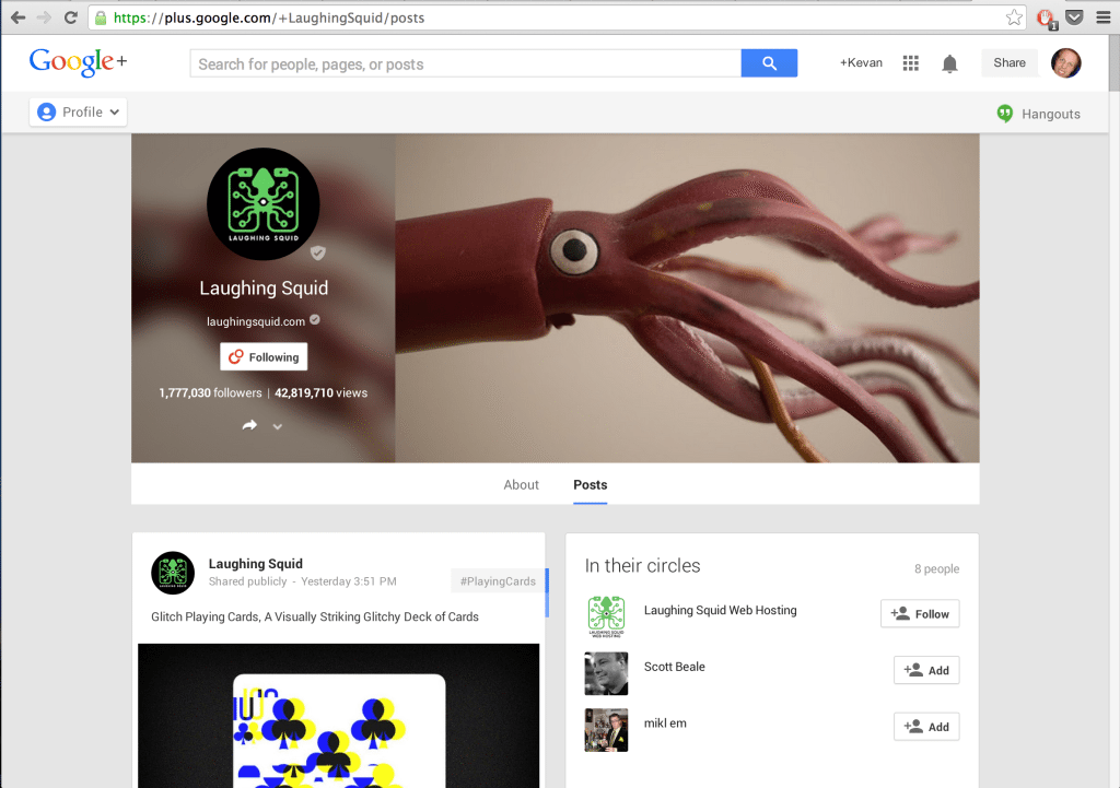
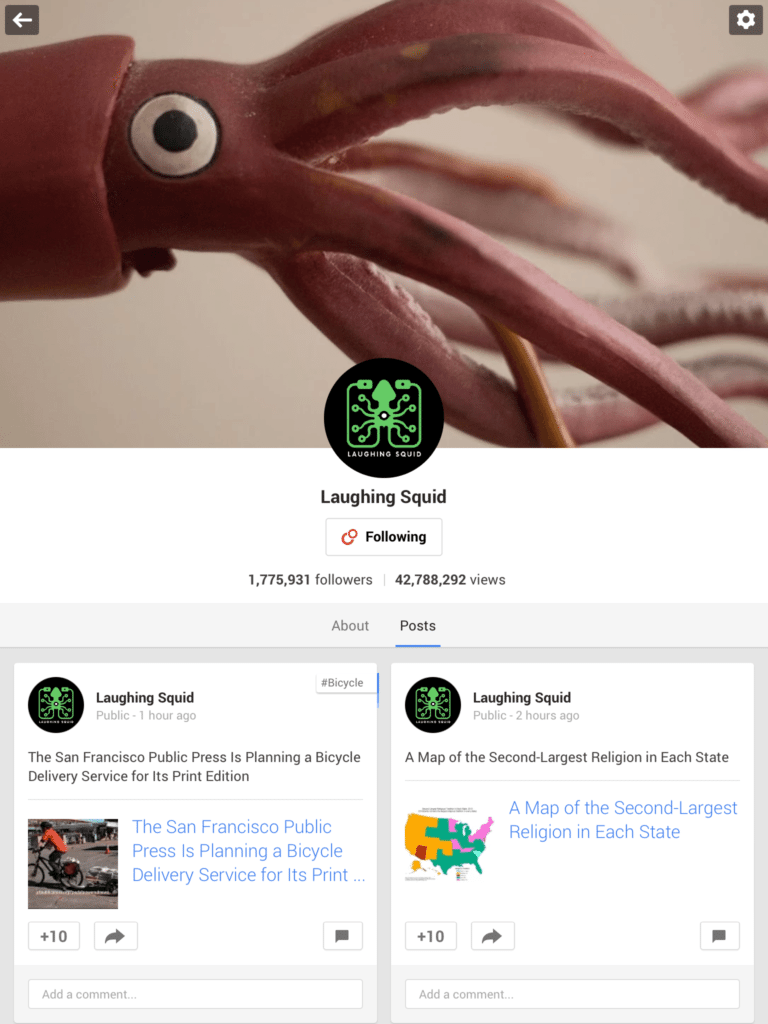
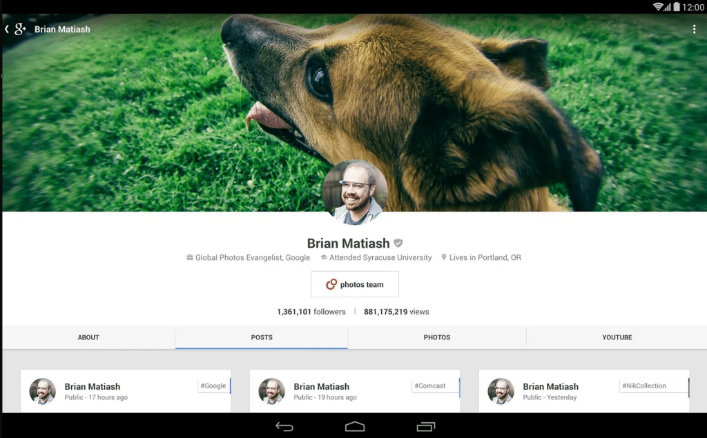
Mobile strategy for Google+: What’s different
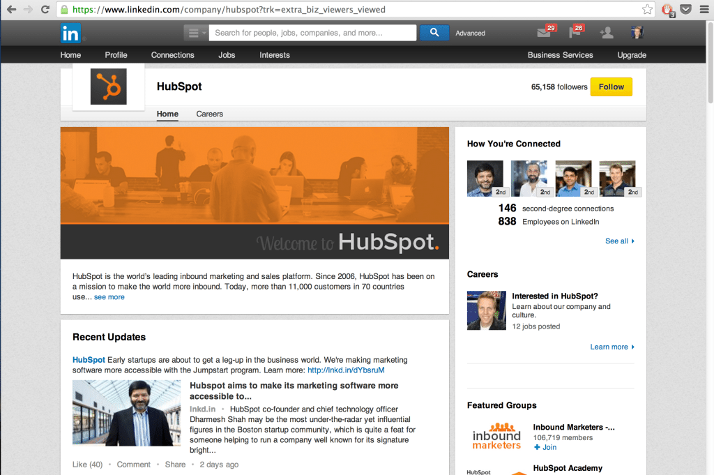
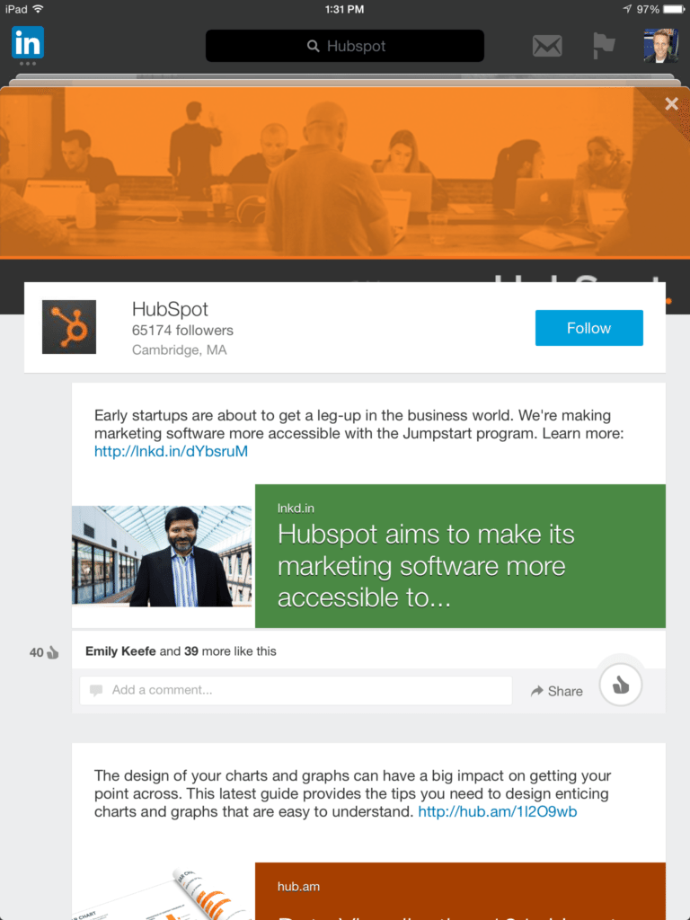
Mobile strategy for LinkedIn: What’s different

3 keys to a mobile social media strategy
Try Buffer for free
140,000+ small businesses like yours use Buffer to build their brand on social media every month
Get started nowRelated Articles

This article looks into social media benchmarks for various industries and platforms.

This simple shortcut will help you cross-post and schedule posts to Bluesky with your iPhone.

What should I work on next? This is a thought that pops up many times throughout the day while I’m working as the Social Media Manager at Buffer. I’ll check Twitter/X, Instagram, LinkedIn, and Threads to make sure I’m covering all my bases and spending time in the best way possible. And on the good days, I’m right in the groove where I know exactly what to do next and what are the most important tasks that need to get done. What really helps me is making a checklist for my social media activi