A Complete Guide to Visual Content: The Science, Tools and Strategy of Creating Killer Images


Former VP of Marketing @ Buffer
We love setting goals for improvement here at the Buffer blog, and one of our most recent challenges has been this: Every post gets an original image.
This might not sound like such a tall task until you consider that Courtney and I are journalism majors whose skills lie in painting pictures with words and not so much in painting pictures with Photoshop. We try our best, in the name of visual content.
You’ve perhaps heard of visual content? The term seems to be everywhere these days. We come across it all the time as we’re curating content, and it seems that social media strategies now consider visuals as required elements.
As visual content on social networks has grown, so too has the emphasis on storytelling with pictures. Indelible, craveable, relatable images have become a high currency in the world of content marketing, and the push for visual content seems to only be getting stronger.
So what are you to do with this new focus on visuals? I’m happy to share with you some of our favorite ideas, tips, and tools.
First off: Why visual content is so important
Here are some telling stats on just how big visual content has become and how it’s changing the way we all approach marketing.
Sixty-three percent of social media is made up of images. That means nearly two-thirds of the updates you see on social media are visual content, according to a Citrix report from January.
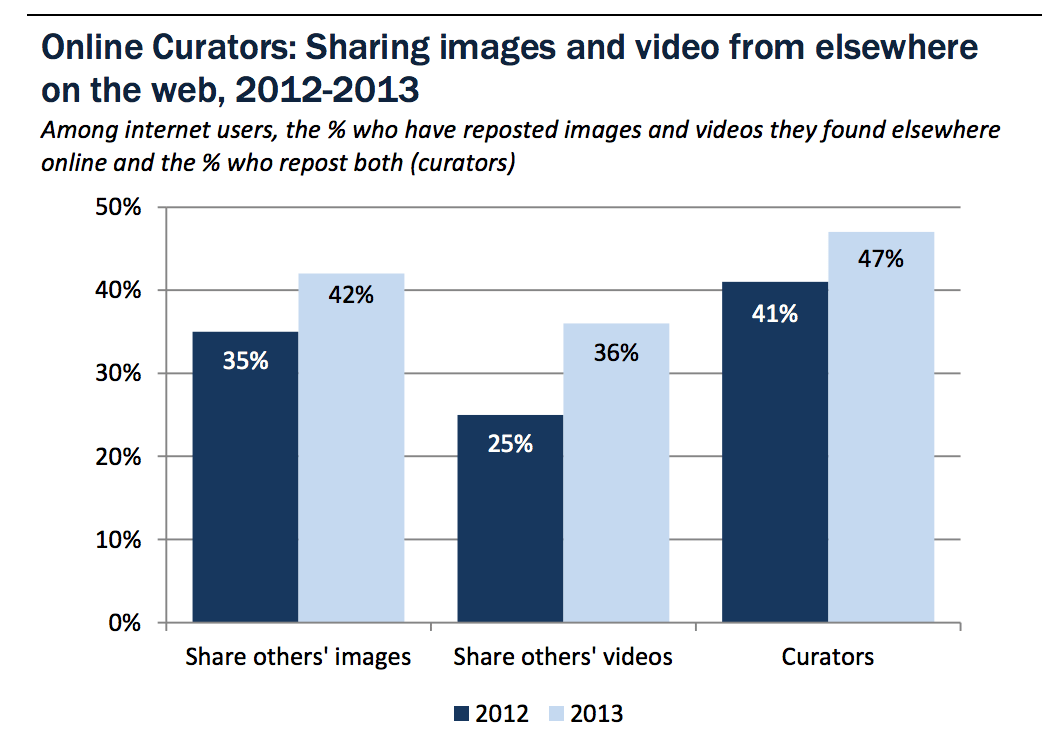
Nearly half of all Internet users have reposted a photo or video they have found online. An equally intriguing stat from the same 2013 Pew Research Study is that 54 percent of all Internet users have posted an original photo or video that they personally have created.
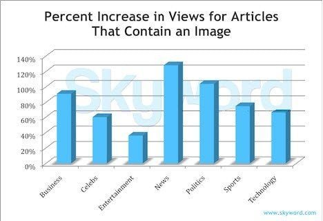
Content with relevant images gets 94 percent more views than content without. This oft-cited visual content stat is evidence that visuals have been vital to online success for some time. >The original study from content platform Skyword came out in 2011.
Ninety-four percent equates to almost double the views, and the boost is noticed across all topics and categories.
Tweets with images receive 150 percent more retweets. We ran the numbers on this ourselves, comparing tweets from our Buffer account to see exactly what difference images made. The results are striking! Retweets, replies, and clicks all benefit from images. We first ran this analysis back in November, and we continue to see these stats bear out in our tweets today.

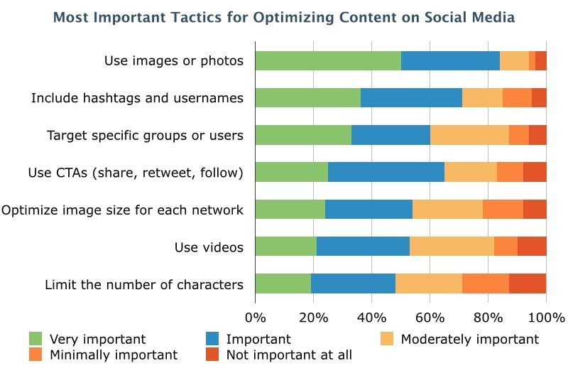
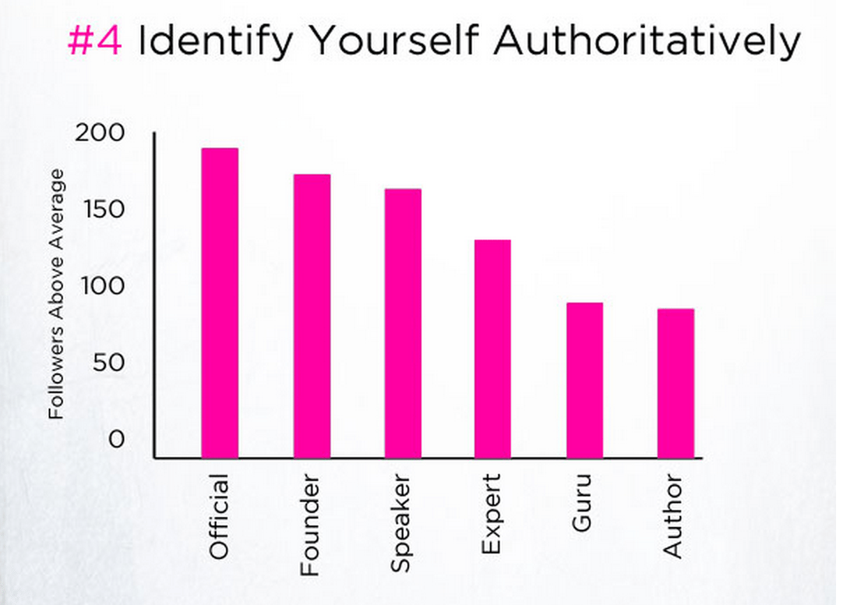
Images are the No. 1 most important factor in optimal social media content. This according to an ongoing research survey conducted by Software Advice and Adobe. More than 80 percent of survey respondents pointed to images being “Very Important” or “Important” for their marketing optimization on social. The runners up in terms of importance were hashtags and usernames.
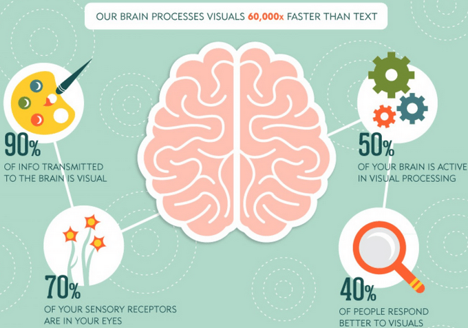
The brain processes visuals 60,000 times faster than it does text. We are wired to take in visual content faster and more effectively than we are words. Ninety percent of the information sent to our brains is visual; we’ve been trained to consume visual content as quickly as we can.
Here’s a great visual representation of this data from >the Optimal Targeting blog:
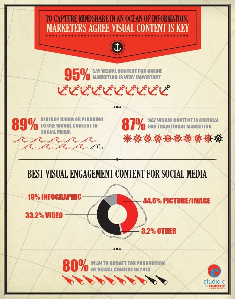
To recap, many of the big, important stats on visual content are summed up nicely in>this infographic from Matter’s Studio-C. The stats below paint a strong picture of how vital visuals are for marketers.
4 lessons on the psychology and science of visual content
We love breaking down topics into the origins of why something works (or doesn’t work), and these deep dives often lead us into psychology and science. I found the same to be true for visual content. There’s a lot of neat psychological and scientific explanations for why visuals can be so powerful and what goes into creating an awesome image. Here are four of my favorite learnings.
1. Visceral reactions to visual content
Have you ever fallen in love with a design but couldn’t explain why?
These visceral reactions are some of the strongest connections we can make to visual content. When we feel a visceral reaction, we are responding from the part of the brain responsible for survival instincts and fight-or-flight responses. The response is subconscious. It originates from the central nervous system whenever we’re stimulated by vital factors like food, shelter, danger, or reproduction. We might not be able to explain why we love a beautiful design because our conscious thought hasn’t yet caught up with our subconscious.
The trick with making visceral reactions work in visual content is being aware of the feelings that your images and video evoke. If you can elicit a survival-type response—pictures that hint at safety by showing a home or a field, for instance—you may be able to tap into a visceral reaction.
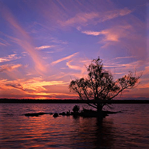
Here’s a photo that earned a visceral reaction from me, possibly due to the feeling of security with a key and the calming colors.

2. Rule of Thirds
The Rule of Thirds is a method for composing the elements of an image to be visually pleasing and to be in sync with the way our eyes prefer to scan an image. Photographers know the Rule of Thirds well; it is a foundational piece of photography.
The way it works is by dividing an image into a grid of thirds both horizontally and vertically. Basically, put a tic-tac-toe board on an image.
The tic-tac-toe board creates intersections of lines, and according to Rule of Thirds, these intersections are where the eye is most likely to be drawn.
The design lesson here is to place your key elements along these intersections. Avoid placing a key element right in the center.
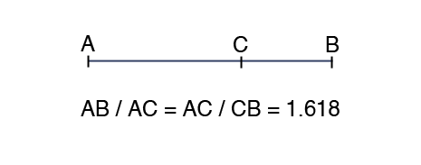
3. Golden Ratio
The Golden Ratio is where the ratio of a smaller segment to a larger segment is the same as the ratio of a larger segment to the sum of both. Confusing? It’s quite a bit easier to see this one explained in a graphic, like this one from Vanseo Design:
This ratio could appear in terms of width and height of an image or in the way that a blog page is composed with the main content and sidebar. (There’s even a handy tool for figuring out the Golden Ratio for web typography.)
For images, this ratio creates a Golden Rectangle. The Golden Rectangle, when you dissect it into smaller and smaller Golden Rectangles, forms a spiral shape that is often present in nature, architecture, and art.
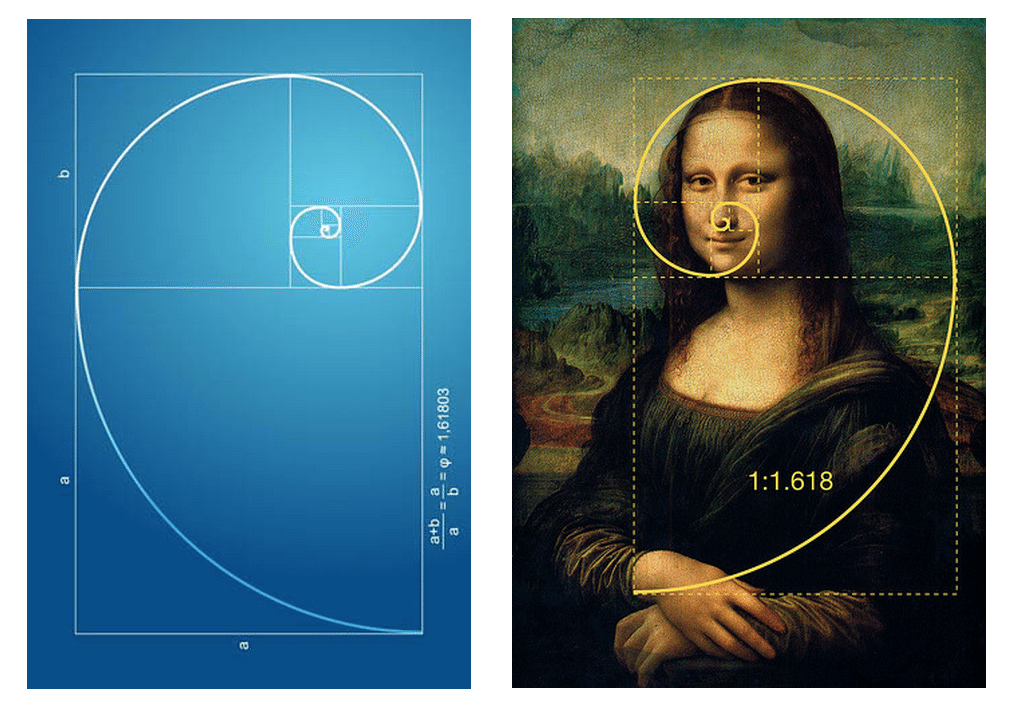
To find the Golden Ratio for an image you’re creating, you can apply a little algebra to the height and width. For example, if you know that the height of your image will be 400 pixels, you can multiply 400 x 1.618 to find the width: 647 pixels.
To check if your image is “golden,” you can divide the width by the height. Depending on how you divide, the golden answer will be either 1.618 or 0.618.
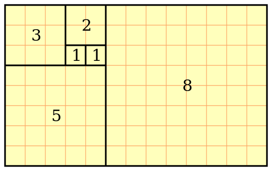
4. Fibonacci Sequence
The Fibonacci Sequence is a series of numbers where the next number in the series is the sum of the previous two numbers. Here’s how the sequence starts:
0, 1, 1, 2, 3, 5, 8, 13, 21, 34, 55, 89, 144 …
These numbers are found commonly in classical creative works and in nature, and they have a neat tie-in with the Golden Ratio. Dividing any number in the Fibonacci Sequence by the previous number will result in an approximation of the golden number 1.618—the basis for the Golden Ratio.
The grid below is shows the marriage between Golden Rectangles and Fibonacci Sequence numbers.
Ross Johnson of 3.7 Designs has a lot of neat tips on how science can inform design. Here’s his take on the Fibonacci Sequenece:
Patterns based on the sequence are intrinsically aesthetic and therefore should be used in the composition of our designs. This sequence can be used to create visual patterns, create shapes, organic figures, build grids or dictate sizing and ratios.
9 major types of visual content
What are we specifically talking about when we talk about visual content? I sometimes lose track of this myself. There will eventually be an end product to a visual content strategy. Here are the most common ways that marketers create visual content.
- Eye-catching, creative photography — think stock photos or Instagram pics
- Video — YouTube, Vimeo, or Wistia embedded right into a post or shared directly to social media
- Screenshots — helpful images of your product or workflow
- Infographics — visual information, either super long and meaty or bite-sized and informative
- Data visualization — standalone charts and graphs (example)
- Comics — relevant comic strips or cartoons (example)
- Memes — popular memes customized to fit the context of your post or update (example)
- Visual note-taking — casually-designed layout of ideas, typically text-heavy (example)
- Miscellaneous graphics — images that complement the content, e.g. the images in the above section on Golden Ratio and Fibonacci Sequence
While thinking about the ways to fulfill a visual content strategy, you’ll also want to beware some of the common pitfalls of visual content. Kathryn Aragon does a great job summarizing the trouble spots to an unfocused visual strategy.
Images should not be:
Inserted willy-nilly, just to have an image.
Trite or overused stock photos.
Thought of only as share-bait.
Boring or irrelevant.
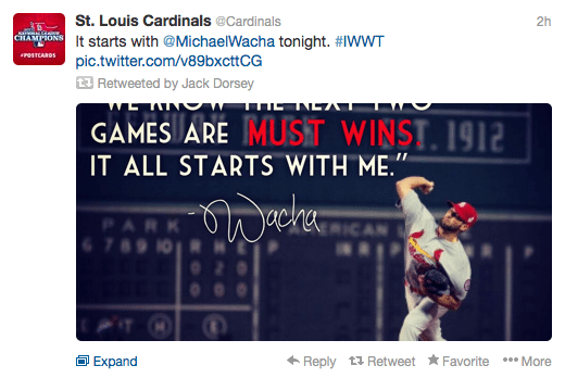
It may also be helpful to keep in mind how your visual content will be displayed across various social networks. Take Twitter’s inline images for instance. The default viewable portion of an inline image is 440 pixels wide by 220 pixels tall. Images outside this 2:1 ratio will risk getting cropped at inopportune places, like this example the St. Louis Cardinals’ timeline.
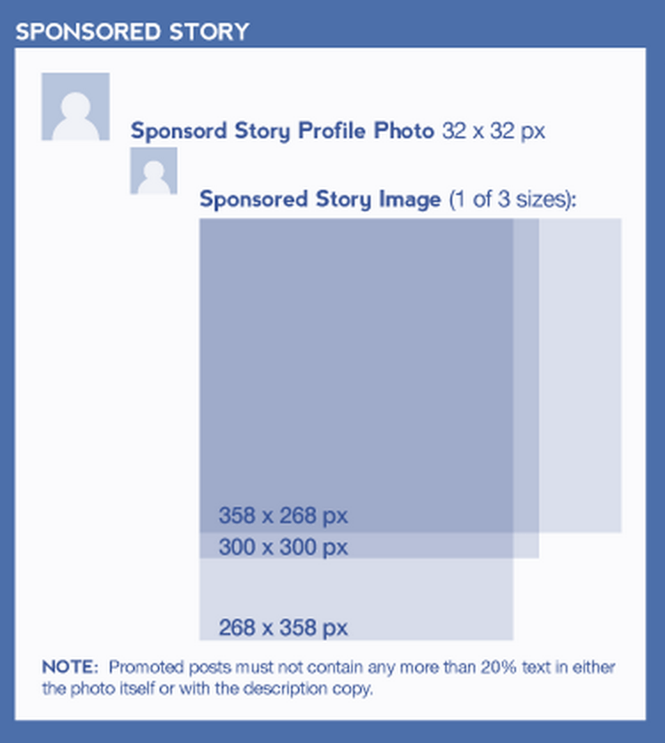
Media Bistro has a great collection of all the sizes you need to know for visuals on all the major networks: Twitter, Facebook, Google+, LinkedIn, Pinterest, Instagram, and YouTube. Here’s a peek at what they suggest for a Facebook sponsored post. (Click through for a complete view of all the helpful image dimensions for all networks.)
6 best tools for creating visual content
Canva
As a non-designer, I am quite dependent on the amazing tools at Canva to get a lot of my design work done. The setup with Canva is super easy. You can choose from a number of premade templates or design your own from scratch. The drag-and-drop interface makes it quite intuitive to add different elements, and each of the elements has advanced options for editing as well.
One of my favorite features is that the elements align to grids automatically. You can line up a series of elements with relative ease.
Bonus tip: For super fast image adjustments like cropping or scaling, I’ve found BeFunky to be an indispensable tool. You can upload, edit, and save an image without even signing in.
PowerPoint
A go-to tool for many amateur designers is presentation software like PowerPoint. If you think of slides as images, it’s easy to see how this tool could be useful for building out visual content. You can set images as backgrounds, add text and typography, and place icons and graphics.
When you save in PowerPoint, choose to save as an image, and you’ll be set.
Bonus tip: For a cloud version of PowerPoint, you might be interested to try Google’s Presentation tool found in Google Drive.
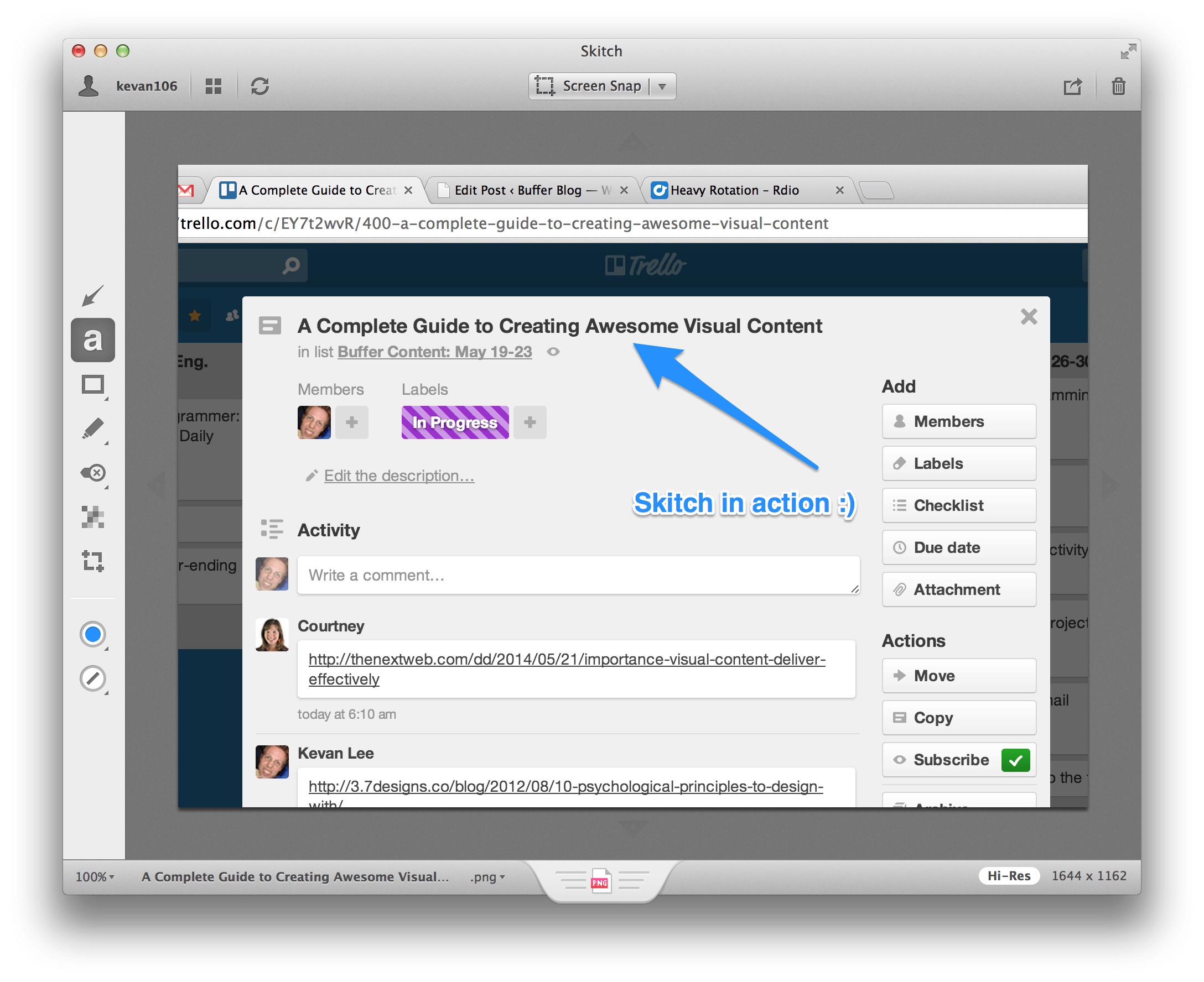
Skitch
Screenshots are perhaps the easiest way of adding visual content, provided you have a reliable screenshot tool. We use Skitch, a product of Evernote, for our screengrabs. Skitch has some helpful annotation features that look good and are easy to implement.
Bonus tip: If you’d rather run things lean, you can use keyboard shortcuts to do simple screengrabs:
- Windows: Print Screen places a screengrab onto your clipboard
- Windows: Print Screen+Windows key saves a screengrab into a photo folder
- Mac: Command+Shift+4 lets you choose the area you’d like to grab for your screenshot
- Mac: The above command followed by Spacebar lets you take a screenshot of an active window
Photoshop
Of course I couldn’t help but mention the most popular image creation tool out there: Photoshop. If you have the time, skills, and resources to use Photoshop for your visual content, then you’re likely to find a lot of helpful features and tools to building pretty much anything you could want.
Bonus tip: If you’re after a free version, you might want to try Gimp, which has a lot of similar features and tools but is completely free.
Infogr.am
If you’re interested in creating infographics or interactive visual content
Place It
With Place It, you can create some really striking visuals for promotional content of new tools and services. You can add your product’s screenshots right into awesome-looking stock photos and even interactive backgrounds. Here’s what the Buffer Blog would look like when added to a Place It graphic:
Tips on making visual content that people will love
I’ve come to rely on a lot of little tips for making visual content for Buffer blog posts. It’s great to have a few tricks in your pocket when it comes to design. Here are a few of my favorites.
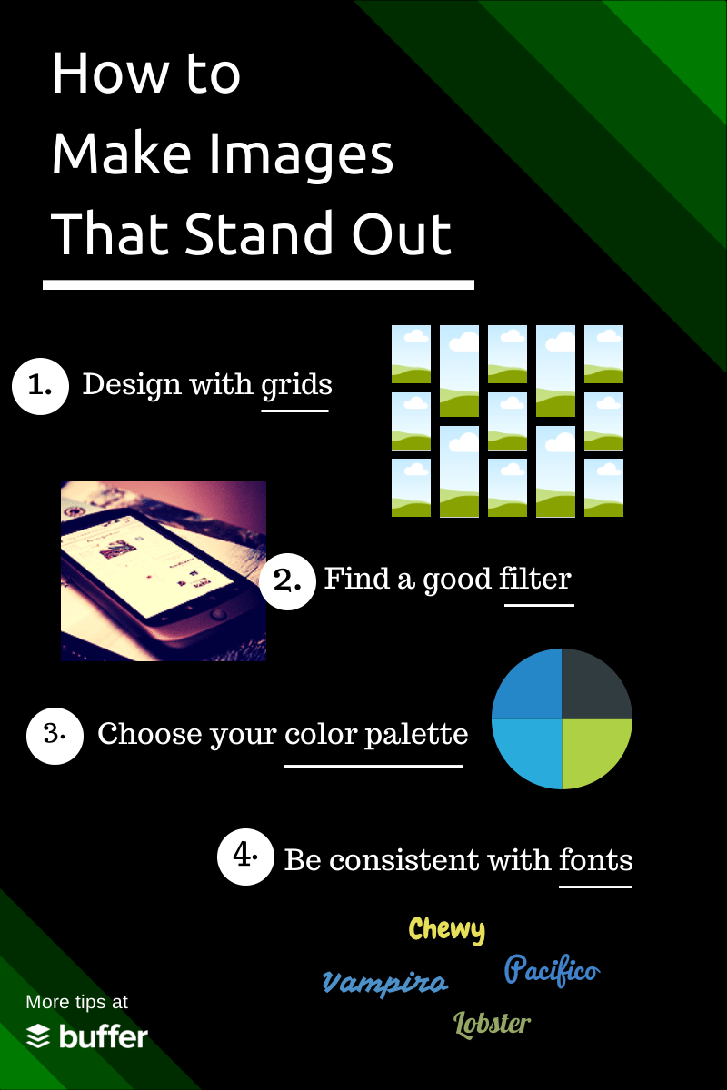
Design with grids
The Rule of Thirds highlights the importance of grids when it comes to framing a photo. Grids can also play a big role in creating images that look great. In this sense, you could look at creating a collage with many images in a grid or placing a frame around a photo. Grid techniques give order and professionalism to your images.

Bonus tip: It’s much easier to overlay text onto a grid of images. The text really pops when it rests on top of solid lines.
Find a good photo filter and use it consistently
Why might a filter come in handy? When you’re pulling images from a wide variety of sources for your blog, filters can provide a sense of consistency across the visuals. A consistent filter could even make your posts more recognizable in social media, which becomes especially important as timelines fill with visuals.
Take a look at the following two pictures, before filter and after filter:
Before:

After:

Set a color palette and determine your brand fonts
If your brand doesn’t have a set palette of colors or two to three go-to fonts, then now might be the time to find some. Consider how the colors and fonts that you choose portray your brand. One thing to keep in mind might be the psychology of color: Colors trigger different feelings for us. This image>from PowerText shows how different colors (and different logos) tend to make us feel.
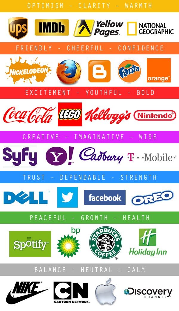
Bonus tip: When you’re designing with color, keep in mind the concept of semantic resonance. This basically means that, when possible, use colors that fit the topic you’re talking about. In infographics, this would mean displaying data about Google+ with a red bar and data about Twitter with light blue.
Choose a striking stock photo
We’ve come across a huge number of free stock photo sites in our search for visuals for the blog. It’s often difficult to decide what exactly makes for a good photo. When we’re searching at Buffer, we tend to think abstract: If we’re doing a post on Facebook followers, we might try a search for “lines” or “queues” rather than a search for the Facebook logo. When choosing the right picture, you can keep in mind many of the lessons relayed from the psychology and science of visuals: Search for visceral reactions, go with bright bold colors, look for the Rule of Thirds and the Golden Ratio.
Bonus tip: Social media agency Laundry Service found that Instagram photos make for more effective advertising imagery than stock photos. Might be worth experimenting with for your next campaign.
Build a helpful, humorous infographic
Writing on the Harvard Business Review blog, Gareth Cook of The Best American Infographics mentioned a few key areas of the most successful infographics. Cook believes that the key is to distill lots of information into an easy-to-read, intuitive layout:
Give people a sense of all the data that’s out there, and enough context, without overwhelming them.
And being humorous doesn’t hurt either. Some of his favorite infographics are heavy on the whimsy. Here’s an example:
What is most important for you when creating visual content?
As we’ve pushed forward with visual content for the Buffer blog, we’ve learned a lot and continue to experiment with new tips and tools. We’d love to hear what you’ve discovered, too!
What types of visual content do you most enjoy? Which are the ones that work best for you? It’d be awesome to hear your thoughts on the topic. Share any and all ideas here in the comments.
P.S. If you liked this post, you might enjoy our Buffer Blog newsletter. Receive each new post delivered right to your inbox, plus our can’t-miss weekly email of the Internet’s best reads. Sign up here.
Image credits: Dave Chapman, 3.7 Designs, Pew, >Skyword, The Next Web, Vanseo Design, Hong Kiat, Dan Farrelly, Wikipedia, PowerText, Chang-JJ, Mighty Hive, Death to the Stock Photo.
Try Buffer for free
140,000+ small businesses like yours use Buffer to build their brand on social media every month
Get started nowRelated Articles

Sending ads by mail may seem like a thing of the past, but this marketer thinks it’s a surprisingly effective approach for e-commerce brands.
Learn how to leverage AI social media content creation tools and save valuable time in your social media marketing efforts.

With the newsletters on this list, you'll be able to stay on top of all developments in social media and learn from amazing experts