The Always-Updated Guide to Social Media Logos

Former Head of Content at Buffer
Keeping up to date with the latest social media logos can be a challenge. And even once you’ve found the correct logos it can also take some time to understand the brand guidelines:
- How much spacing should be around the logo?
- What colors should I use?
- What size should be it be? etc,
To help you save time, we put together this resource to keep you updated on the latest social media logos. Alongside the most recent logos for Facebook, Twitter, YouTube and more, we’ve also included the key guidelines for the usage of each logo as well.
Let’s get started!
Social Media Logos
Below is a guide to the logos and brand guidelines for many of the most popular social media platforms out there. We’ll do our best to keep this post updated and ensure it always contains the most current version of each logo (including vector images of each logo).
Try Buffer for free
140,000+ small businesses like yours use Buffer to build their brand on social media every month
Get started nowLooking for a particular social platform? Try clicking one of these categories below:
Facebook | Twitter | Snapchat | Instagram | Medium | Pinterest | Google+ | LinkedIn | Vine | YouTube
Facebook Logo & Guidelines
The “f” logo is one of Facebook’s most important visual and identity assets and it has changed slightly over the years.
The current logo features the trademark ‘f’ in white on a blue tile.
Logo
Guidelines
Only use the ‘f’ logo to refer to:
- Your presence on Facebook, such as your Page, timeline, group, app or event
- Your implementation of Facebook on your website
- Your product’s integration with Facebook, such as ‘For use with Facebook’
- Content that originates from Facebook
Proportions
The proportions and spacing of the “f” logo should never be altered for any reason.
Pro tip: Hold the “Shift” key in most software programs to maintain the proportions while scaling up or down.
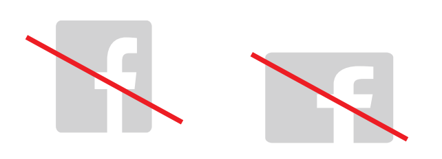
Incorrect use
To ensure accurate and consistent use, Facebook advises never to alter, rotate, embellish or attempt to recreate the “f” logo. The rounded box shape should also never be altered embellished.
Full Facebook brand guidelines and assets >
Instagram Logos & Guidelines
Instagram has a singular focus on captivating imagery and nothing symbolizes this focus more so than their logo.
Logos
Instagram has two main logos, the black and white logo and the App Icon.
The black and white Instagram logo should be used whenever you refer to your presence on Instagram. The App Icon should only be used if you are showing it on a device with other apps or if you are encouraging people to download the Instagram app.
- The Multi-color camera logo shouldn’t be altered in any way. However, the black and white Instagram logo can be used in any color, as long as all other aspects of its design stay the same.
- Unless the glyph or camera logo will appear in a list of other social media logos, a clear call to action (e.g. “Follow us on Instagram”) should accompany the logo.
Transparent Instagram logo
When you’re creating content, it’s super helpful to have a transparent Instagram logo to use in your designs and assets.
You can download a transparent Instagram logo here →
Instagram logo vector
An Instagram vector logo will help your designs in two key ways: scalability and flexibility. Jpg and Png images aren’t too scalable, but a vector image can be resized to fit your specific needs.
You can download an Instagram logo vector here →
For more: Check the full Instagram brand guidelines and assets →
Twitter Logos & Guidelines
The Twitter bird is instantly recognizable. However, it has been through quite a few transitions since Twitter first launched in 2006.
The current Twitter logo features the bird with its head angled upwards.
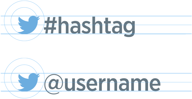
Logo
The minimum size of the logo should be 16 pixels, and the empty space around the logo should be at least 150% the size of the logo itself. For example, if you’re adding the Twitter logo to hashtag or username, it should have the correct 150% spacing:
Guidelines
Twitter asks that people refrain from using the marks in a manner that suggests sponsorship or endorsement by Twitter, or confuse Twitter with another brand. Alongside these points Twitter also share a few more guidelines when it comes to using their branding:
Don’t:
- Use speech bubbles or words around the logo
- Rotate or change the direction of the logo
- Animate the logo
- Surround the logo with other birds or creatures
- Change the color of the logo
- Anthropomorphize the logo
- Add special effects to the logo
- Use older versions of the logo, previous logos, or any marks that may be confused with the brand
To support its logo mark, Twitter primarily use the Gotham font family.
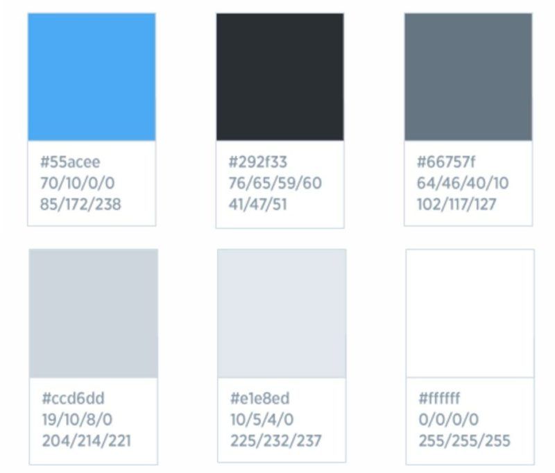
Twitter brand colors
Full Twitter brand guidelines and assets >
Snapchat Logo & Guidelines
Snapchat’s ‘Ghostface Chillah’ logomark has become extremely famous and instantly recognisable as the platform has gone from strength to strength over the past few years.
Logo
Logomark
The logomark is Snapchat’s primary choice of identifying its presence.

Ghost mark
Another option to signify the presence of Snapchat is through the Ghost Mark.

Guidelines
When using Snapchat’s branding it’s important that no other logos or elements infringe the space around it. Clearspace around the logomark should always be equivalent to 1/3 of the width of the logomark.
The minimum size the logomark may be used for print applications is .4” (10mm) wide and for digital applications, the minimum size is 45 pixels wide.
Snapchat brand color
Snapchat’s logotype should always contrast with the background. The official yellow colours used by Snapchat is:
- Hex: #FFFC00
- CMYK: 0/0/100/0
- RGB: 255/252/0
- PMS: Pantone Yellow U
Full Snapchat brand guidelines and assets >
Medium Logos & Guidelines
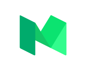
The standard version of the Medium logo, which should be used in most instances, is rendered in four tints of green, progressing from dark to light, left to right.
Logo
Standard version
Grayscale and one-color versions
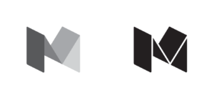
The grayscale version of Medium’s logo should be used less often than the standard green version, in smaller or more discrete contexts. The one-color version of the logo should only be used at small scale (i.e., less than ~50px.), and it should only appear as a single solid color.
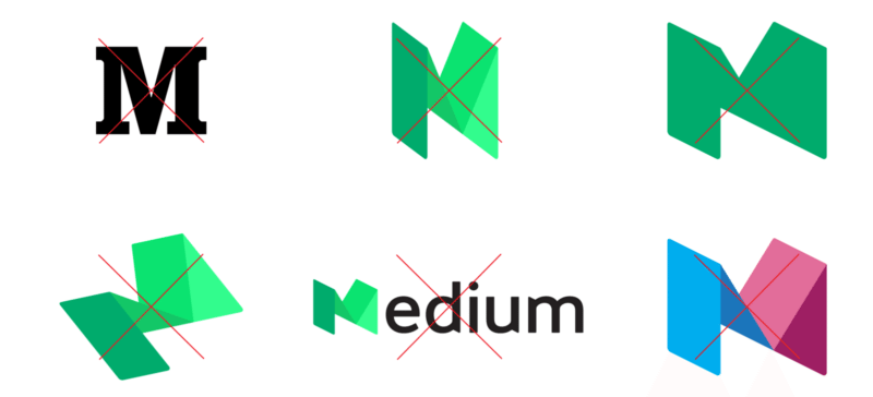
Guidelines
Don’t:
- Use the old logo.
- Alter the colors of the logo, or add additional colors.
- Crop, stretch, modify, or change the orientation.
- Use the logo in confusing or conceptual ways.
- Spell Medium by adding “edium” to the right side of the logo.
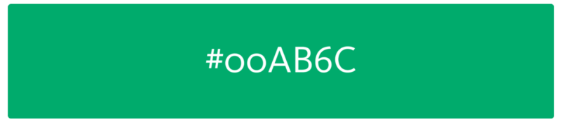
Medium brand color
The “Medium green” is represented as #00AB6C, which matches the leftmost color panel in the standard green logo.
Full Medium brand guidelines and assets >
Pinterest Logo & Guidelines
The Pinterest badge is a red circle and white scripted P outlined in white. The Pinterest wordmark shouldn’t be used or reproduced in any material.
Logo
Guidelines
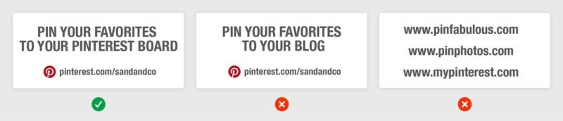
When it comes to using Pinterest’s badge branding, they ask that:
You only using the Pinterest badge (not the wordmark)
The badge appears before a call to action and the copy includes your Pinterest URL
The height of the badge appears proportionate to the CTA copy
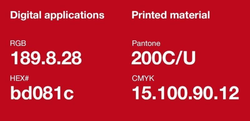
Pinterest brand color
Pinterest’s badge logo should always be reproduced in the Pinterest red:
Full Pinterest brand guidelines and assets >
Google+ Logo & Guidelines
The Google+ logo has been through many transitions since the platform launched. The current official Google+ logo is a capital ‘G+’ with a red background.
Logo

Guidelines
Google prefers that you do not change or remake the icon in any way. However, if you display multiple third-party social icons together on your app, you can customize the Google+ icon to match your app’s style provided that all buttons are customized using a similar style:
- Same color and visual treatment.
- Same shape and size.
If you do edit the logo, you must not change the font of the “g” or the position of the “+” symbol in the icon and the aspect ratio must be preserved. The “g+” must always be centered in the icon.
Full Google+ brand guidelines and assets >
LinkedIn Logos & Guidelines
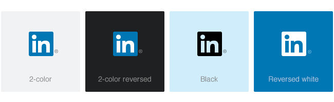
The LinkedIn logo uses three colors: LinkedIn Blue, black, and white. Primarily the logo should be used on a white background for maximum impact and clarity.Logo
The logo comes in four variations. In cases where the 2-color logo or [in] is not appropriate, the following versions are available for use:
The same variations are available for the [in] mark as well:
Guidelines
The LinkedIn logo should be surrounded by clear space 2x the side of the width of the ‘i’ in the logo. For example:
The minimum size of our logo and [in] is 21px on screen, or 0.25in (6.35mm) in print, measured by the height of the [in].
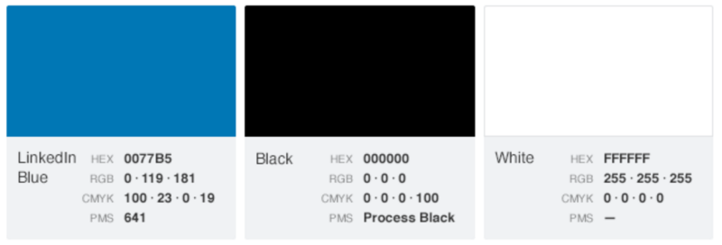
LinkedIn brand colors
LinkedIn primarily use three colors: LinkedIn Blue, black, and white:
Full LinkedIn brand guidelines and assets >
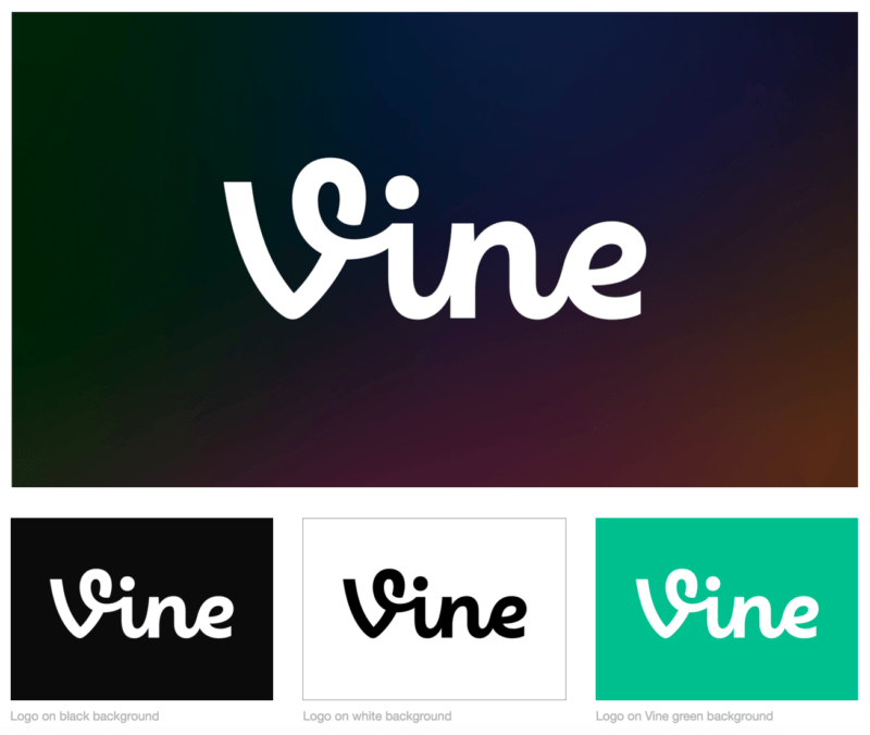
Vine Logos & Guidelines
The Vine logo is always presented in monochromatic formats and whenever possible, the logo should be presented as white on a dark background.
Logo
Guidelines
The minimum clear space is defined by half the height of the Vine logo and the minimum height of the Vine logo is 32px, measured from the top-most point of the V to the baseline.
Vine also request that:
- The Vine logo is not placed in a container shape
- No additional visual effects to the Vine logo
- You make sure you’re using the most up-to-date assets
- No green other than #00bf8f should be used
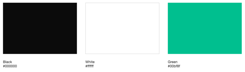
Vine brand colors
The Vine brand is represented by three primary colors: black, white, and Vine green.
Full Vine brand guidelines and assets >
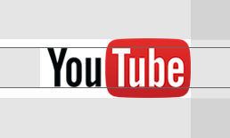
YouTube Logo & Guidelines
The YouTube logo has been pretty consistent since its launch. The logo features black and white text over a red television shaped block.
Logo
Guidelines
The YouTube logo should never appear smaller than 25px in height. And it should always have the minimum area of clear space around the logo, to work out the minimum clear space take the cap height as a base.
Minimum size:

Clear space:
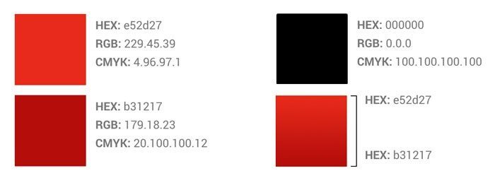
YouTube brand colors
The YouTube full-colour dimensional logo is made from the colors below:
Full YouTube brand guidelines and assets >
Over to you
Thanks for reading! I hope you found this resource useful.
Are there any other social media logos and brand guidelines you’d like us to add? Let us know in the comments below.
Related Articles

We've rounded up 26 free Instagram tools for creators, marketers, and small businesses

Everything you need to know about selling on Instagram — from the different options for people to buy to tips on making the most of your Instagram sales strategy.

Tried and tested: These AI image generators consistently delivered the best results. Here's a look at how they work, how much they cost, and how they handled a specific prompt.