
 Publish
 Analyze
 Engage
 Start Page
 AI Assistant
 Facebook
 Google Business
Profile
Google Business
Profile Instagram
 LinkedIn
 Mastodon
 Pinterest
 Shopify
 TikTok
 Twitter
 YouTube

When I first started out in marketing, I didn’t quite predict that I’d be a part-time designer, too.
Now, in 201, visual content is more than 40X more likely to get shared on social media than other types of content and it’s become obvious and even necessary for all of us marketers to have at least some basic knowledge of key design terms.
Thankfully, we live in a wonderful world where anyone can make the jump from novice to intermediate and create well-designed images for social media. There are tools like Pablo and Canva that make this design work achievable (and beautiful).
However, tools aside, if you want to take your marketing skills to the next level, improving your understanding of design is essential.
Have you ever wondered what might be possible with just a little extra design knowledge in your back pocket?
Turns out, to take your social media images from good to great, is a reasonable leap. And it all starts with a good foundation and understanding of some key design terms and principles.
If you’re looking to take your social media images to the next level and become a better marketer, check out this design dictionary for a crash course on how to better understand design.
—
52 design terms explained for marketers
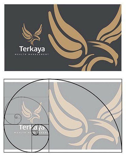
1. Golden ratio
The golden ratio occurs with two objects which, once you divide the larger by the smaller, result in the number 1.6180 (or thereabouts). The most famous golden ratio is the golden rectangle, which can be split into a perfect square and a rectangle the same aspect ratio as the original rectangle. You might see this in image composition or website design and grid layout.
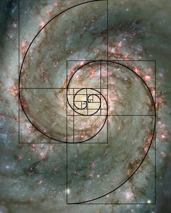
(via)
By using the golden ratio you can ensure your images are eye-catching and beautifully formatted. Here’s an example of the golden ratio being used to divide space between the body of a website and the sidebar:
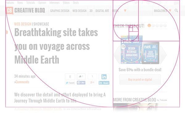
Below is another example where the key elements of the design all fit within a different section of the Golden Ratio:
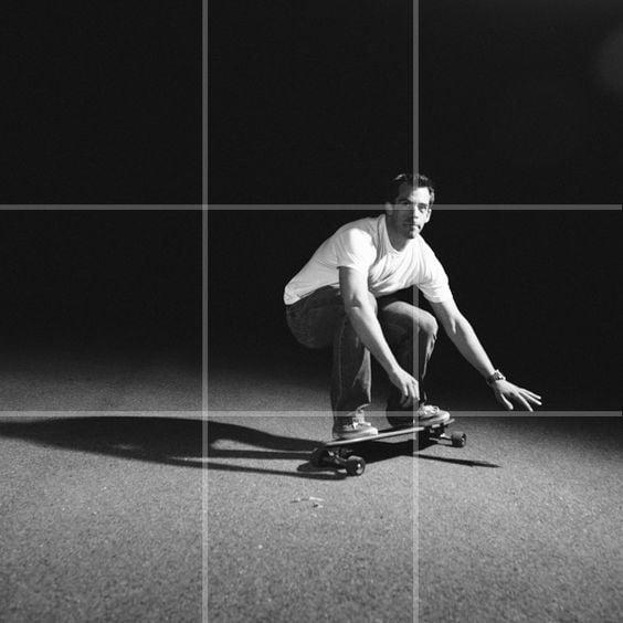
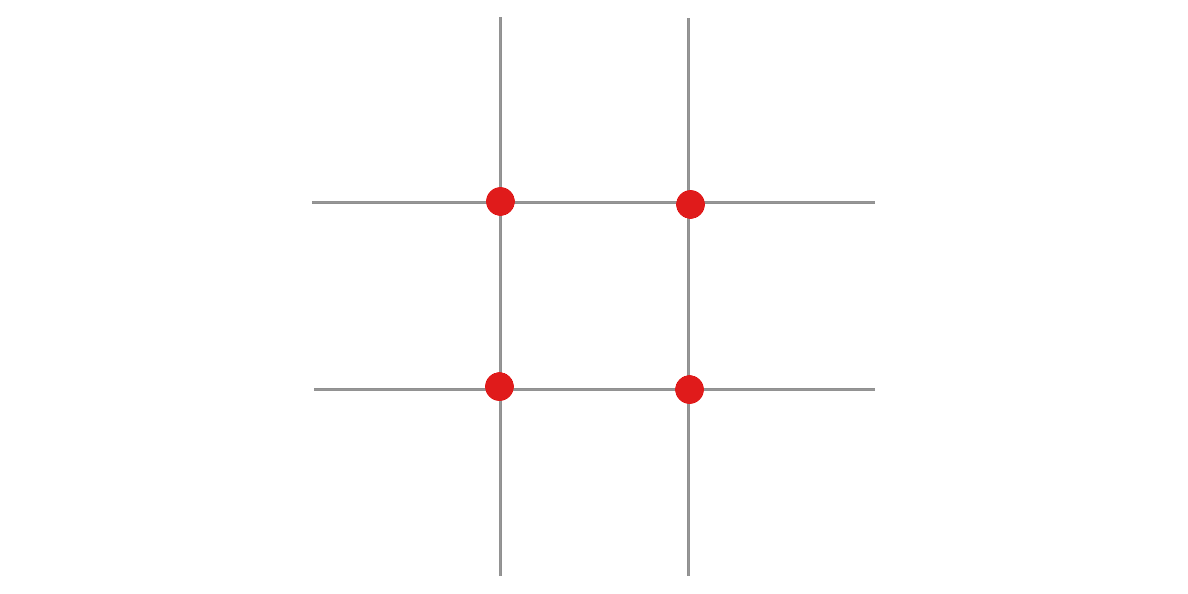
2. Rule of thirds
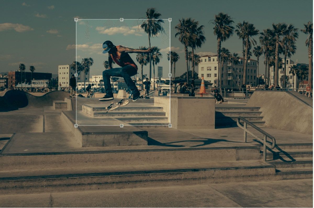
You can apply the rule of thirds by imagining a 3×3 grid lying on top of your image and then aligning the subject of the image with the guide lines and their intersection points (e.g. placing the horizon on the top or bottom line) or allowing the elements of the picture to easily flow from section to section.
(via)
Once you have your grid in place, the spots where the lines intersect each other indicate the prime focal areas within your design:

Typography, text, and font terms
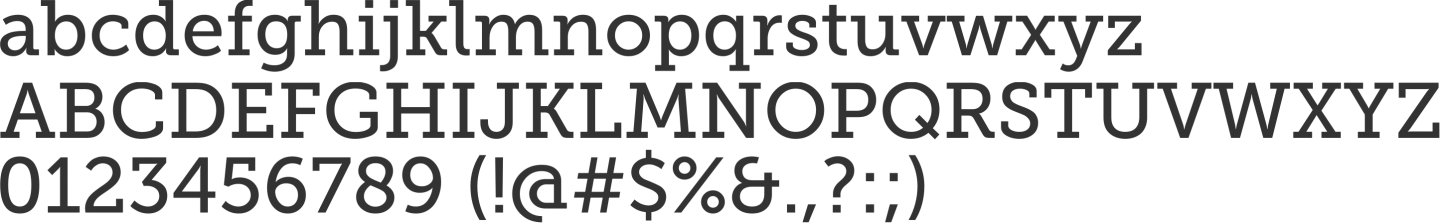
3. Typography
“Typography is the visual component of the written word,” Practical Typography beautifully explains. All visually displayed text, whether on paper, screen or billboard, involves typography.
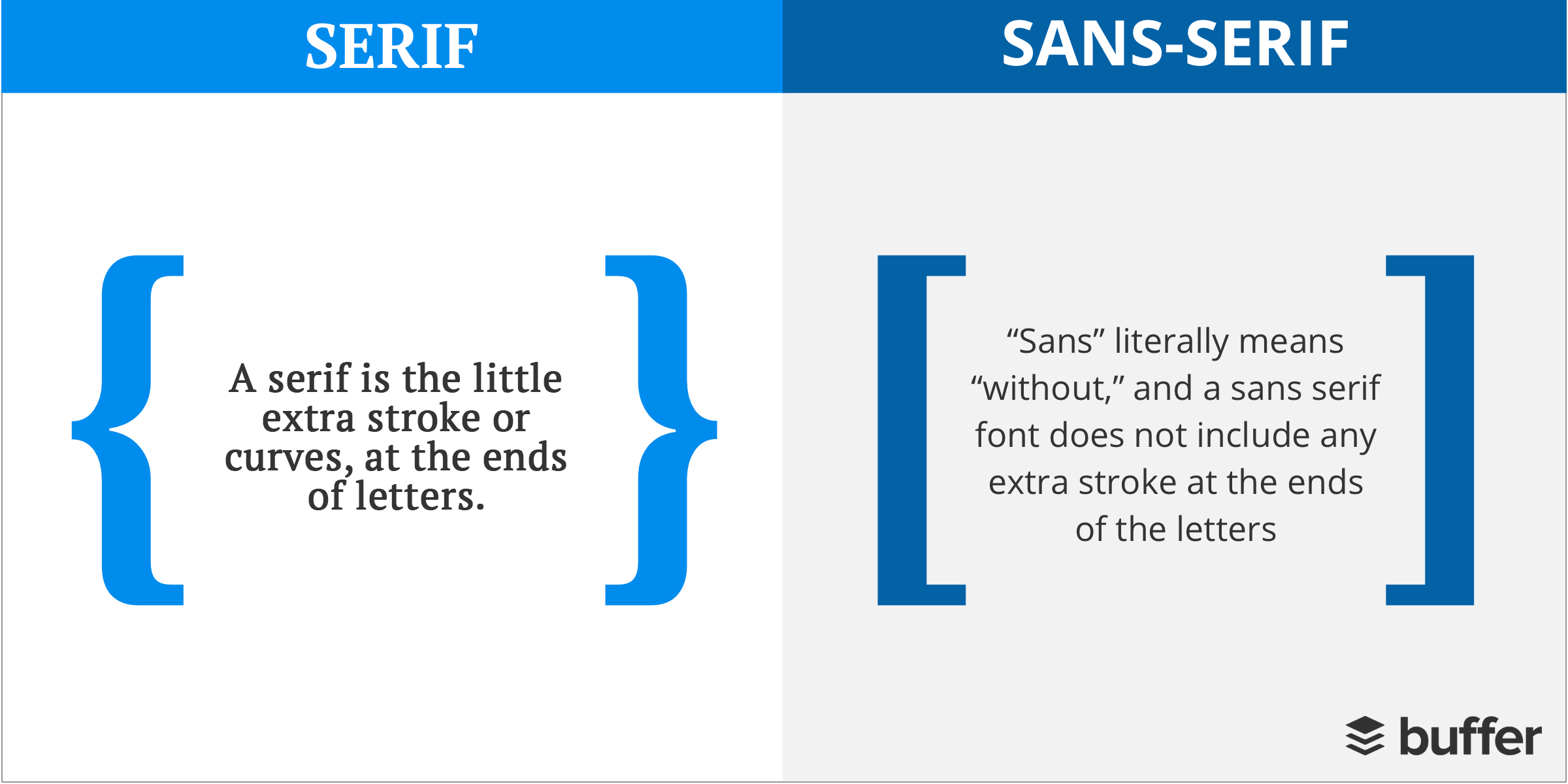
4. Serif
A serif is the little extra stroke or curves, at the ends of letters.
5. Sans-serif
“Sans” literally means “without”, and a sans serif font does not include any extra stroke at the ends of the letters.
Though there are no set rules for when to use a serif or sans serif font, it’s suggested that sans serif fonts should be used for online body text and serif fonts for headlines and print.
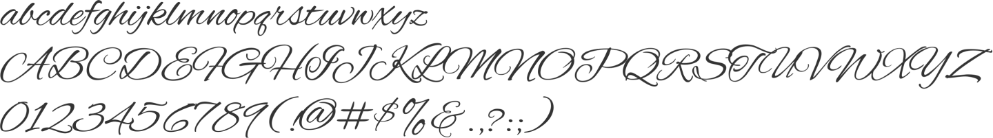
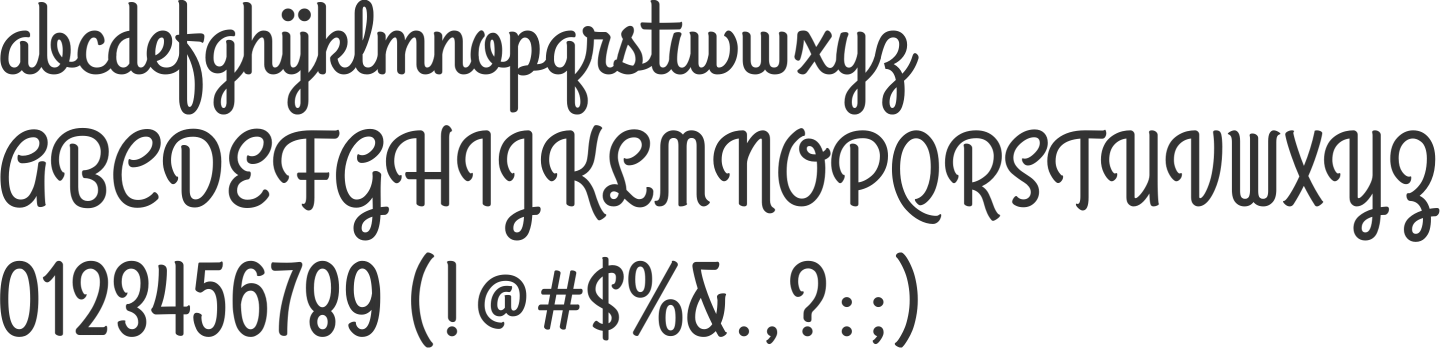
6. Script
Script typefaces are fonts or type based upon historical or modern handwriting styles and are more fluid than traditional typefaces.
A couple of example script fonts include:
And, Grand Hotel:
7. Slab serif
Slab serif fonts feature geometric feel than traditional serif fonts and feature serifs that square and larger, bolder.
An excellent example of a slab serif font is Museo Slab:
8. Monospace
A monospaced font, (also known as a fixed-pitch, fixed-width, or non-proportional font) is a font whose letters and characters each occupies the same amount of horizontal space.
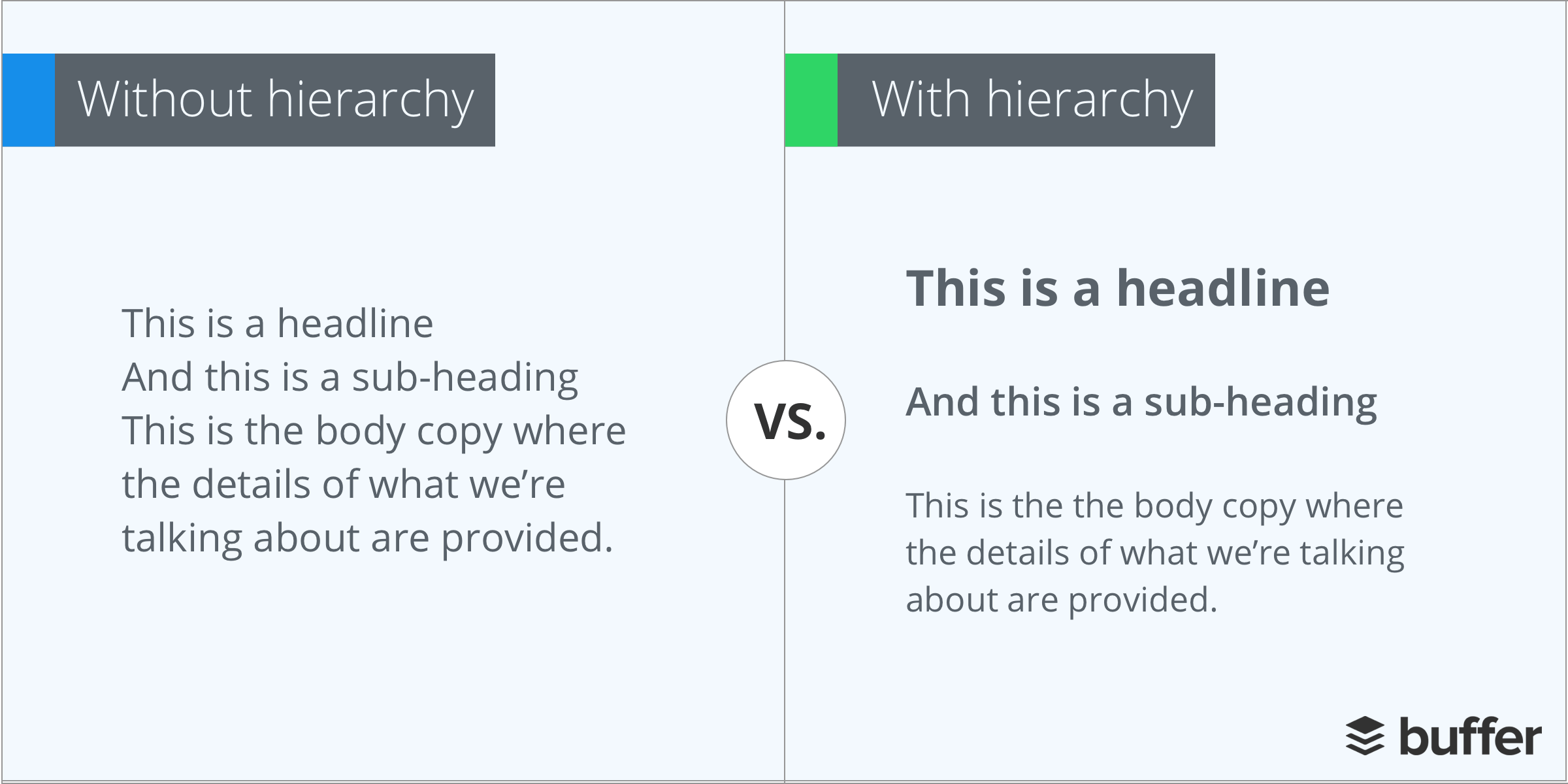
9. Hierarchy
Typographic hierarchy is an essential part of any design or layout and even if you’re not familiar with the term, you’ll be sure to have seen hierarchy in action on any website, newspaper or magazine.
Typographic hierarchy is a system for organizing type that establishes an order of importance within the data, allowing the reader to easily find what they are looking for and navigate the content. It helps guide the reader’s eye to where a section begins and ends, whilst enabling the user to isolate certain information based on the consistent use of style throughout a body of text.
Here’s an example to illustrate the importance of hierarchy:
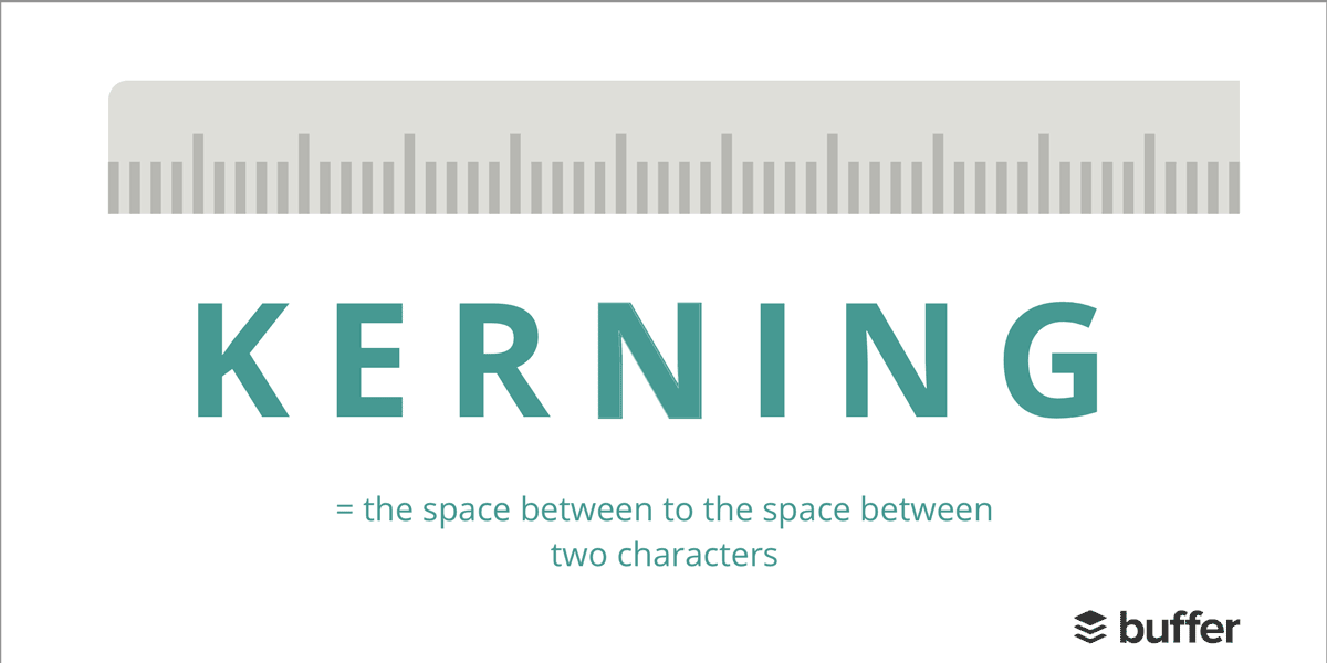
10. Kerning
Kerning refers to the space between two specific letters (or other characters: numbers, punctuation, etc.) and the process of adjusting that space improves legibility.
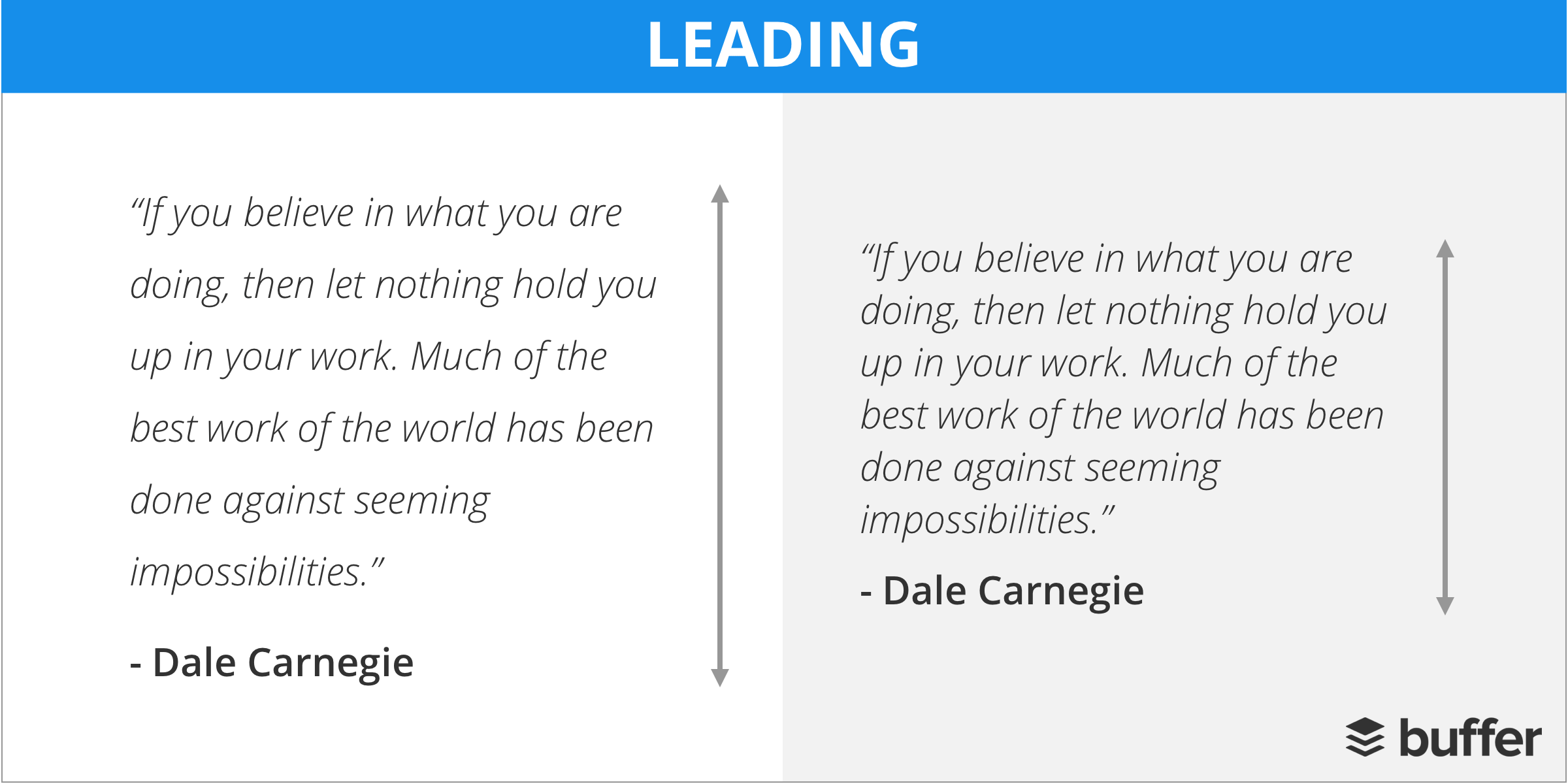
11. Leading
Leading determines how text is spaced vertically in lines. Leading is used when content that has multiple lines of readable text and ensures the distance from the bottom of the words above to the top of the words below has appropriate spacing to make them legible.
12. Tracking
Tracking is similar to kerning in that it refers to the spacing between letters or characters. However, instead of focusing on the spacing between individual letters (kerning), tracking measures space between groups of letters.
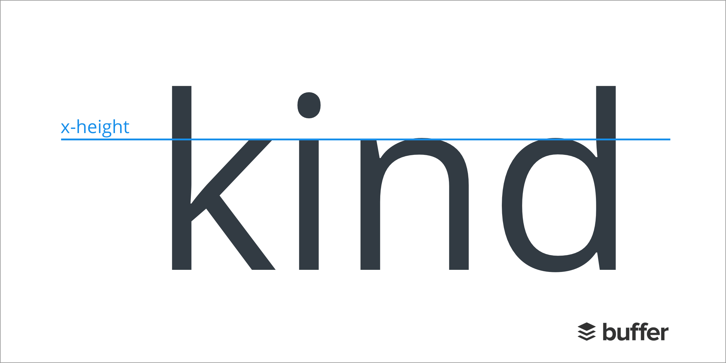
13. X-height
The x-height refers to the distance between the baseline and the mean line of lower-case letters in a typeface.
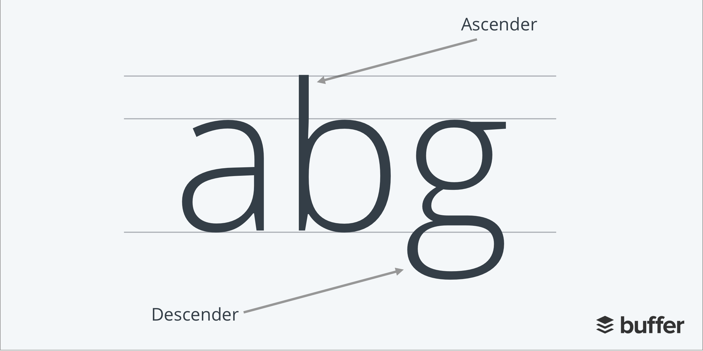
14. Ascender / Descender
The ascender is the portion of a lowercase letter that extends above the mean line of a font (the x-height). On the other hand, the descender is the portion of a letter that extends below the baseline of a font.
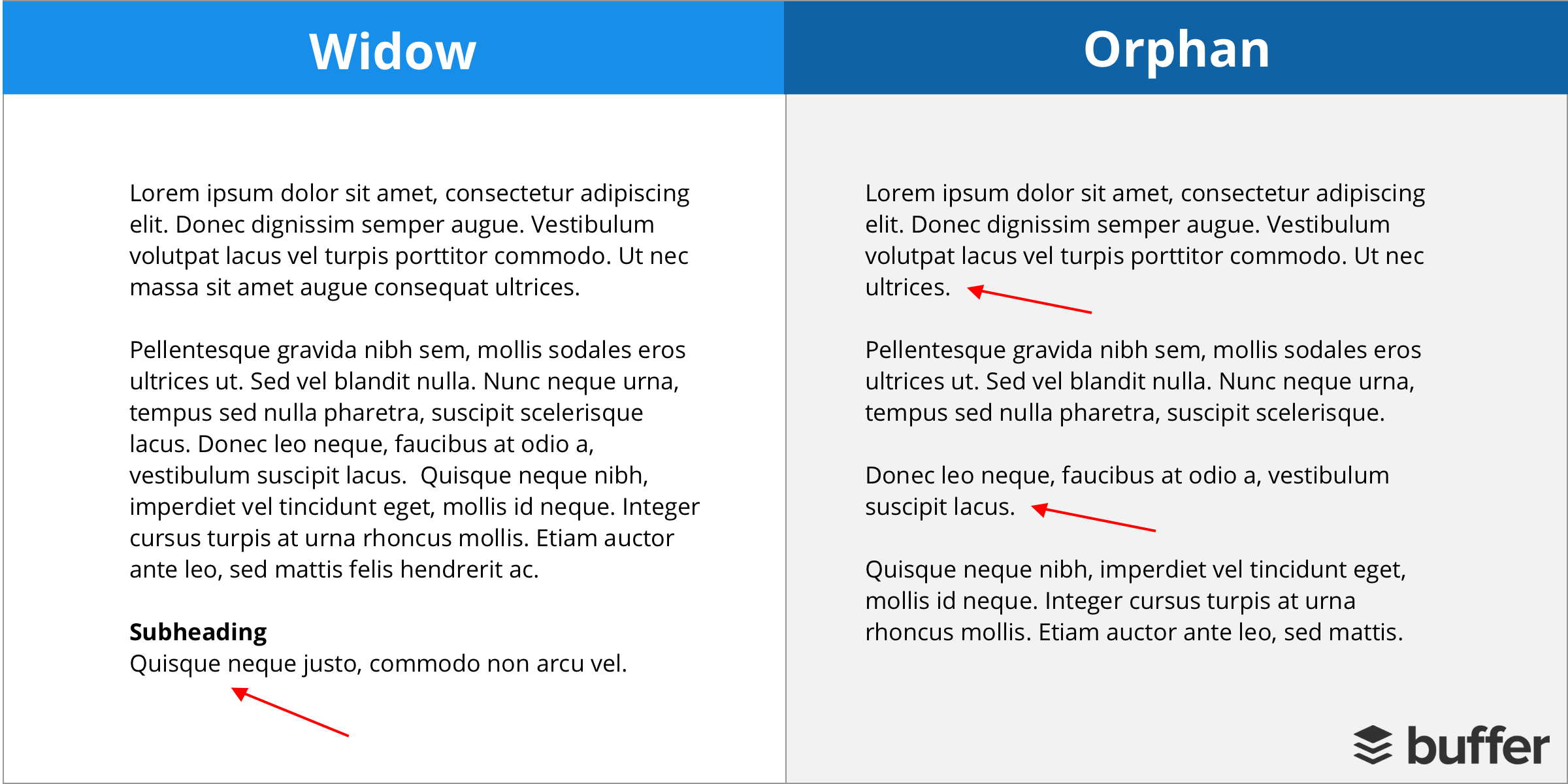
15. Orphans / Widows
Widows and Orphans are lines of text that appear at the beginning or end of a paragraph, which are left alone at the top or bottom of a line. There is some debate about the exact definitions of these terms but as a rule of thumb:
- Orphan: A is a single word or very short line, that appears at the end of a paragraph or the beginning of a column or a page, separated from the rest of the text.
- Widow: A paragraph-ending line that falls at the beginning of the following page or column, thus separated from the rest of the text. Or the beginning of a new paragraph that starts at the bottom of a column or page.
16. Lorum Ipsum
Lorem Ipsum is simply dummy text used by the design industry. It’s used as placeholder text and has a more-or-less average distribution of letters, making it look like readable English, as opposed to using ‘Add content here, add content here’ within designs when the copy isn’t quite ready.
Colors
17. RGB
RGB color is a model in which red, green, and blue light are added together in various ways to reproduce a broad array of colors. RGB tends to be used for on-screen purposes.

18. Hex
A hex is a six-digit number used in HTML, CSS, and design software applications to represent colors.
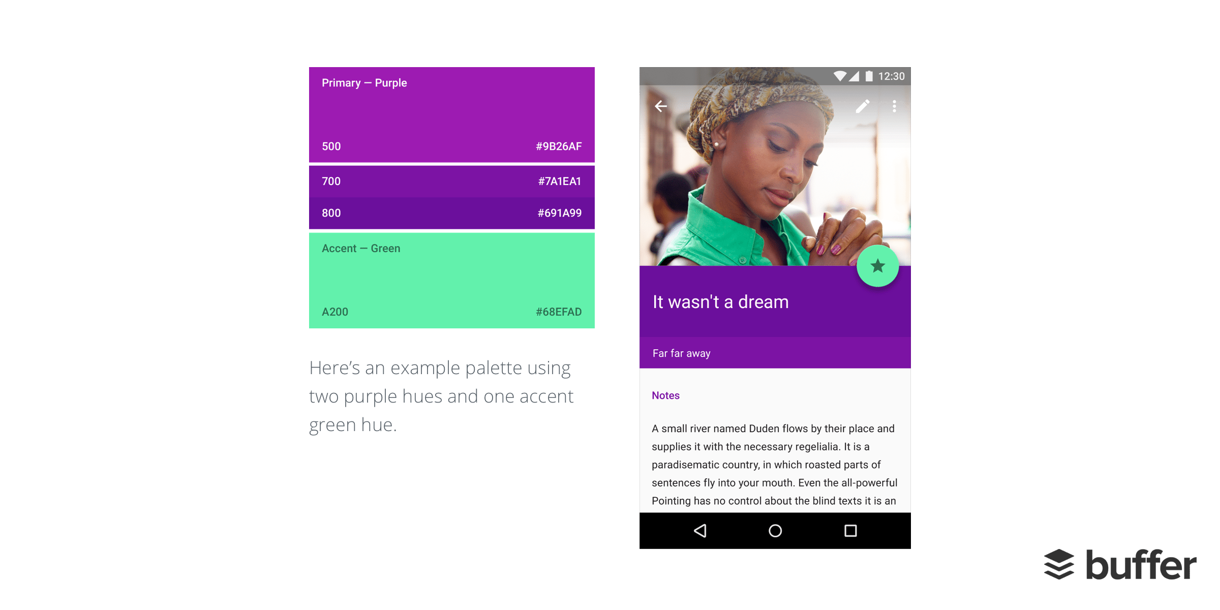
19. Palette
A color palette comprises of colors that can be utilized for any illustration or design work that represents your brand. The chosen colors should be designed to work harmoniously with each other.
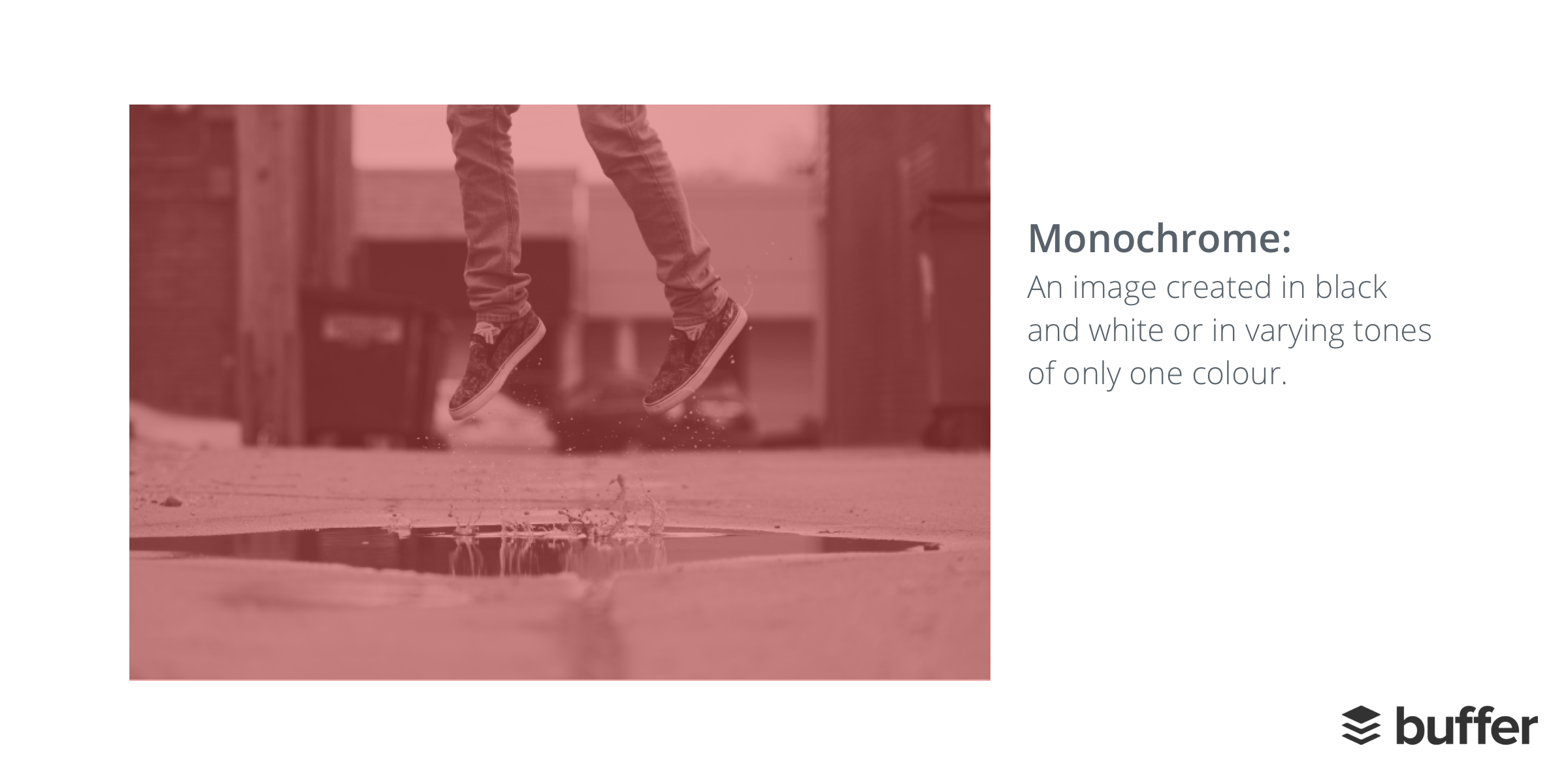
20. Monochrome
Monochrome is used to describe design or photographs in one color or different shades of the single color.
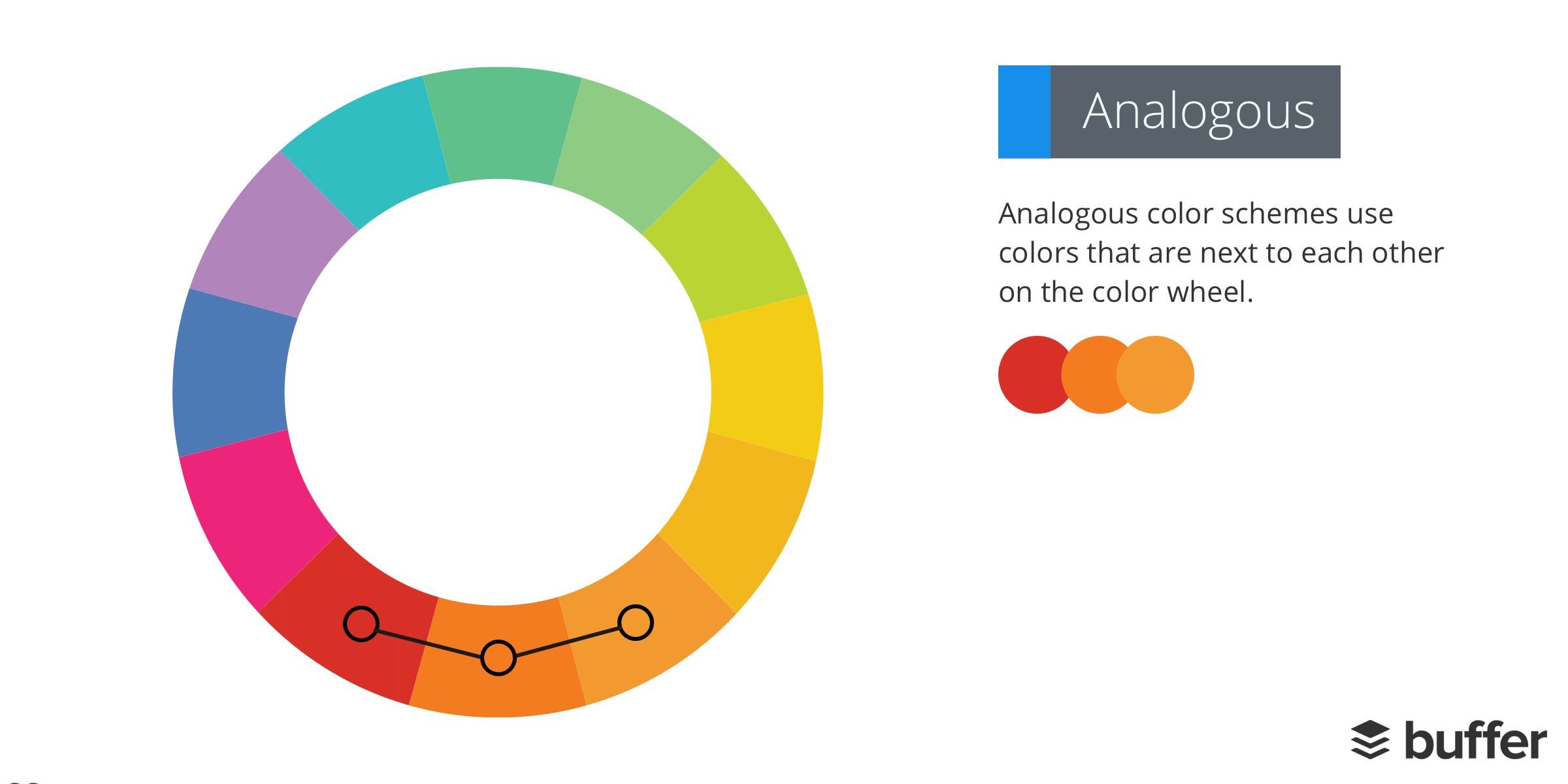
21. Analogous
Analogous color schemes use colors that are next to each other on the color wheel. They usually match well and create serene and comfortable designs.
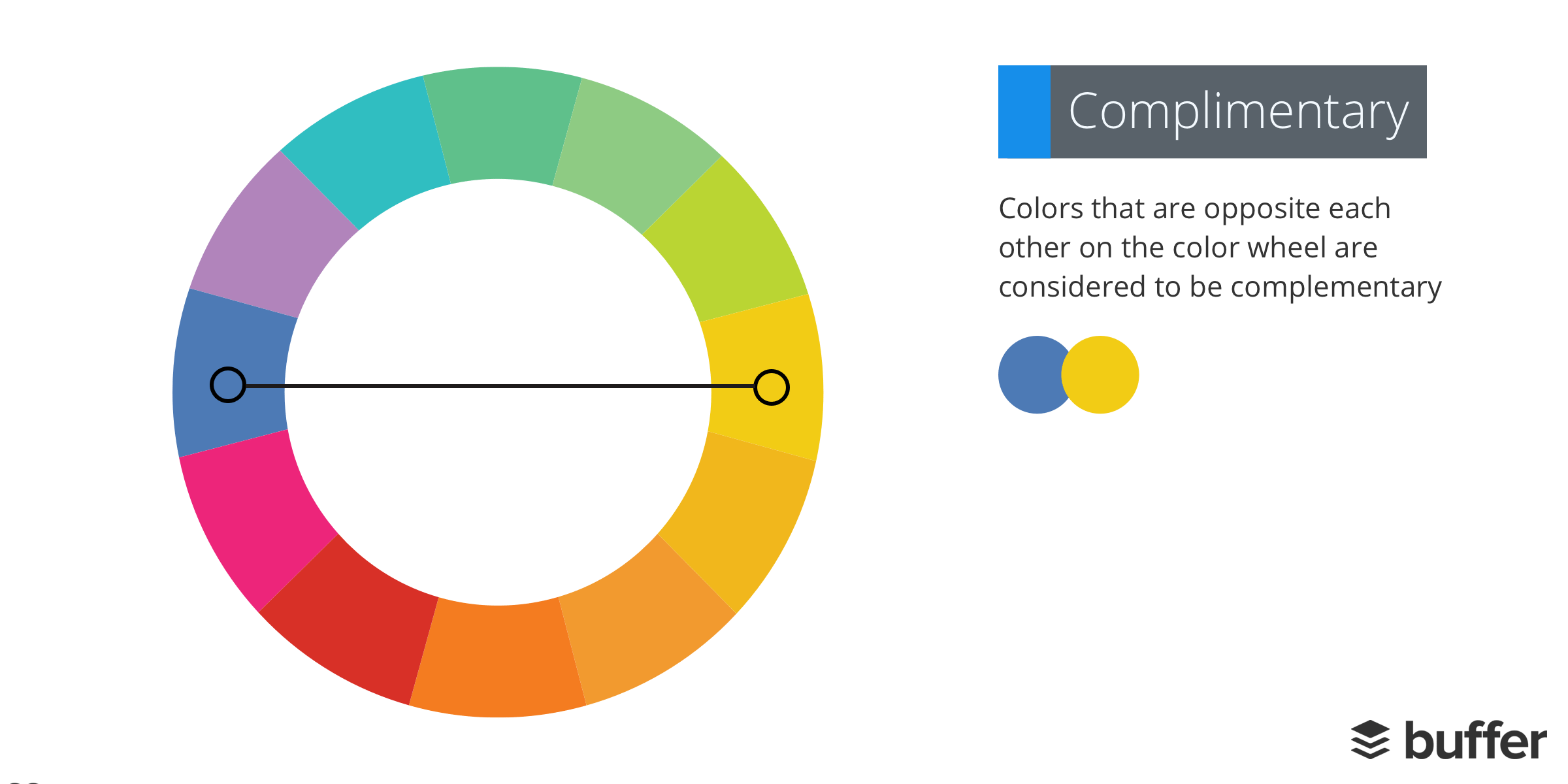
22. Complementary
Colors that are opposite each other on the color wheel are considered to be complementary colors (example: red and green).
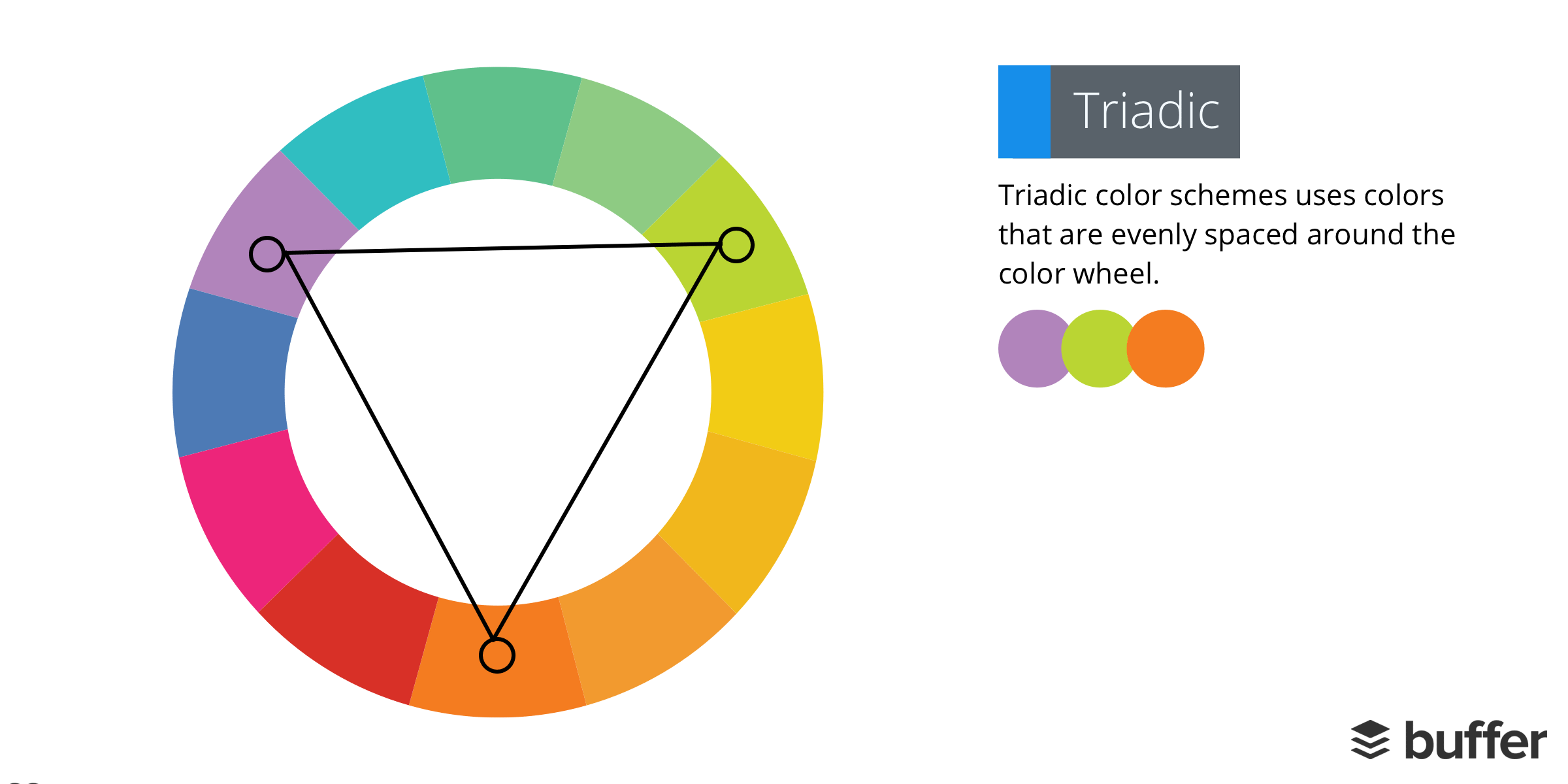
23. Triadic
A triadic color scheme uses colors that are evenly spaced around the color wheel.
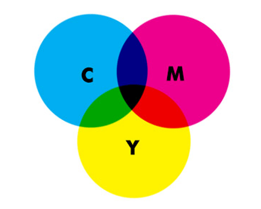
24. CMYK
CMYK is a color model that is used for print purposes. CMYK colors begin as white and then get darker as more colors are combined.
(via)
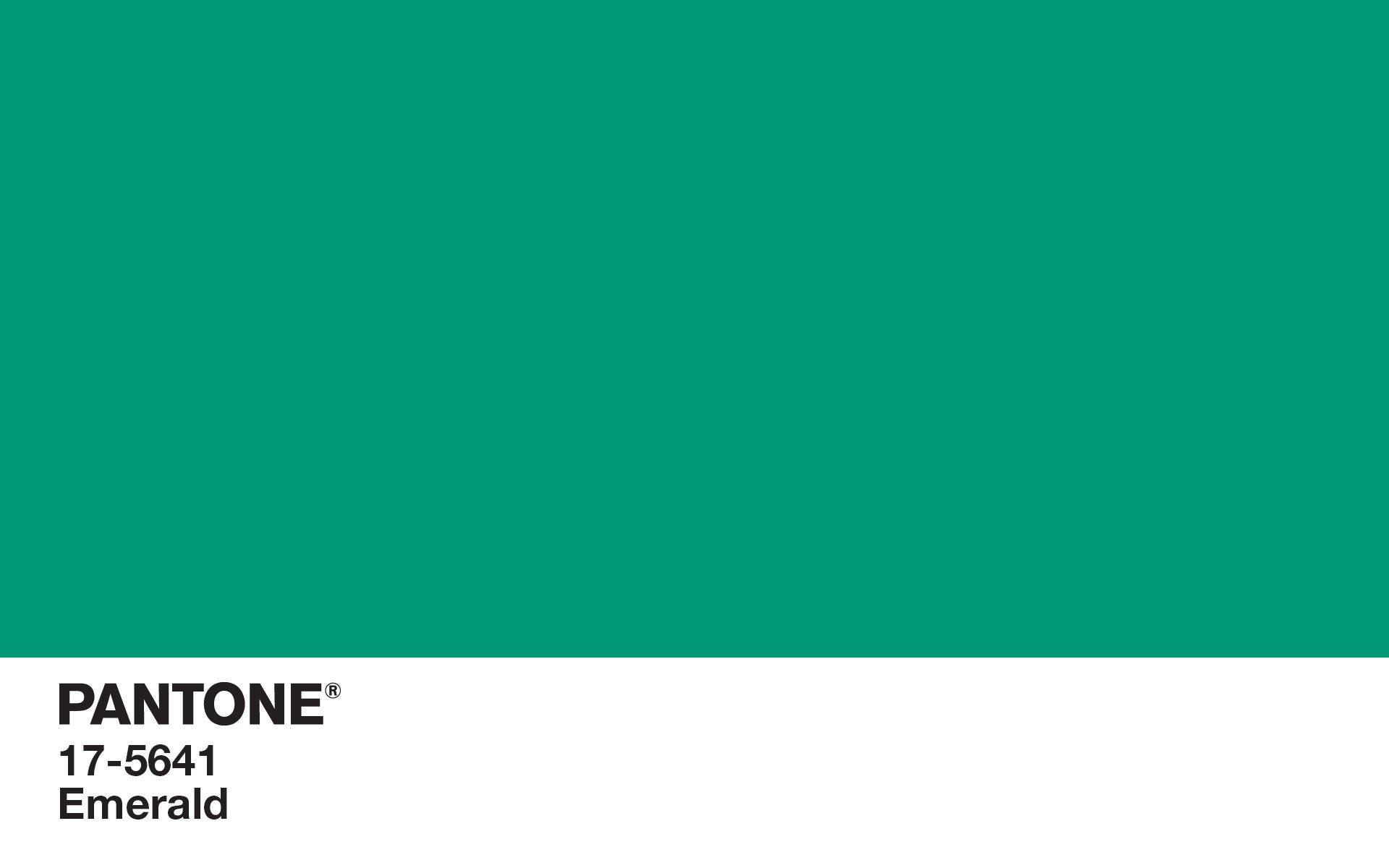
25. Pantone
The Pantone Matching System (PMS) is a standardized color reproduction system. Every hue is given a number, making it easy for people to reference and reproduce the same colors.
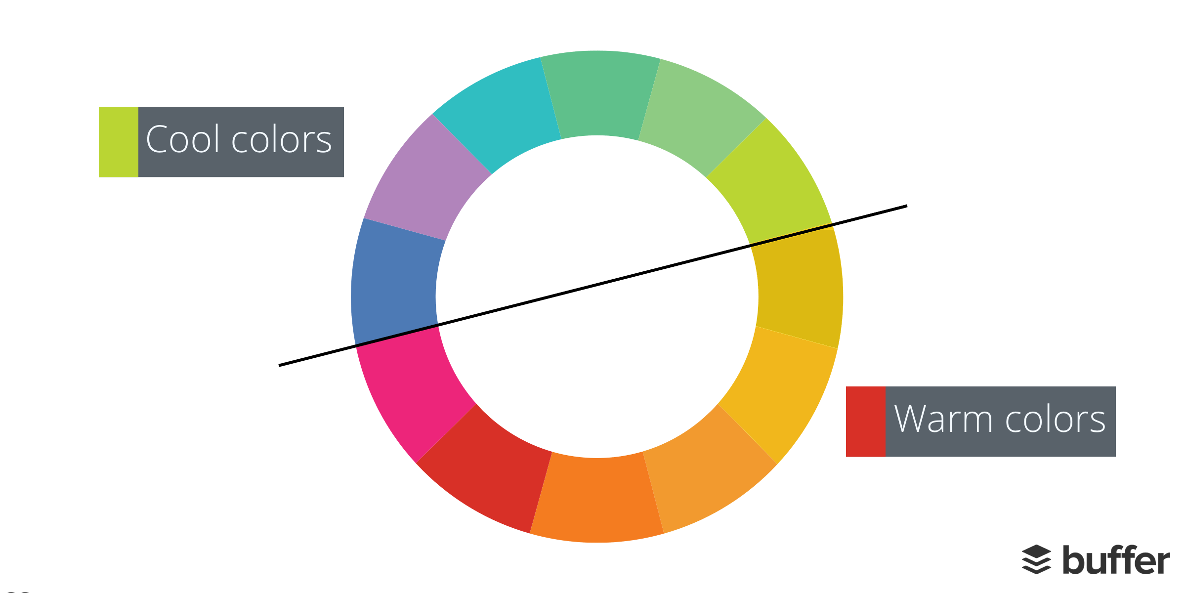
26. Warm colors
Warm colors are made with red, orange yellow and various combinations of these colors. They give a friendly, happy, cozy vibe.
27. Cool colors
Cool colors such as blue, green and light purple have the ability to calm and soothe.
28. Color theory
Color theories create a logical structure for color. There are three basic categories of color theory: The color wheel, color harmony, and the context of how colors are used. Understanding how to use different colors to convey meaning is an important part of both design and marketing. Here’s a quick guide on how colors affect our brain:

Do you want to learn more about color theory? Check out: Why Facebook Is Blue? The Science of Colors in Marketing.
29. Gradient
A gradient is a gradual change of colors (such as green turning gradually into blue) or a color fading into transparency. There are two common types of gradients: radial and linear.
30. Opacity
Opacity enables us to make an element of a design transparent. The lower the opacity, the more transparent an element is. For example, 100% opacity means an object is solid.
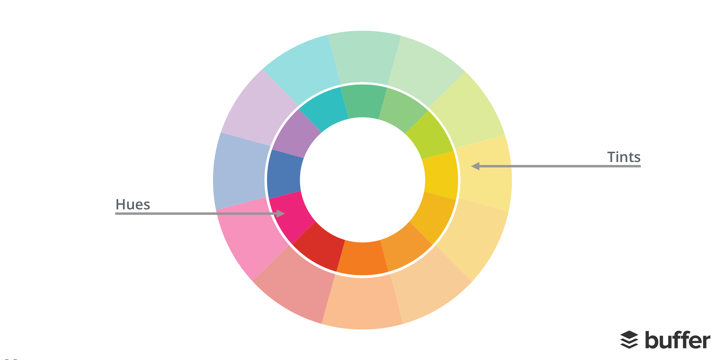
31. Hue
Essentially, a hue is a way to describe a color. And a hue can be any color on the color wheel. For example, red, blue and yellow are all hues.
32. Tint
A tint is a variety of a color. Craftsy explains that Tints are created when you add white to any hue on the color wheel. This lightens and desaturates the hue, making it less intense.
Branding and logos
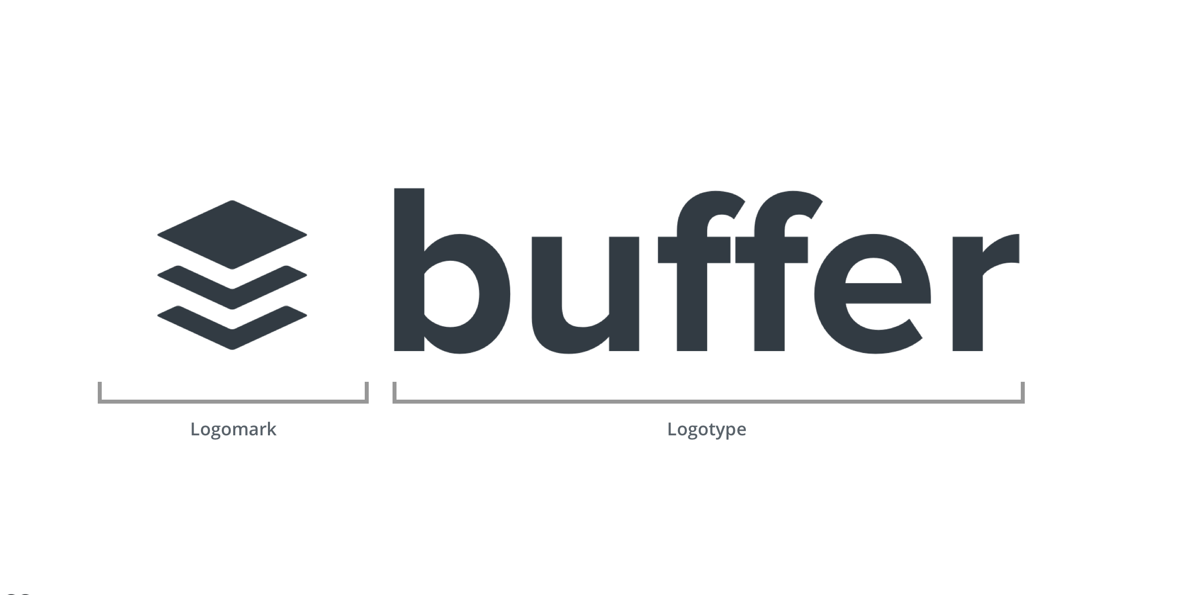
33. Logotype
A logotype is the name of a company that is designed in a visually unique way for use by that company. Most of the time when people refer to a logo, they’re referring to the brand’s logotype.
34. Logomark / Brandmark
A logo mark generally does not contain the name of the company and instead more abstractly represents that company using a symbol or mark.
35. Icon
Icons are images used to represent an action or an object. For example, a pen icon could represent someone writing (action) or simply a pen (object). When using, icons think carefully about what you want to signify and how clear it is to your audience.
36. Style guide
A style guide is a set of standards for the design of anything related to your brand, whether it’s a website landing page, business card or printed document. The reason to have a style guide is to ensure complete uniformity in style and formatting wherever the brand is used to ensure no dilution of that brand.
As an example, you can check out our Buffer style guide here.
37. Grid
A grid is constructed from evenly divided columns and rows. The point of a grid is to help designers arrange elements in a consistent way. Here’s an example of the grid we use at Buffer:
Using the Buffer design grid, a page can be divided into fifths, fourths, thirds and halves – and any combination of these. Each grid row must contain parts that add up to one whole. For example, one-fourth + one-half + one-fourth.
Design Terms and Techniques
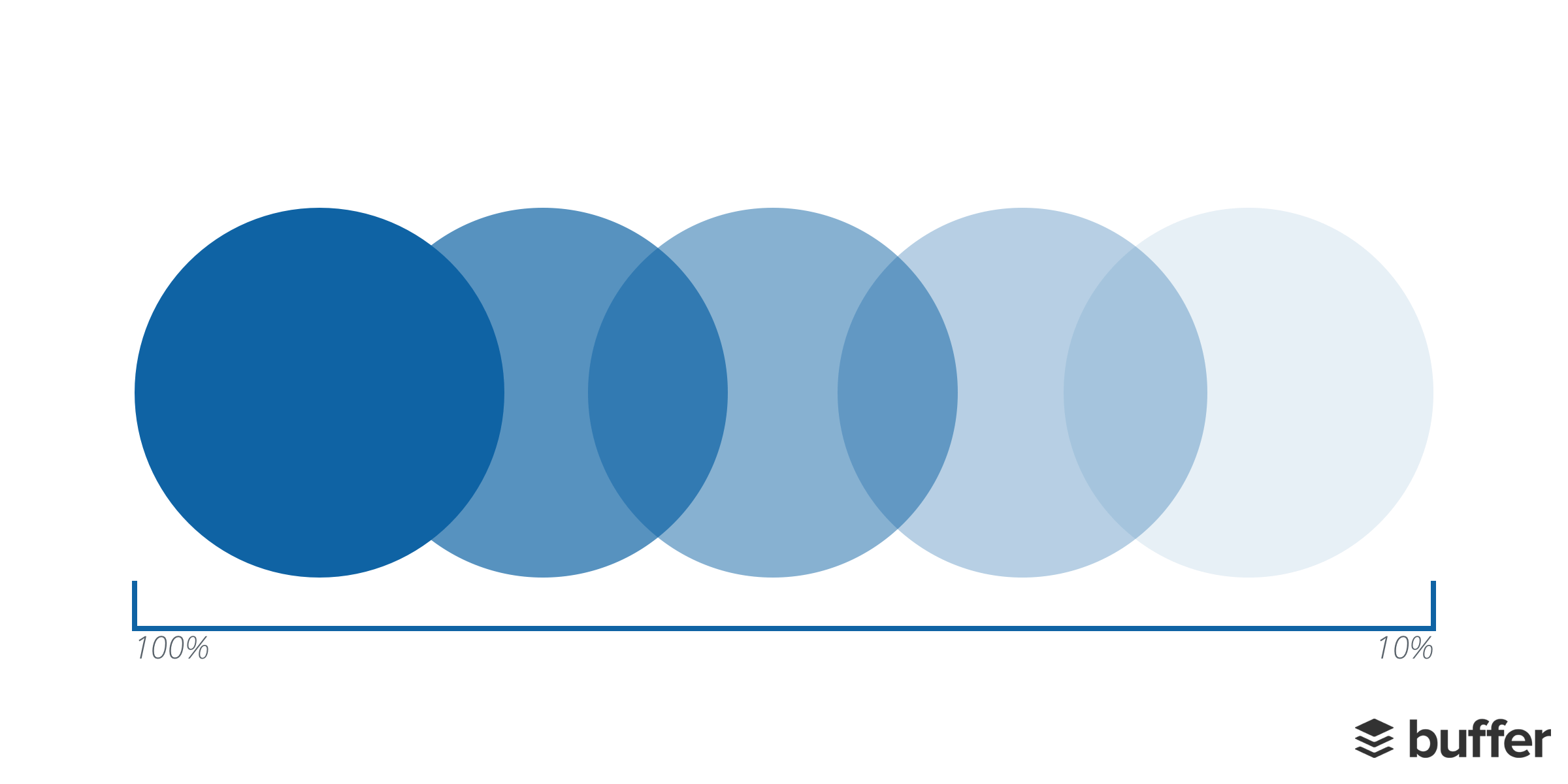
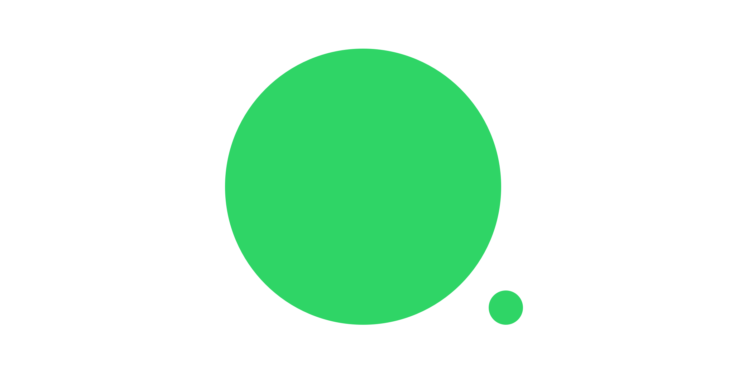
38. Scale
In design, scale refers to the size of an object in relationship to another object. Two elements of the same size can be seen as being equal. Whereas elements with a clear variation in size tend to be seen as different.
When putting together a design, think about how you can utilize scale to help you illustrate the meaning behind your image. Take the below example; the larger circle appears to be more influential and important that the smaller one. You could even say the smaller circle may be a little timid or shy.
39. Aspect ratio
An aspect ratio is the proportional relationship between the width and height of a rectangle (a rectangle is used because the vast majority of screens are wider than they are tall). An aspect ratio is defined via a mathematical ratio, with two numbers separated by a colon.
- width:height
- This means that 4 inches wide by 3 inches high would be a ratio of 4:3
40. Texture
A texture is defined as the surface characteristics of your image. In design, you can utilize textures such as cloth and brickwork to mirror the visual appearance of the actual texture.
41. Knolling
Knolling is the act of arranging different objects so that they are at 90-degree angles from each other, then photographing them from above. This technique creates a very symmetrical look that feels pleasing to the eye. Images that feature knolling tend to be set against a contrasting solid background.
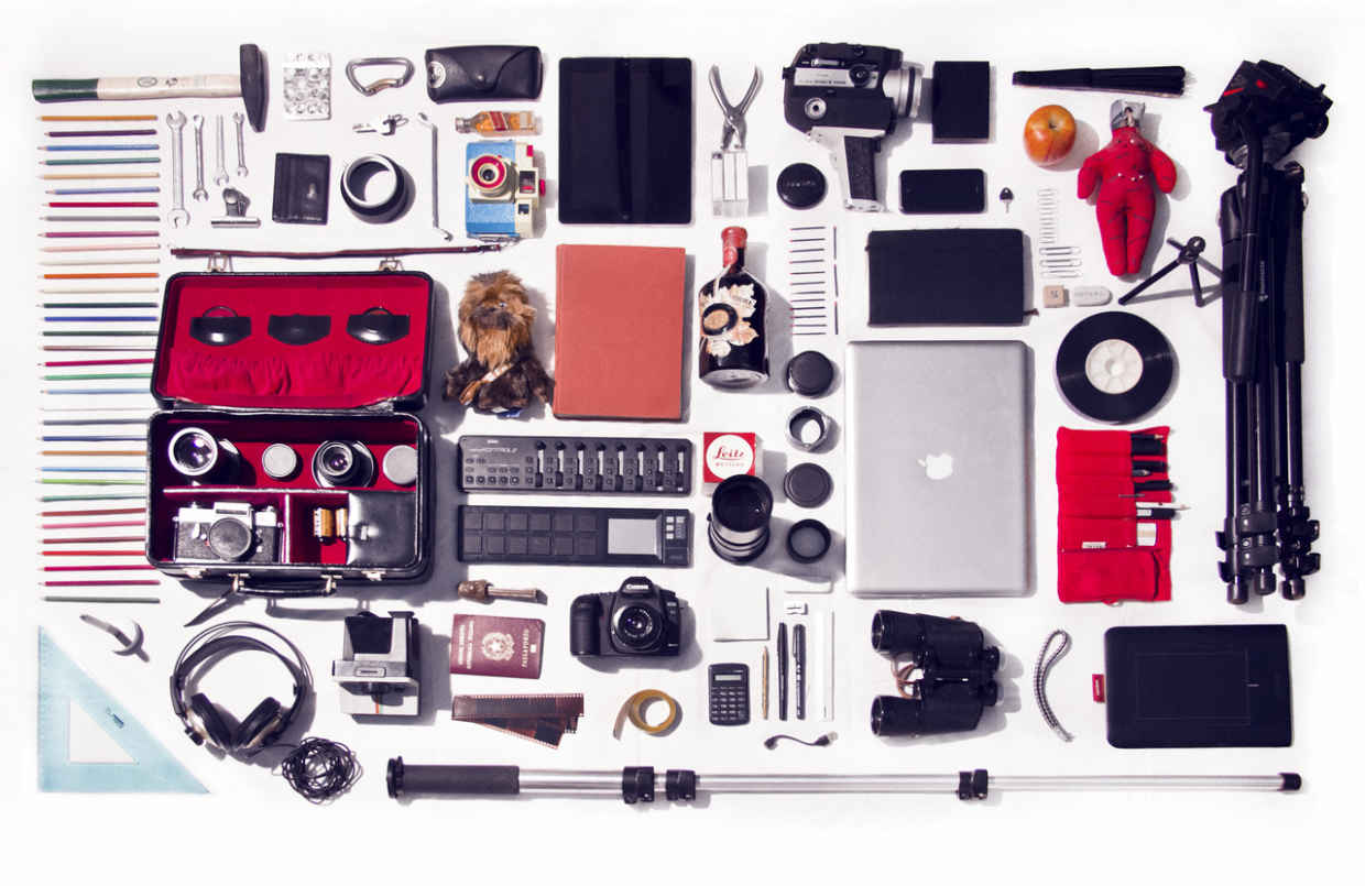
(via)
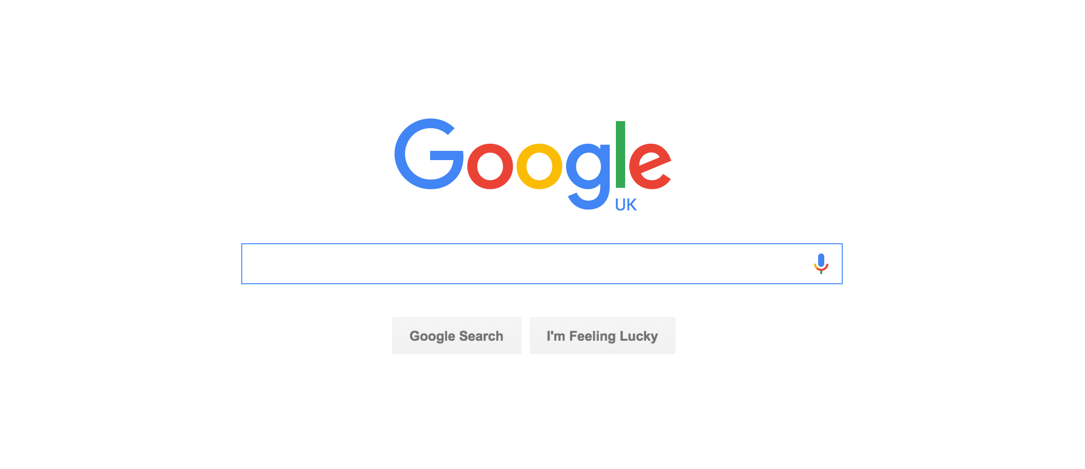
42. White space
Whitespace, often known as negative space, refers to the area of a design left blank. It’s the space between graphic elements, images, copy, and anything else on the page. Even though it’s known as white space, it can be any color.
An excellent example of white space is the Google homepage. It’s almost filled with whitespace to encourage users to focus on the search bar:
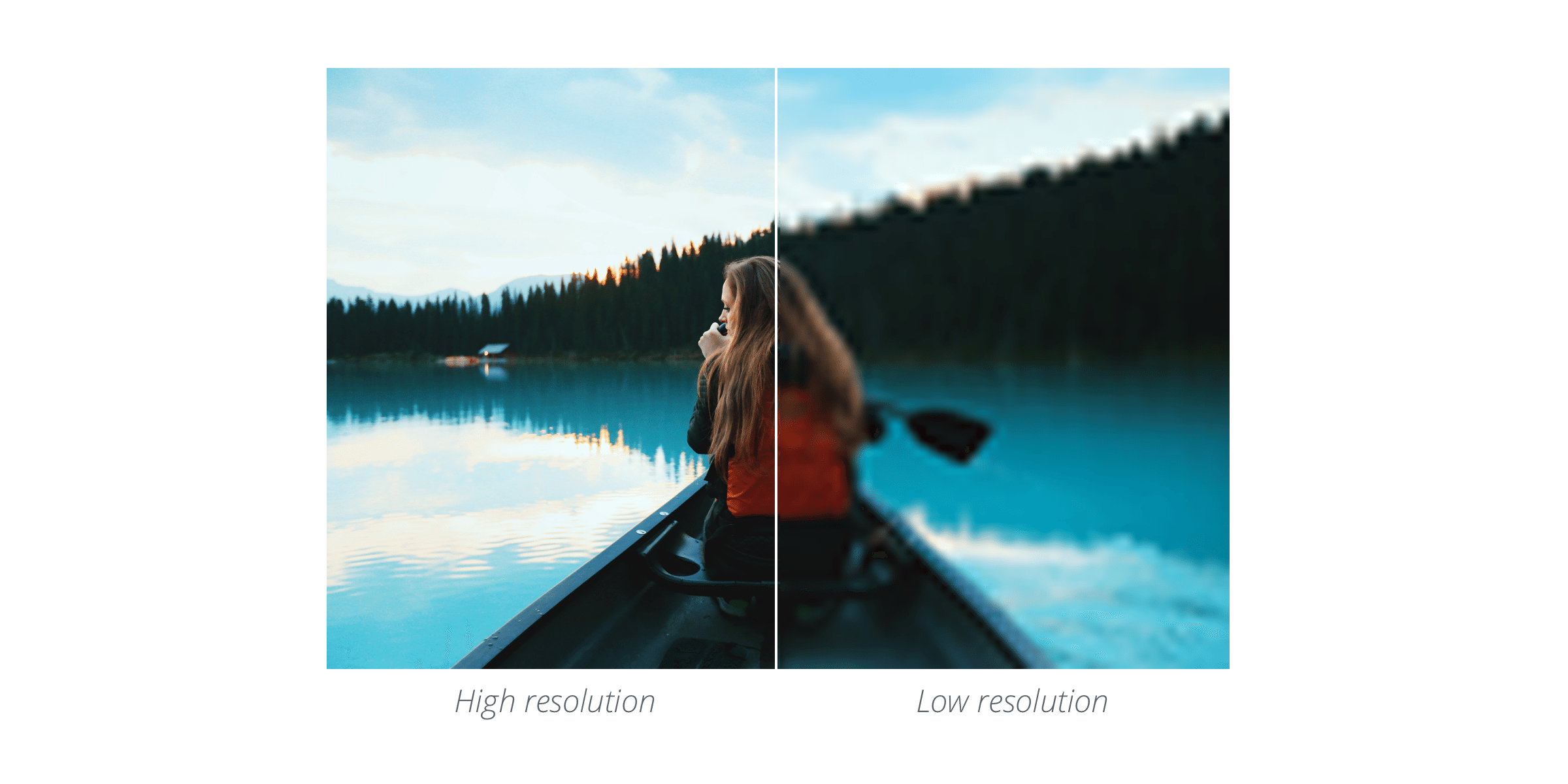
43. Resolution
The resolution of an image determines the quality. As a rule of thumb, the higher the resolution, the higher the quality. A high-resolution image will be clear and crisp whereas a low-resolution image will feel a little pixelated and blurry.
44. Contrast
Contrast occurs when two elements on a page are different. For example, it could be different colors between the text and the background color or dark vs. light colors.
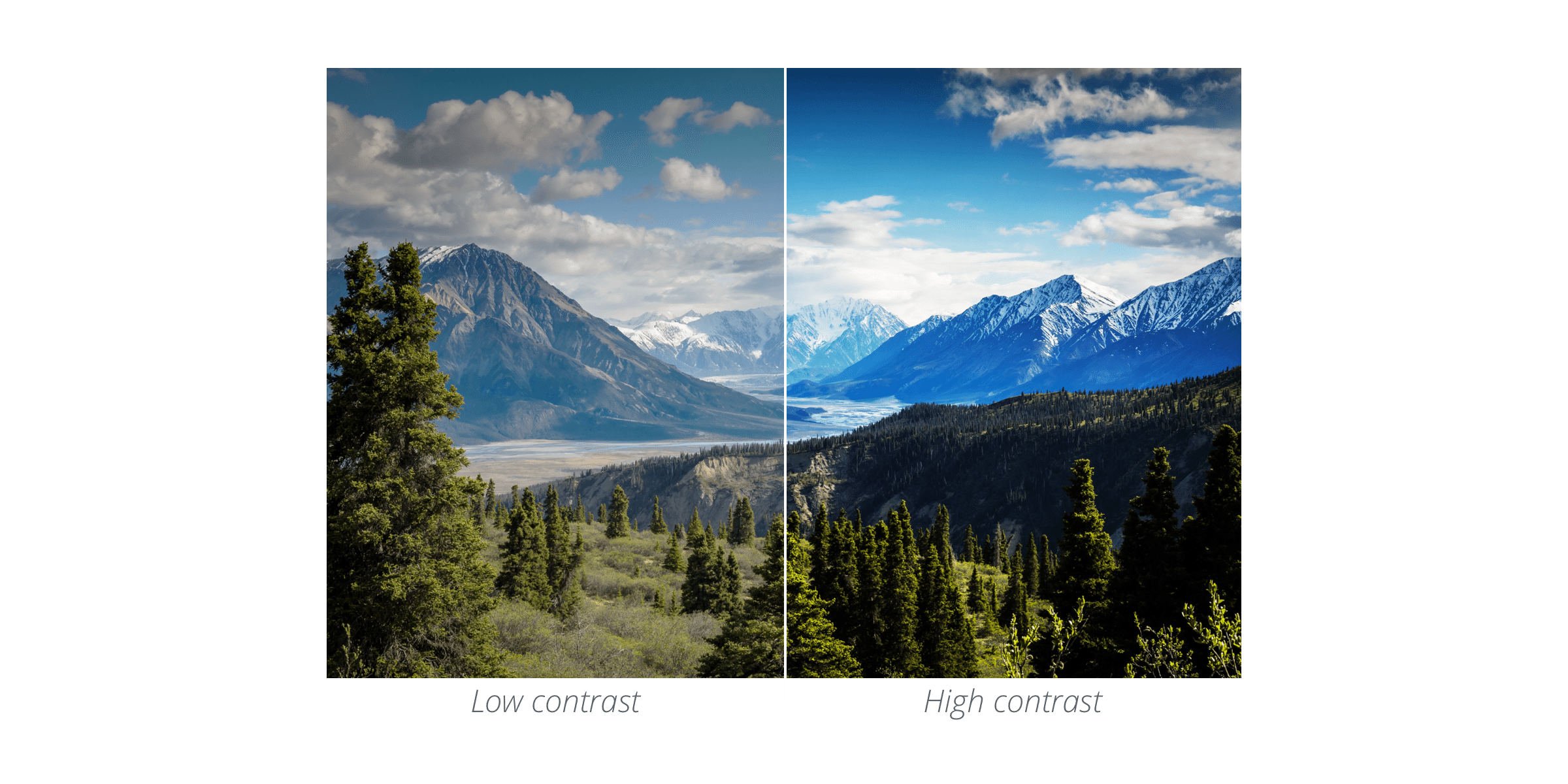
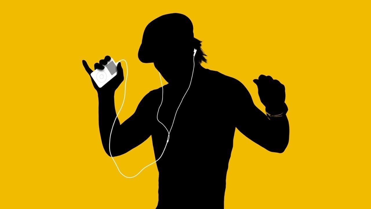
One of the main reasons to use contrast in your designs is to grab attention. For example, the infamous iPod silhouette adverts were so memorable because there is a huge contrast between the white iPod and earphones and the bright background and silhouette.
45. Saturation
Saturation refers to the intensity or purity of a color. The more saturated a color is, the more vivid or brighter it appears. Whereas desaturated colors, appear a little duller.
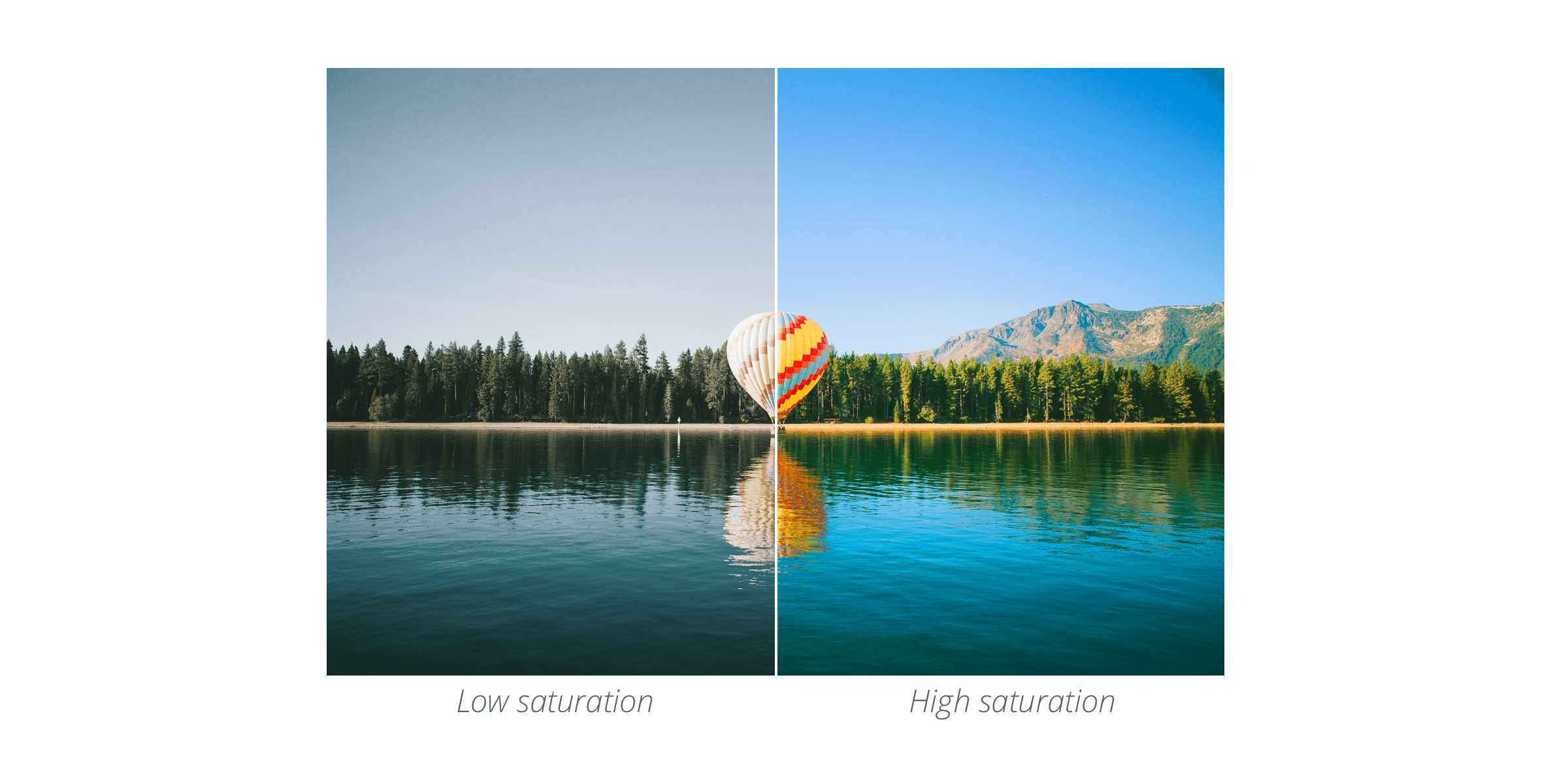
Highly saturated images tend to stand out and draw attention, therefore giving the appearance of carrying more weight than less saturated images. If you’re adding a text layer over a picture and would like it to stand out, using a less saturated background can be a great way to do so.
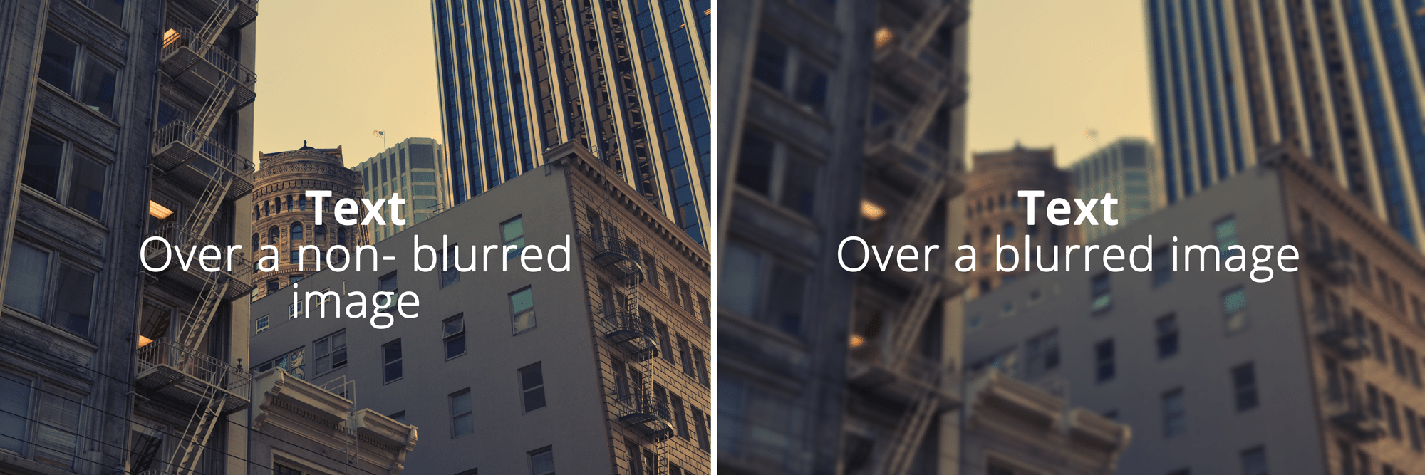
46. Blur
Blur makes images more unclear or less distinct. Using a blur can be a great way to make text stand out when overlaid onto an image. When you put text over an image, the two elements can form a somewhat competitive relationship (example on the left below), a little blur can make the text stand out more and appear much more readable (on the right below).
47. Crop
When you crop an image, you’re cutting away and discarding the unnecessary portions of the image. Cropping allows you to change the emphasis or direction of an image.
48. Pixel
A pixel is a minuscule area of a screen (the word comes from “picture element”). Pixels are the smallest basic unit of programmable color on a computer and images are made up of many individual pixels.
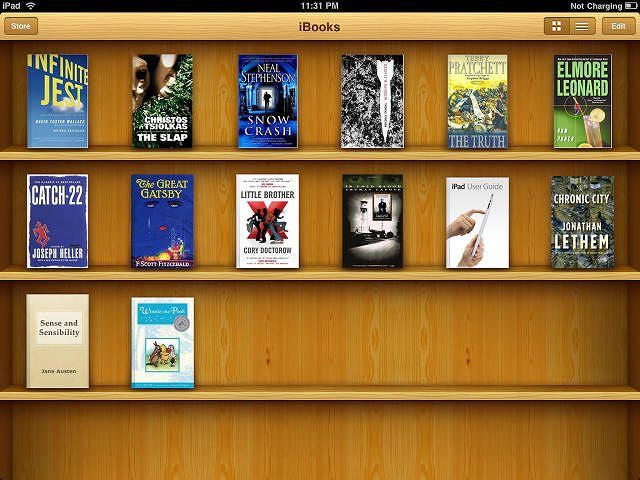
49. Skeumorphism
Skeuomorphism is when a digital element is designed to look like a replica of the physical work. For example, think iPhone’s calculator or Apple’s newsstand where the bookshelf and magazines look and feel like they do in real life.
50. Flat
Flat design is a minimalistic approach that focuses on simplicity and usability (almost the opposite of Skeuomorphism). It tends to feature plenty of open space, crisp edges, bright colors and two-dimensional illustrations.

(via)
51. Raster
Raster images are made up of a set grid of pixels. This means when you change the size of stretch a raster image it can get a little blurry and lose some clarity.
52. Vector
Vector images a made up of points, lines, and curves. All of the shapes within a vector are calculated using a mathematical equation which means the image can scale in size without losing any quality. Unlike rasters, vectors won’t get blurry when scaled. You can find some great vector images to use within your designs on sites like Vecteezy.

Over to you
I hope you found this dive into design terms and definitions helpful. It’s amazing how fast marketers can pick up tools like Canva and Pablo to create beautiful looking images.
I’m curious to hear if there are any other design terms you hear regularly and would like some clarification on? Feel free to share any questions or thoughts in the comments below.
Further reading:
- 50 Design Terms Explained Simply for Non-Designers from the Canva blog
- 10 Digital Design Terms You Need to Know from Design Shack


