How to Create Engaging Images for Social Media: A Simple Guide For Non-Designers

A great social media marketer today and an awesome advertiser in the 1960s have much in common.
David Ogilvy, the father of advertising, was famous for spending an inordinate amount of time on headlines. Why? Because that’s the line that people read the most, so it mattered a lot.
Ogilvy was a master at stuff like this — prioritizing what was really important.
Try Buffer for free
140,000+ small businesses like yours use Buffer to build their brand on social media every month
Get started nowIf he lived through the age of social media, I’m fairly certain Ogilvy would say something like:
On the average, many more people engage with images as read the copy in social media posts. When you have crafted your social media image, you have spent eighty cents out of your dollar.
Images have never been more important in social. They’re the key to driving greater online engagement, much like a great headline in advertising.
The only issue here is that if, like me, you aren’t über-skilled in graphic design, creating eye-catching engaging images can be difficult. So how can non-designers like me still create incredible images for social media? One way is by learning simple, repeatable design principles.
Here are 3 key design principles that will help you create engaging social images every time!
Principle #1: Create a Simple and Balanced Layout
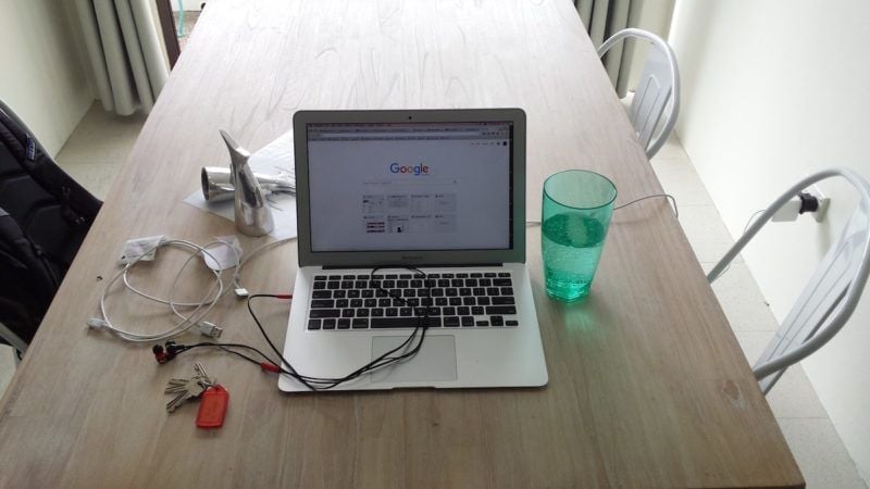
This is what the table in my Airbnb looked like this morning.
This is what the table looked like about 30 seconds later. Notice any difference?
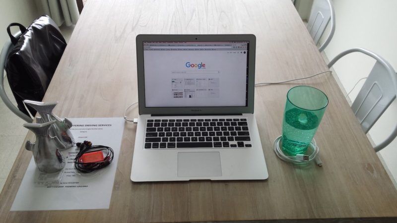
Both images contain the same items. Nothing was removed from the table, yet the second picture — with a slightly altered layout — just feels so much better, at least to me!
The lesson here is simple — the layout of elements in your images makes a huge difference.
Take a look at these two basic examples.


Doesn’t the second image look a lot better? This is because of two design principles related to image layouts — proximity and alignment.
Proximity
As Bakari Chavanu explains:
Proximity means grouping elements together so that you guide the viewer to different parts of the message.
In the examples above, the first image places the icon and text in very close proximity. This prevents each element from standing apart and fulfilling its role.
- The icon visually communicates surfing.
- The text communicates details about surfing.
Applying the proximity principle means that the viewer should clearly be directed to the icon and then to the text. This allows the viewer to better understand what’s being communicated.
In the second example, text is only grouped beside text.
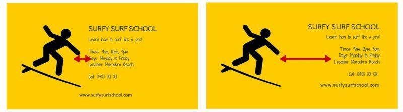
Applying the proximity principle adds unity and continuity to your images.
Alignment
Proper alignment of the elements in your images helps to maintain balance.
Again, take the surf school images as an examples.
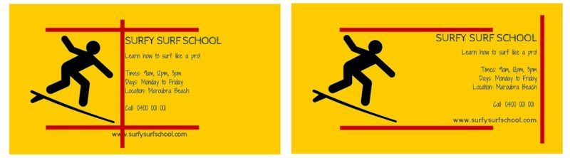
- The top of the icon and the text are aligned in both images.
- All the text is aligned only in the second image.
- The bottom of the icon and text are aligned only in the second image.
These small differences all contribute to making the second image feel more balanced and engaging.
How to Create Simple and Balanced Images
- When you have different elements in your image (e.g. text, icons, illustrations) think of what role they play in your image.
- Keep some sort of alignment with these different elements, whether it’s vertical, horiontal or diagonal.
Principle #2: Colour Makes All the Difference
Leslie Cabarga, author of The Designer’s Guide to Colour Combinations notes:
That a poor choice of colours affects us subconsciously is a fact observed by many real estate agents. Potential buyers viewing a house with ugly wallpaper will often reject the whole house. I recall as a child not being able to eat in a certain restaurant whose walls were painted a pale, 1950s green.
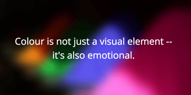
Colour is not just a visual element — it’s also emotional. And because colour elicits particular emotions it can often determine whether or not people are drawn to your images.
This isn’t to say that it’s as simple as staying away from particular hues. What it does mean is that it’s crucial to think about the role that colour plays in your creations.
That role is simple — to create contrast in your images.
Callie Kavourgias describes this colour and contrast function:
Contrast creates conflict between elements to attract the eye to a specific place and is the most effective way to add visual interest….it allows you to highlight key elements in your design.
Here are a couple of simple examples.
Each pair of circles has the same colour in the centre, but each appear different. You might even notice depth changes with different colour variations.
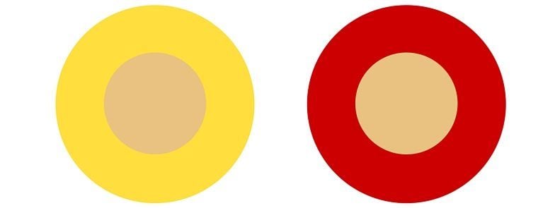

This contrast shows that the perception of colours used in your images can be dramatically different based on how you combine them.
That’s a key principle when it comes to colour and contrast: keep it simple because less is often more.
It’s important to pick the right colour combinations, but how do you know which colours to pick?
How to Choose Contrasting Colours
One fantastic tool that I recently discovered to help with this is Paletton. It automatically picks contrasting and complimentary colours so that you don’t have to think about it too much.
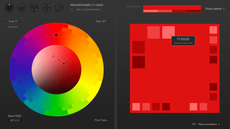
In this example, I chose red as my primary colour (represented by the uppermost dot on the colour wheel) and asked for monochromatic colour scheme (a colour scheme based on various shades and tints of one hue).
When I hover over the different boxes on the right I’m provided with the hex codes (like ‘FF6B6B’ seen on the right side of the image above), which I can then use in my designs.
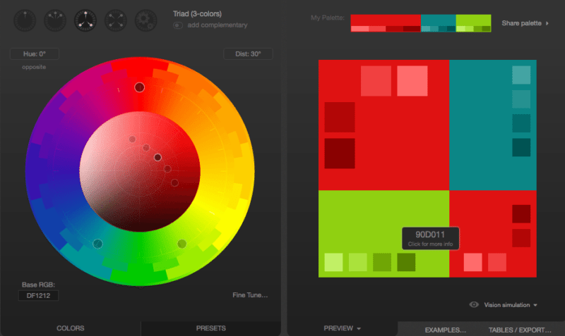
In this second example I also used red as my primary colour, but instead asked for a triadic colour scheme (three colors that are equally placed in lines around the color wheel). Again, I’m able to pick contrasting colours that go well together.
Another tool I use quite frequently is Brand Colors, a collection of official colour codes from world-renown brands.
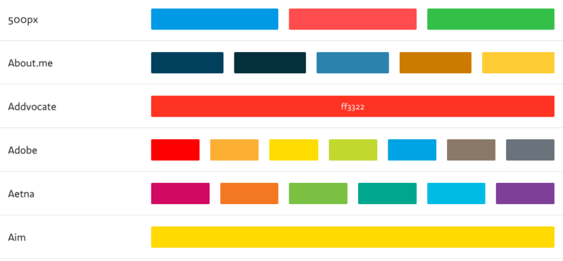
Hovering over any colour (such as I did here with the Addvocate brand) reveals the hex code.
When I’m stuck and can’t think of a great colour combination, I’ll often go to Brand Colors for some inspiration.
These types of tools are life-savers for non-designers like me.
Principle #3: Choose Fonts That Are Readable and Consistent
It’s probably an over-used analogy, but picking a font is kinda like selecting which clothes to wear.
Your choice of clothes echoes parts of your personality and style. Walking into a meeting wearing a suit versus wearing a t-shirt and short-shorts will leave people with quite different impressions about you.
Similarly, when you use fonts in a social media image they communicate a key message about you and your brand.
Let’s use an example. Here are two social image alternatives — which one do you prefer?

I lean towards the image on the left because:
- It’s easier to read.
- The 2 fonts seem more complimentary
This doesn’t mean the other image is horrible, but it does illustrate the importance of focusing on the role of text.
Max Luzuriaga, a web designer and developer sums it up well:
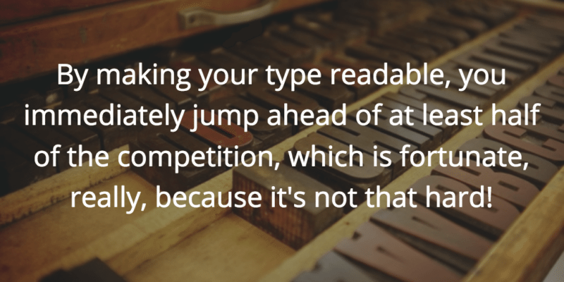
What do you do with type? Read it! So why do so many people make it so damned difficult to do just that? Be it tiny font sizes, crammed line-height, or just plain ugly fonts, it seems that a lot of people out there are determined to not let you enjoy their content!
By making your type readable, you immediately jump ahead of at least half of the competition, which is fortunate, really, because it’s not that hard!
This begs the million dollar question — how do select which font to use? Here we can lean on the sage advice of Dan Mayer:
Just as with clothing, there’s a distinction between typefaces that are expressive and stylish versus those that are useful and appropriate to many situations, and our job is to try to find the right balance for the occasion.
While appropriateness isn’t a sexy concept, it’s the acid test that should guide our choice of font.
Most of the time, one typeface will do, especially if it’s one of our workhorses with many different weights that work together. If we reach a point where we want to add a second face to the mix, it’s always good to observe this simple rule: keep it exactly the same, or change it a lot — avoid wimpy, incremental variations.
The best part about choosing fonts is that you don’t even have to do much work.
- Sites such as Font Pair reveal which fonts go well together.
- A simple Google search (e.g. best fonts for business quotes) provides excellent examples for you to copy.
How to Select Fonts for Your Images
- Simple is better than fancy.
- Be consistent — use the same font repeatedly.
- When adding a second font, go for something really different but equally simple.
Over to You
Let’s keep the advice flowing in the comments section below:
- How do you create engaging images for social media?
- Which resources have helped you nail down awesome designs?
- What principles have I excluded here that have worked for you?
I’d love to learn from you! Jump in and let me know! ?
Featured image from Unsplash; teaser icon by Jozef Krajcovic.
Try Buffer for free
140,000+ small businesses like yours use Buffer to build their brand on social media every month
Get started nowRelated Articles

Stop chasing the tail-end of Instagram audio trends — here are all the methods you can use to find the most popular music and sounds.

Learn how to generate AI images and schedule them across social platforms using Buffer and Apple's Image Playground. Discover tips for creative AI image generation and when to use AI-generated visuals strategically.

All the features on Bluesky, plus how to use them.