
The Best Typography, Colors, and Templates Used in the Highest-Converting Social Media Images


If you’ve been looking to supercharge your social media strategy, you probably know a lot about the benefits of using images.
But, how much do you know about actually creating scientifically shareable images?
Turns out, there’s tons of actionable, research-backed advice on how to create social media images that get shared—the ideal colors, fonts, text, and more, all leveraging what we know about design, psychology and the Internet to get more shares and engagement.
By the end of this article you’re going to be fully aware of how to make images that your readers can’t help but share. All backed by science.
What Makes A Shareable Social Media Image?
A shareable social media image is made up of five components:
- Emotion: When your readers feel it, they’ll share it.
- Relevance: Your image should not only fit your niche, but fit your audience too.
- Colors: Using the right colors, to get maximum shares.
- Typography: Choosing a font that not only looks good, but also says what you’re trying to say.
- Hashtags and Text: Using the right words, phrases and hashtags that will make your audience interact.
In the article you’re going to learn how you can take advantage of all of these elements, and put them together to create the best social images you possibly can.
1. Emotion
Create Epic Content (Or Nobody Will Share It)
Before I carry on, there’s one thing I do need to mention:
You need to treat your images as content.
And not just any sort of content. I mean the epic kind, that’s going to add a ton of value to your reader’s life. Because that’s the only content people share, right?
If you’re creating images because you feel you need to – and just scatter them throughout your news feed – you’re not going to get anywhere.
Your images should:
- Back up points you’ve made
- Show statistics
- Provide tweetable (or valuable) quotes
- Add depth
- Go above and beyond the content you’ve written
So, be sure that the images you use – or make – aren’t just there for the sake of it. Treat them as content and put a high value on what goes on them.
What Makes An Image Emotional (And Shareable)?
Emotion is the biggest piece of the sharing puzzle. And it’s the driving force behind all five points on this list – so it deserves a lot of attention. So, what makes an image emotional?
As it turns out, there are a lot of factors:
- Color: Studies of abstract art have shown that the way color is used and distributed across a piece controls the emotions you feel. For example, black creates feelings at the despair end of the spectrum and bright primary colors can create joy and happiness.
- Font Choice: You’ll learn about this in depth in section four.
- Complexity: This isn’t complex designs – more on that next – but emotional complexity. Research shows that the more feelings your images can convey, the more viral it will go.
- Showing one of these five things: Research from Harvard studied what makes marketing campaigns, and their images, go viral. They found that: Admiration, Interest, Serenity, Amazement and Astonishment were the most shared emotions.
Simple Designs, Big Emotions
You don’t have to be a graphic designer to create solid social media images. In fact, far from it. I’ve run twitter feeds for months without a single minute of design under my belt.
All it takes is a little knowledge of how design works, and what it takes to make something your audience wants to share.
Firstly, there isn’t a magic bullet of design that goes viral. At least not to the current research. But there is a principle of design that, when harnessed, can go a really long way.
Simplicity.
The psychology of design shows that people are most responsive – and more likely to engage – with images or logos that are laid out in a clean and simple way. That’s because if people are presented with too much information, it can be overwhelming and force them to switch off.
For example, this study on smoking warnings showed that when smokers were presented with too much graphic or negative information, they were actually more likely to smoke because they paid less attention to the images.
Basically, simple designs cut through the noise and make your message easier to digest.
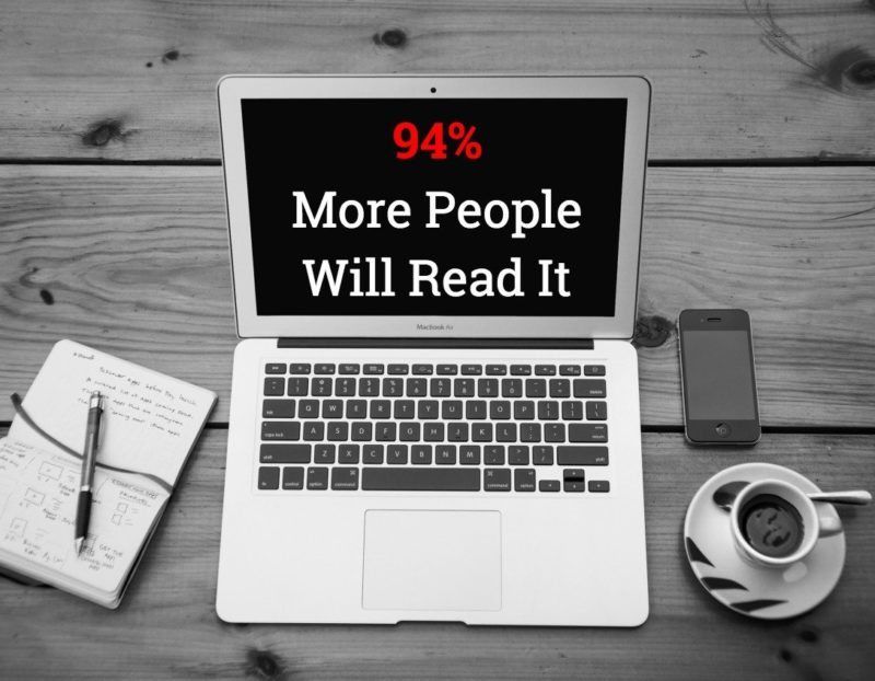
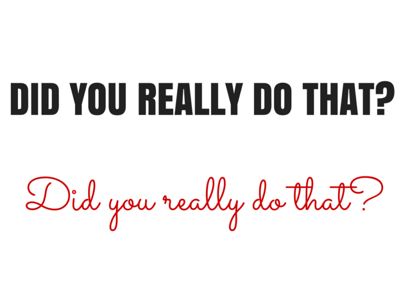
Which of these two images is easier for you to process, and has the biggest impact?
This one:
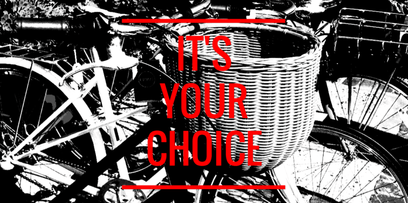
Or this one:
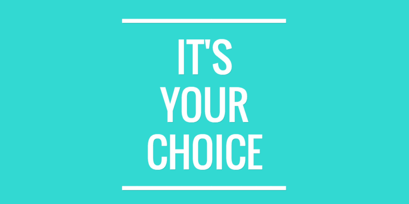
The second one right? It’s a no brainer. Clear and crisp cuts it. Two colors, one font – that’s it.
There’s no arguing with the message either. It goes right through the noise, and into the hearts (and minds) of your reader.
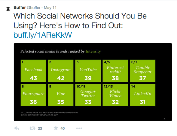
If you look at most articles on highly shareable images – like this one from Jeff Bullas – all the ‘types’ of image have this simplicity in common too.
You don’t need to go too far to see it in action either. All it takes is a quick glance at the Buffer twitter feed to see simple, clear and crisp layouts getting a lot of shares:
Here’s some simple tips on how to create simplicity, and powerful emotion, in your images:
- Less is more: Don’t give your audience too much to look at.
- Focus on clarity: Is the message you’re trying to create easy to see?
- Use plenty of white space: If in doubt, leave it out. Empty space isn’t wasted; it can actually add power to your designs.
- Few filters and effects: The less filters and special effects you use, the better.
- Don’t be scared to use a premade template: Apps like Share As Image and Canva both come with templates you can use to fit your purpose.
It’s also really helpful to know the sizes for each platform you’re using too. But, there’s a wonderful – and constantly updated – guide to that right here.
2. Relevance
Choosing A Relevant Image
Relevancy is important in content marketing. Making sure that what you’re doing fits who you’re doing it for. But, never has that been more important than when you’re choosing an image.
Let me explain:
90% of the information the brain processes is visual, and it’s processed 60,000x faster than anything you read. That means when your brain first sees an image, it’s trying to join the dots between what you see and what you should be seeing.
Essentially, your brain is trying to figure out if the image makes sense.
If the image doesn’t fit your:
- Brand
- Niche
- Status Update
Then you’re going to drive your audience away from the image—and the share button—and right onto the next post in their feed.
And while standout images that don’t make sense might make your reader stop and look, it’s not going to make them share. Which is why you’re here, right?
I want you to flip your thinking on choosing an image. Instead of looking at it as, “Does this make sense for me to share it?” I want you to think of it this way:
“Does this make sense for my audience to share it?”
Which might sound like a small adjustment, but it makes a big difference to how you look at images. Because, you have to then consider how that image would look to their community, as well as your own.
To get a feel for what’s relevant, and what’s not, you you need to do a little research into your own niche and the authorities who are sharing images. And, the images their followers are sharing.
Take a couple of minutes to try this activity:
- Head to Twitter
- Find five authorities in your niche (or business competitors)
- Look at the pictures they share, that have been retweeted
- Make notes of the similarities between those images
- Find where they fit for your content
But, What If We’re Not Visual?
Good question, well phrased.
What counts as relevant for a company with, well, nothing relevant to photograph? Well, there’s one thing you and your audience have in common:
You’re both people.
Take the American Airlines twitter feed, @AmericanAir. There’s not too much that’s visual about their business, but people use their services every single day.
So why not photograph them having a great time doing it?
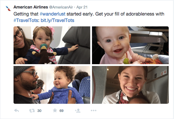
All relevant really means is that your images have to make sense to the reader. And, if you’re a company who can’t find a visual representation of what you do, use the failsafe of showing people enjoying it.
Are Abstract Images Relevant?
Abstract images – visuals that make their point through representation – get used a lot around social media. For example, Buffer uses them a lot on their social feeds.
But do they counts as relevant images?
The answer is: it depends on the goal.
As Kevan discussed in this article on creating twitter visuals, abstract visuals can still have an impact on shares and engagement, because any image is better than not using an image at all. But, as you saw earlier, simple designs have a big impact.
So if you just want to increase engagement and make a point, you can use abstract images all you want.
However, if you’re looking for maximum shares and engagement, your best choice is to go with a clear explanatory image—or a simple, easy-to-digest design—so the reader has to do less work to figure out what you’re trying to say.
Relevance Is In The Eye Of The Beholder…
A few weeks ago I went to the theatre to watch a comedy show. The guys on stage picked apart comedy through the ages—from Cavemen through to Chris Rock—and talked about what makes comedy funny. And about halfway through the show they said a line that has never left me:
“It’s not about what makes you laugh, it’s about what makes the audience laugh”
The same can be applied to content, and the images you’re creating. It’s not about what you would share, it’s about what your audience would share.
When you’re choosing or creating your images, ask yourself these questions:
- Does this fit my niche?
- Does this fit my brand?
- Is it easy to understand?
- Does it make sense for my audience to share this?
If you can answer yes to all of these questions, you’ve got a relevant image that your audience can respond to.
3. Colors
The 3 Colors You Need For The Most Shares
Colors are powerful.
In fact, according to Neil Patel, they are 85% of the reason you choose to buy a product. And from a quick glance at my bookshelf, over half of all the books I’ve bought on impulse have orange on the cover—a color that fuels the impulse emotion.
There’s been a lot of research into how different colors affect people from different cultures and places, or how they can back up a point that’s being made.
For example, here’s a great infographic about the impact of different colors on people from around the world.
But, not much has been known about how colors impact readers sharing habits:
Until now.
A recent study from Georgia Tech examined over 1,000,000 Pinterest images between 2009 and 2011, and looked at the color trends between the highest and lowest shared images.
The results?
- Red, Purple and Pink promote sharing
- Green, Black, Blue and Yellow all stop people from sharing
That’s because those three colors—red, purple and pink—all drive carnal, visceral emotions, such as failure and sexual arousal, in both men and women.
When you’re creating your next image, then, try making the points you want to stand out in either of these three colors for maximum shares.

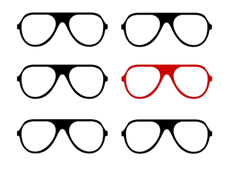
How To Use These Colors In Images
Now you know the colors that work, that doesn’t mean you suddenly have to start drowning your images in Red, Pink and Purple. Instead, try to use the colors to make standout points in your images.
Take a look at this image I created for the Share As Image Blog, on why you should add images to your blog posts:
By highlighting the important pieces of information, this image alone brought in over 60 shares (out of 125) for the piece. It’s a simple tweak, but by making the points you want your readers to resonate with in those shareable colors, you can create a nice spike in your shares.
But, what if your image doesn’t have text?
You can still apply the same principles by making the focal point of your image stand out in one of those colors, too:
Or you can adjust the background to the image you’ve used:
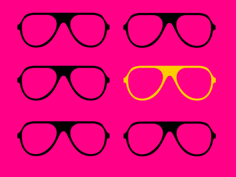
The idea is to work these colors into your image where they fit, not to just force them in there because you feel you have to. These colors will increase the shares you have, but don’t damage your content just to make use of them.
4. Typography
Choosing The Right Font
It’s easy to think that your font is a simple design choice.
But the truth is that it’s the body language of your image. It says a lot to your reader without you even realizing it.
Not sure what I mean? Take a look at this image:
There’s a huge difference between the two, right?
Fonts have been shown to impact everything from your political beliefs, to whether you’re an optimist or a pessimist and how long someone will read an article for.
But what do they have to do with how your image can get more shares?
Simple. It’s all about emotion. Creating it can:
- Motivate readers
- Drive decision making
- Make people share
So, it boils down to the message you’re trying to put out – and the emotion you want to evoke. This slideshow has a great list of fonts and the emotions they create:
The Quick Guide To Choosing The Right Font
The aim here is to think beyond the words you’ve written; and make sure the font is a match for what you’re saying. Doing that isn’t as complex as you’d think, though. Here’s a simple three step guide to help you choose the best font for your image:
- Decide on your emotion: You’ve already seen how emotion is a driver behind sharing, so be clear on the emotion you want them to feel.
- Create the designs three times: Find three fonts you like that fit your message. Then, create the design three times and compare them to each other. I find going away for a coffee break and coming back makes this decision much easier.
- Choose the most readable font: If your audience can’t read it, you’ll struggle to get your message across. Avoid the prettiest font, and choose the one with the most power over your audience.
5. Hashtags And Text
How to Optimize for Maximum #Power and Success
Okay, now you’ve seen the emotional power of choosing the right font. But what about the text you’ve actually written – how do you optimize that for sharing success?
Well it turns out there is no magic formula for text on images. All it really has to do is answer these questions:
- Does it fit my layout?
- Does the font fit the message?
- Is it relevant?
- Will my readers care about it?
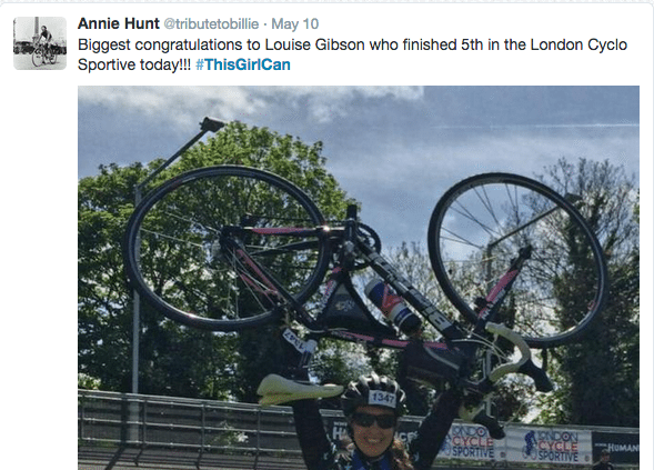
The more powerful the message, though, the better the chance of the image being shared. For example, take a look at the This Girl Can campaign from the UK.
Their marketing strategy was simple: use motivational pictures of real women with a strong message on top, to spread the message – and increase the awareness – of women in sport and exercise.
The results are staggering:
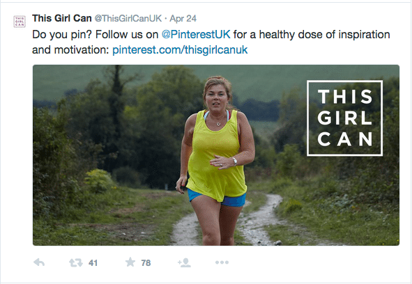
And, they’re not only staggering from an emotional point of view. They managed to build a 62,500 person following in less than a year, and the engagement on all of their updates is high too.
Although the original message isn’t a Hashtag on the image, it’s still become one that their followers use every single day.
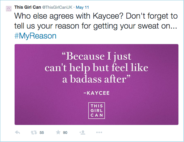
But, what should you do if you don’t have a Hashtag or message? Don’t worry; you can still get up to 847% more shares.
By using quotes in your image, you can take a boring mundane tweet and turn it into a really powerful image. As long as it fits the above checklist, of course. Take a message you want to share, and quickly turn it into a shareable social media image, like this one:
Let’s Get Shareable…
Okay, let’s do a quick round-up of everything you’ve learned so far.
An image needs six elements to get shared:
- Emotion: Your audience needs to feel something when they look at your image.
- A simple layout: If you do too much, you turn them off and away from that share button. Keep it simple, clear and easy to digest.
- Relevant imagery: Your stock photos, backgrounds and filters should all make sense and tie in with your niche or branding. If they don’t, it doesn’t make sense for the reader to share it.
- The right colors: Use the colors that best match your brand, but don’t forget to make the most of Red, Pink and Purple to get the most shares.
- A powerful font: Make sure the words you use match up to the font you choose. Don’t make your image send the wrong message.
- Text or hashtags: Quotes are the most powerful, but having a powerful message or hashtag can create a lot of viral potential.
Where do you go from here? Well, I’ve got a little task for you, if you choose to accept it. Don’t worry, this blog post won’t self destruct if you don’t.
- Open an image creation app (if you want speed, I’d recommend Share As Image)
- Choose a template that fits the platform you use most
- Create an image, using the principles above, for your next update
- Share the link in the comments of this post
- Let me know your results
All that’s left to ask now is, what are you going to create?
Image sources: Pablo, UnSplash, IconFinder
Try Buffer for free
140,000+ small businesses like yours use Buffer to build their brand on social media every month
Get started nowRelated Articles

In this article, I’ll explain what SEO is for social media, why you should care about it, and how you can use it to your advantage.

How to source the best audio clips for your TikToks while they’re still popular, plus examples of TikTok sounds with staying power.

This article looks into social media benchmarks for various industries and platforms.